Design Principles
To ensure our product has a UI that is both quick and easy to use, we had to adopt several design principles.
1. User Centricity
2. Simplicity
3. Consistency
4. Reduced Cognitive Load
5. Feedback
The most important design principles is approaching the design with a user-centered mindset. The first step is a series of interviews to gage an idea of major important features a user looks for. Through then creating personas, to place ourselves in the user’s shoes, we created multiple sketches. Through effective feedback, we developed prototyped UI designs for them. Through our own heuristic evaluation, we modified the prototypes with the user in mind. With a raft of potential user ages, with different conditions, the UI had to be accommodating for all people.
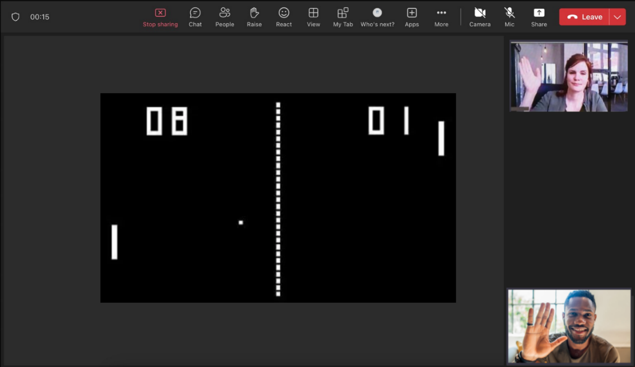
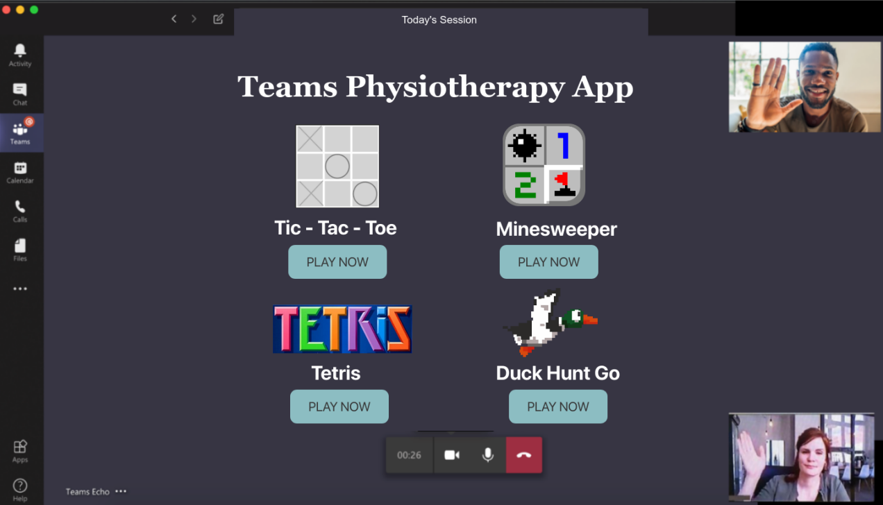
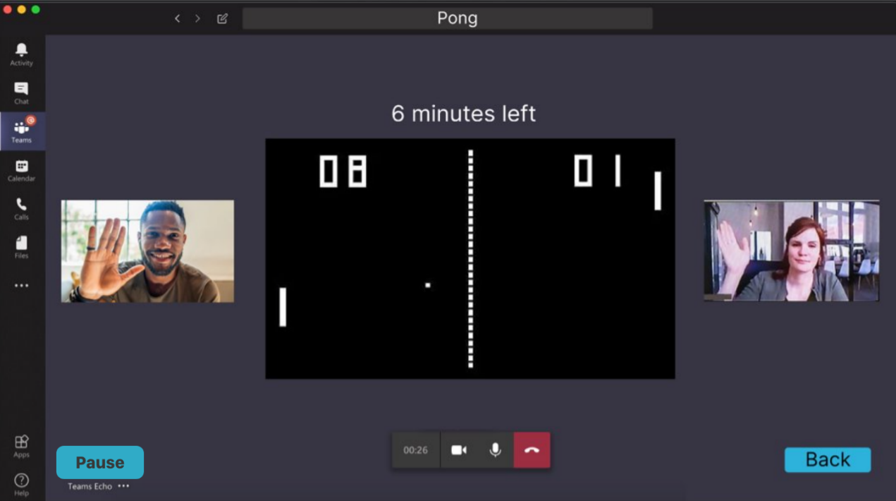
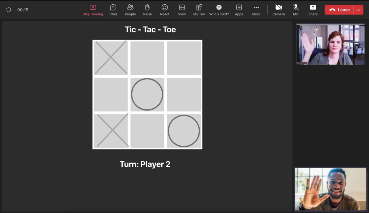
The best UI designs are simple, with few complexities. We strive to make all information, demonstrations and games available to navigate for users in a few clicks, with no unnecessary details. Our UI should be such that all the features there cannot be removed and are essential. For example, all the GIF demos are available to see in 1 pages on our application. By minimising pages only have single primary focuses, our application will be especially easy to use and navigate for our specific users
This will help create familiarity within UI navigation. While ensuring predictable navigating for users within the application. This again is particularly important for less tech-savvy elderly patients, who account for a large amount of our target demographic.
A key factor of UI design is reducing cognitive load, meaning user’s don’t have to think much when setting up their game environment. This inherently arises from combining simplistic and consistent design principles throughout the development of the application.
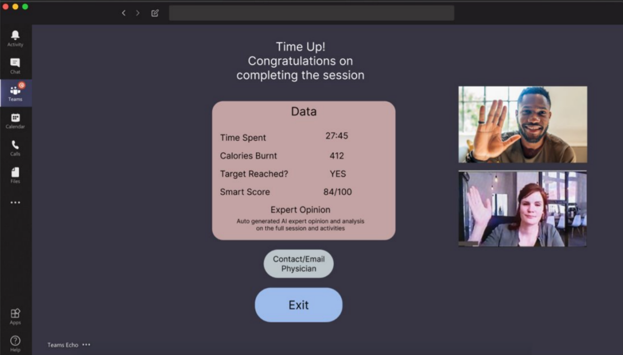
Constantly gathering user feedback throughout the design process, as well as during testing, can help guarantee an effective design. For our project, we have consistently made use of user-feedback, often using pseudo-users as testing subjects. In the end, user acceptance testing was utilised, to meticulously inspect the advantages and disadvantages of our UI.
Sketches
After understanding our user's requirements and wants, we needed to create some design ideas. We decided to brainstorm many ideas, take the positives from user feedback, and then develop prototypes in parallel with the best ideas. Hence, we drew several sketches - interlinked together.
Sketch 1
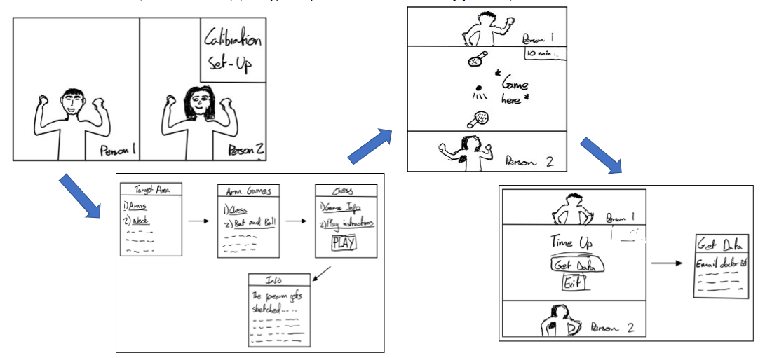
Sketch 2
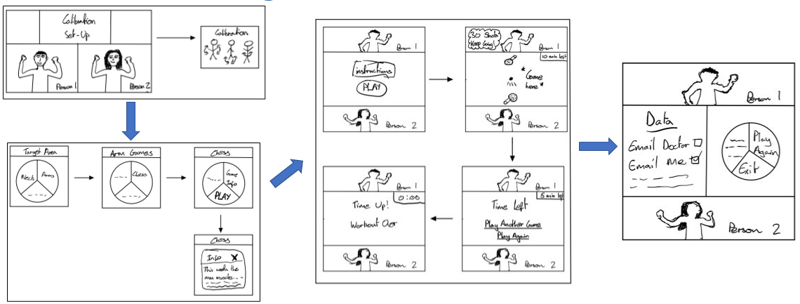
Initial Prototype
Using our sketches as inspiration, we produced a prototype using figma, exploring the usability of our designs.
Prototype 1
Prototype 2
Prototype 3
Heuristic Evaluation
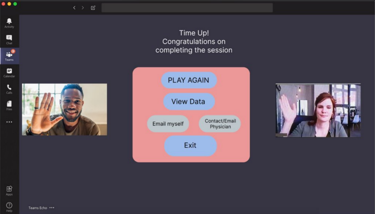
After our sketches and initial prototypes, we used empirical evaluation and a heuristics evaluation to review and optimise our designs. Our empirical evaluation was done through peer and self review, and the main pain points were for more options and buttons such as 'Play Again' along with more friendly designs.
| Issue No. | Heuristic | Problem | Solution | Severity (0-4) |
|---|---|---|---|---|
| 1 | Consistency and Standards | Clearly show when options are clickable | More buttons shown and displayed | 2 |
| 2 | User Control and Freedom | No exits for user errors. E.g., calibrating the wrong body part | Added 'back' buttons for error recovery. | 3 |
| 3 | Visual Design | Prototypes do not use visually pleasing colours and designs. | Brighter, more visually aesthetic colours and designs. | 3 |
| 4 | Flexibility and Efficiency of Use | Some pages lack efficiency (e.g. no feature to email yourself) | More grouped buttons added on, along with an email yourself feature. | 1 |
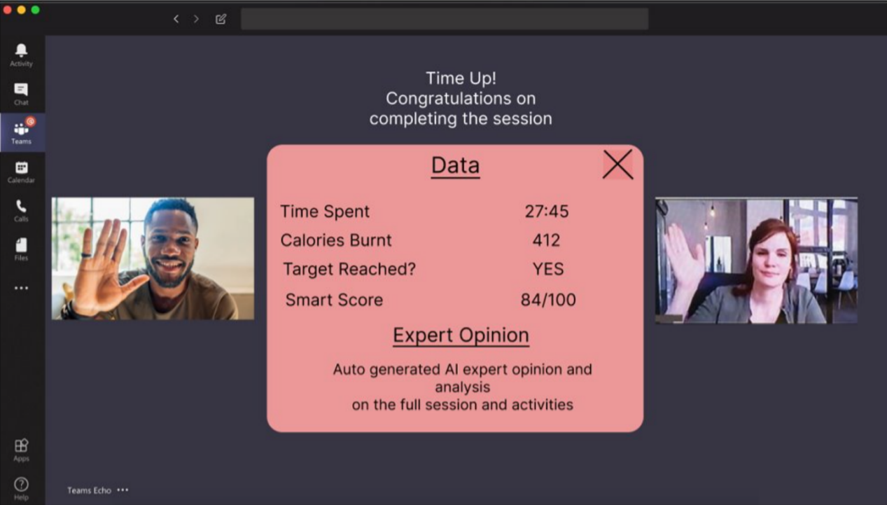
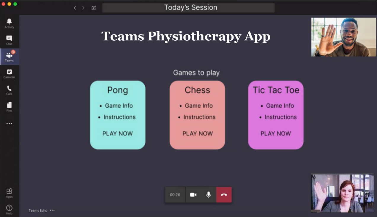
Revised Prototype
Upon completing our evaluation, we went through an iteration process, improving our prototype.
Prototype 1
Prototype 2
Prototype 3
Prototype 4
Prototype 5