Calibration
Calibration research was focused on finding ways of correcting the projected image to the TV surroundings using only a webcam and a projector, replacing a depth camera. While it is possible to get a depth map with just a regular camera, it requires an advanced calibration setup which would be unreasonable to ask of users. The way our algorithm replaces the depth map process is by focusing on a single point of view when calibrating, working with visible 2D projection pixel displacement from single perspective only, hence removing the need for depth in any calculations.
The final calibration system and algorithm, called Space Unfolded, can be accessed via the GitHub repository.
Explanation of the Algorithm
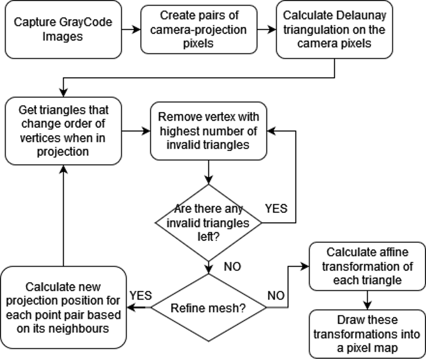
- Use a Gray-Code pattern to map camera pixels to projection pixels.
- Calculate a Delaunay triangulation on all camera pixels found in the previous step.
- Mark triangles which when mapped to the projection are clockwise or too small as invalid.
- Keep count of the number of wrong triangles that each point is part of with a Fibonacci heap, and remove them starting from the ones with most errors until no invalid triangles are left. If two points have the same counts of wrong triangles, remove them in the order in which they were inserted into the heap.
- (Optional) Recalculate each projection point using a homography on its Delaunay neighbours and go back to the previous step. This can be done multiple times, increasing smoothness of the resulting map at the cost of precision and execution time.
- Create a 2D map assigning camera pixels to projection pixels.
- Draw each triangle into the 2D pixel map by interpolating the values inside it with its affine transformation.
Maps obtained using this method can be quickly applied to each frame we display on the projector using OpenCV’s remap function.
Previous Attempts
We investigated the possibility of using a color grid for detecting projection reference points, instead of a structured light pattern. However, while that approach was faster than capturing multiple images with Gray-code patterns, it was too imprecise and error prone to be part of the final product.
The final map creation algorithm also changed. At first, we looked for clusters of points with similar homography using an approach based on modified RANSAC, however this left too much data to be extrapolated and didn’t work well with non-flat surfaces. One advantage of that approach was removing the need for data smoothing afterwards, but that came at the cost of losing finer details.
Weather Detection
We wanted to create an automated Weather mode which triggers our weather-related projection modes such as the Snow and Rain modes. This required a weather classification system to be developed to automatically detect the weather displayed on the user’s primary display screen. While researching the problem, we found that the weather on the TV content could be detected by using a pre-trained Convolutional Neural Network (CNN) model [1].
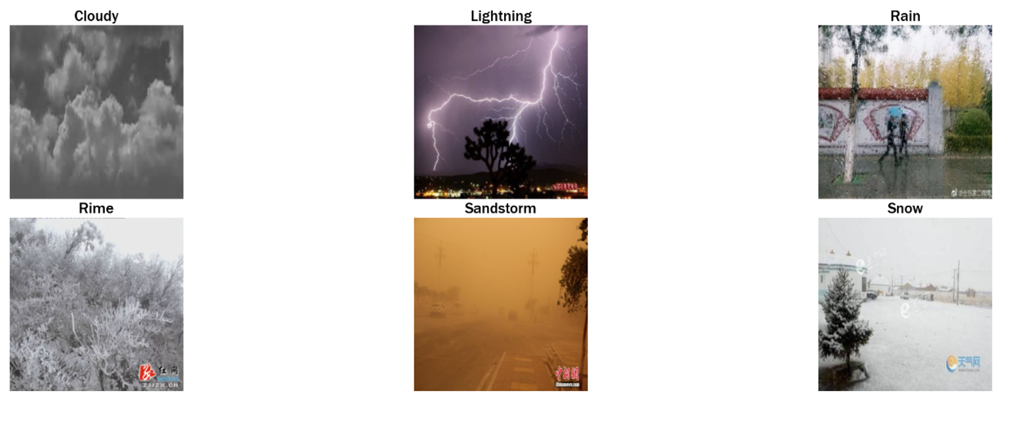
For the Weather mode, we used a neural network which was trained to detect the weather of the image. The data we used for training was pre-classified as “cloudy”, “lightning”, “rain”, “rime”, “sandstorm”, “snow”. We combined the “rime” label with the “snow” one due to their similarity.
Experiments
Most of our experimentation was led by the built-in feature that Python’s Keras has. Keras training was used to split our data into a training and testing set. We used several technologies to look at the accuracy of weather classification.
- Pytorch to load the data and build the model architecture
- OpenCV for image reading and processing
- Pandas and NumPy for data manipulation and organization
- Scikit-Learn for metrics, the classification report and the
train_test_split - Matplotlib and Seaborn for data and image visualisation
Data
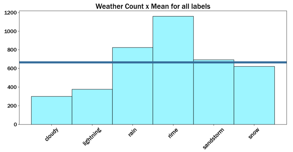
The histogram below shows the distribution of the labels in the dataset (mentioned above) along with a line graphing the mean value of the labels.
Below are exmaple images used to train the model.
Training Results
Below is a plot of the losses through the epochs. The training loss is shown by the orange graph and the validation loss by the blue graph. This plot is used to identify whether the model converges, in other words, to visualise if the model had a great accuracy in training without overfitting.
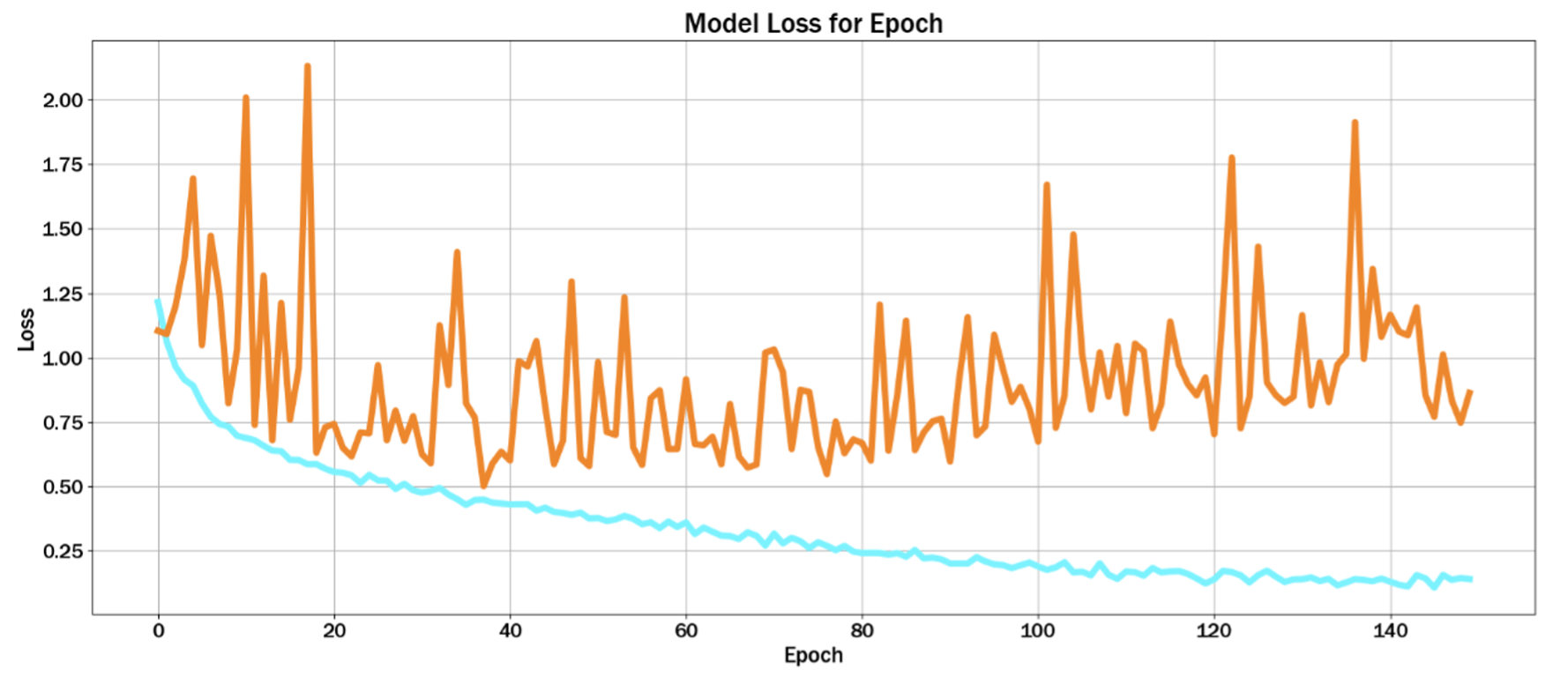
As seen from the graph, if the training loss continues to decrease while the validation/test loss starts to increase, this may indicate overfitting. But generally, both training and validation/test loss decrease so the model has been generalised well.
Classification Report
Below is our classification report summarising the results from the model.
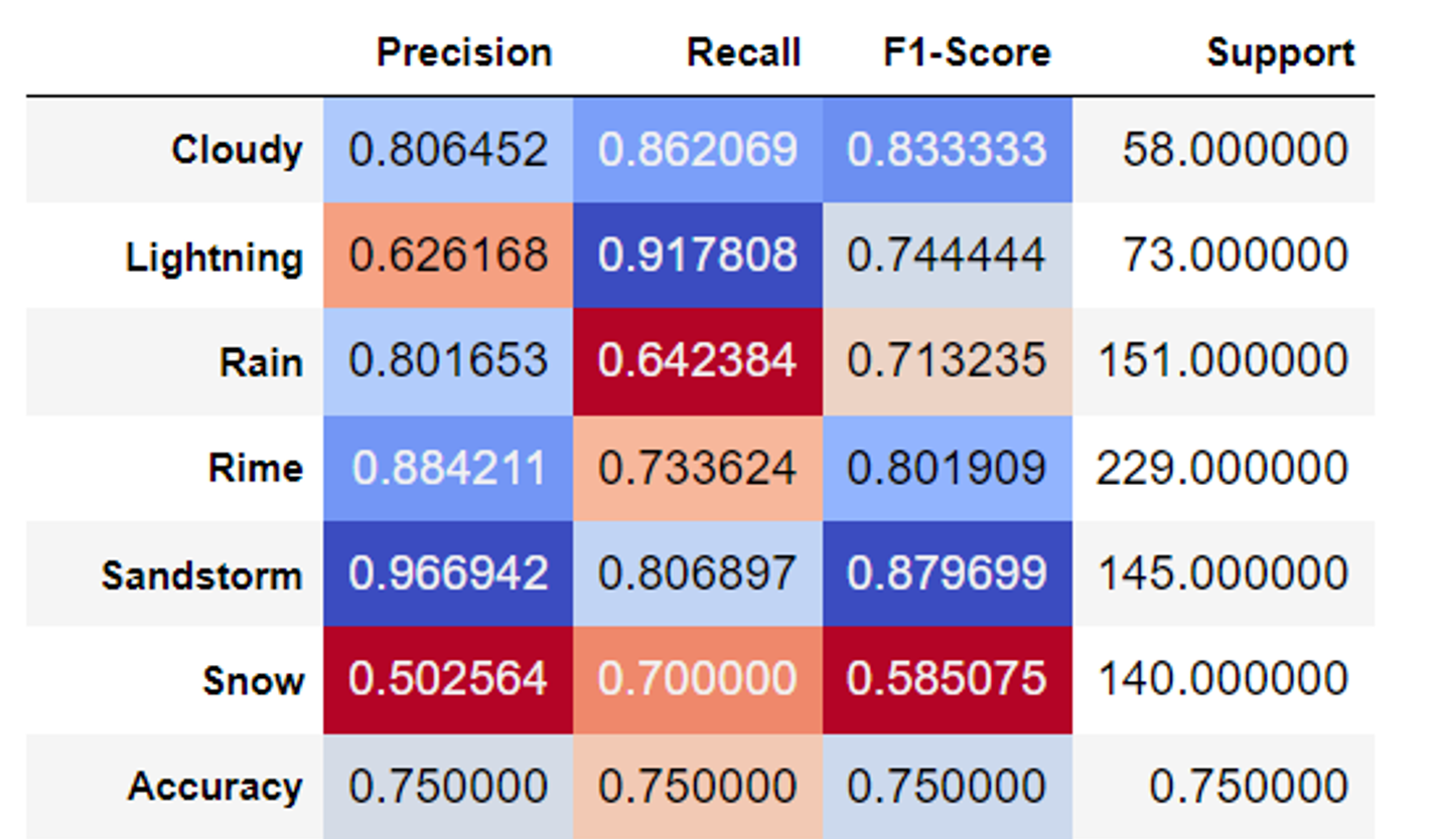
The poor prediction results on the label Snow means that the model has some difficulties trying to differentiate Snow due to similarity with other labels. Cloudy and Sandstorm have an excellent classification score because of noticeable differences between these labels and others.
Summary
Here is a video demonstrating how the weather detection works for our use case.
To improve our weather detection, we can increase the size of the dataset to include images of the different labels from games. This is because weather in games looks very different to snow, rain, lightning (etc.) in real-life.
References
[1] D. Joiner, “Weather Classifier”, 2022. [Online] Available: https://www.kaggle.com/code/davidjoiner/weather-classifier/notebook
[2] J. Czakon, “F1 Score vs ROC AUC vs Accuracy vs PR AUC: Which Evaluation Metric Should You Choose?”, 2013. [Online] Available: https://neptune.ai/blog/f1-score-accuracy-roc-auc-pr-auc