
Design
System architecture
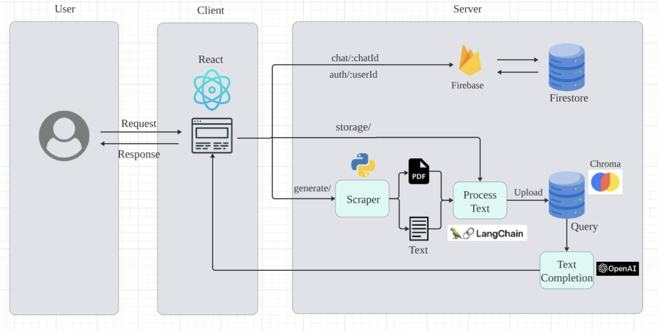
We decided to follow a simple client-server architecture for this application. The front end presents a user-friendly web page interface in React, allowing users to input specific queries and receive responses from the algorithm. On the back end, Python is employed, leveraging various external libraries such as LangChain, Chroma, and OpenAI to achieve the intended functionality.
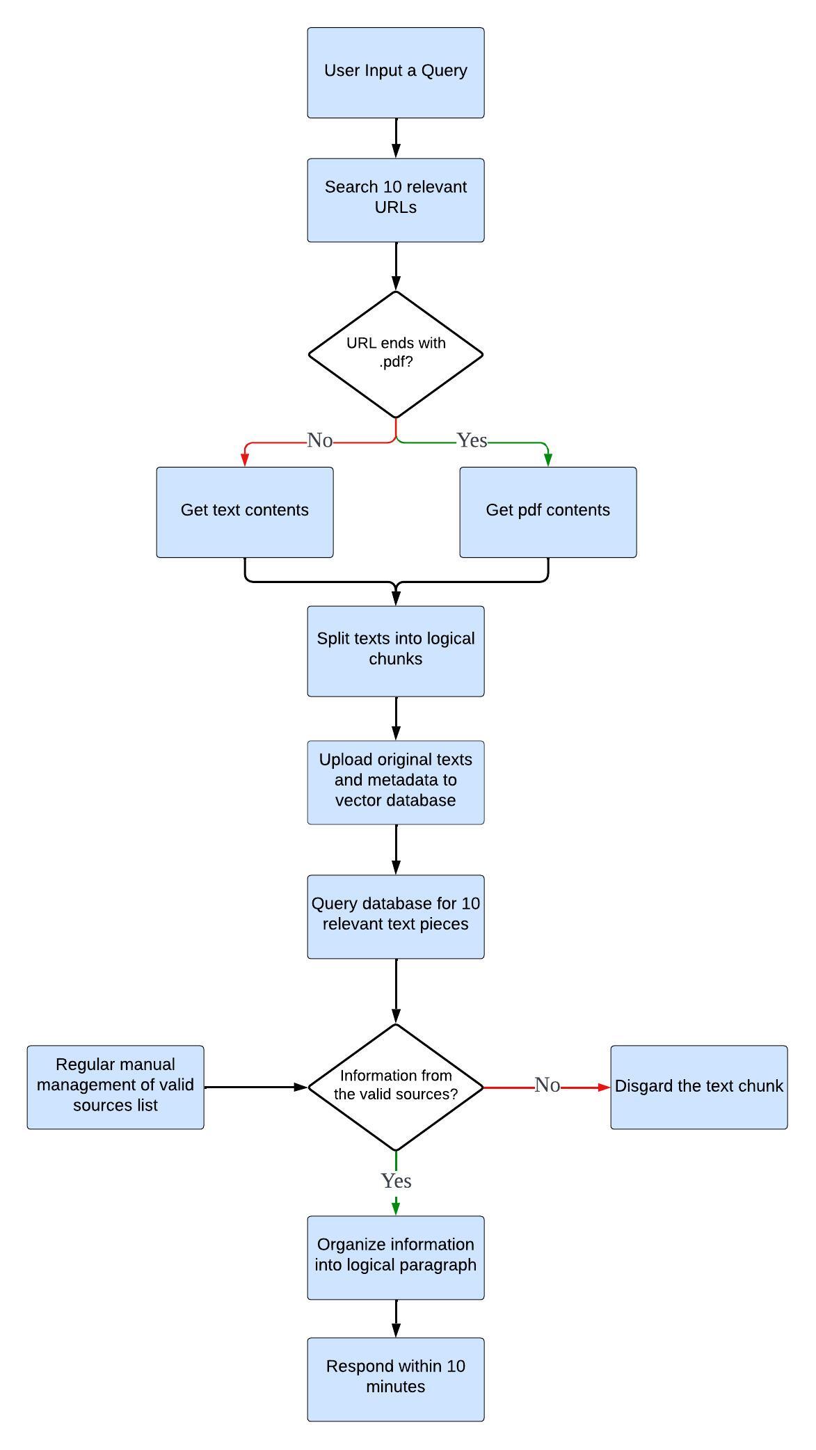
The scraper component retrieves online information in the form of PDFs or plain texts, which is subsequently processed and uploaded into a vector database, along with corresponding metadata. The ten most relevant chunks are picked out and organised into a coherent response. This design ensures seamless interaction for users while utilising advanced technologies to deliver accurate and timely results.
Design Principles
Keep It Simple, Clear and Consistent1
Our goal is to create a chatbot that is intuitive and easy for users to engage with, thus minimising the user's cognitive workload.
By adopting straighforward and unambiguous language, users can navigate and understand how the chatbot works without unnecessary confusion.
Consistency in the behavious of interface elements, such as buttons and menus, reinforces user expections and contributes to a seamless experience.
We follow well-known design usability heuristics and mental models. Ensuring that our design feels familiar and easy to use for users due to its familiarity.
Through the strategic inclusions of only the most pertinent information and features relevant to user tasks, we can eliminate clutter and distractions, leading to a more focused and satisfying user interaction.
The essence of keeping designs simple, clear, and consistent is not merely to beautify the interface but to forge an environment where users can achieve their objectives with efficiency and ease.
Offer Assistance and Feedback1
Effective design isn't just about how things look or work; it's also about guiding and supporting users throughout their journey with the product. By employing visual aids like animations, loading instructions, and confirmation screens we can significantly improve communication with the user. These elements visually convey the status of their actions, whether in progress or completed, offering instant feedback that reinforces their achievements and smooth progression through tasks. This layer of interaction not only elevates the user experience but also strengthens the user's trust in the product, fostering a more intuitive and supportive environment.
Error Prevention2
Following on from the previous princple, when errors occur, they should be accompanied by clear, informative error messages, These messages should not only pinpoint what went wrong but also indicate how the user can resolve the issue. By immediately understanding the nature of the error and the steps required to rectify it, our users can quickly address the problem and proceed with their tasks without significant interruption. This approach not only minimises frustration and confusion but also enhances the overall user experience by fostering a sense of control and efficiency.
Intuitive Navigation1
Intuitive navigation ensures that users can understand and manoeuvre through our app without unnecessary delays or confusion.
The essence of this lies in providing clear, logical pathways complemented by straightforward navigation cues, ensuring that individuals can intuitiely grasp the product's structure and functionality from the onset.
To allow users to navigate the content without feeling lost, navigation markers will indicate what page the user is currently on, along with scroll bars and well-structured menus.
Crucially, navigation should be forgiving, accommodating users who stray from the intended path by providing clear, accessible options to return or cancel actions, thus maintaining a sense of control and minimizing frustration.
In synthesizing these elements, designers craft environments where users can focus on interacting with the chatbot, not on deciphering the interface, leading to a more satisfying and engaging interaction with the product.
References
1. careerfoundry.com. (n.d.). Our Guide to the Top 7 User-Centered Design Principles. [online] Available at:
https://careerfoundry.com/en/blog/ux-design/user-centered-design-principles/
2. Nguyen, C. (2023). 7 Essential UI/UX Design Fundamentals: A Comprehensive Guide for Designers. [online] uxplaybook.org. Available at:
https://uxplaybook.org/articles/7-ux-fundamentals-a-comprehensive-guide
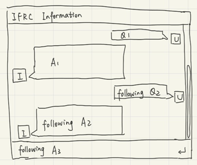
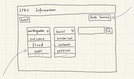
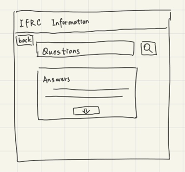
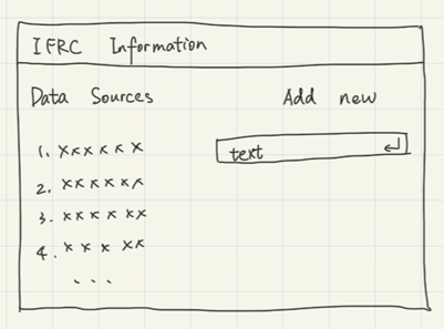
Sketches
After collecting user requirements and gaining a deeper understanding through personas and scenarios, we created sketches to explore various ideas for the user interface of our chatbot and the data management page. The sketches were based on our design principles.
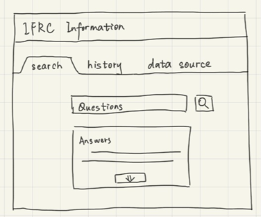
Refined Sketches
After consulting with our users, we learned that they were pleased with the data source sketch. However, they found the conversational style interface unprofessional, and liked the look of the Q&A style.
Chatbot UI
Data Source Management UI
Prototype
We developed interactive prototypes from our detailed sketches to evaluate if users appreciate the design during interaction, providing a practical way to test and enhance our design concepts.
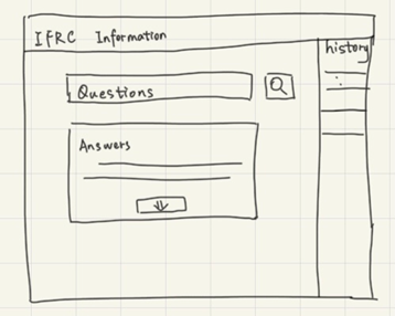
Chatbot UI
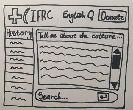
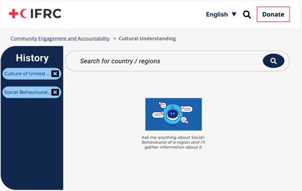
In the input box provided, users can enter a query to initiate the prototype. Upon submission, the prototype will display an animation demonstrating the sequence of events triggered by the user's query. Shortly after, approximately within 10 seconds, it showcases the chatbot's pre-determined response to the query without extensive loading times.
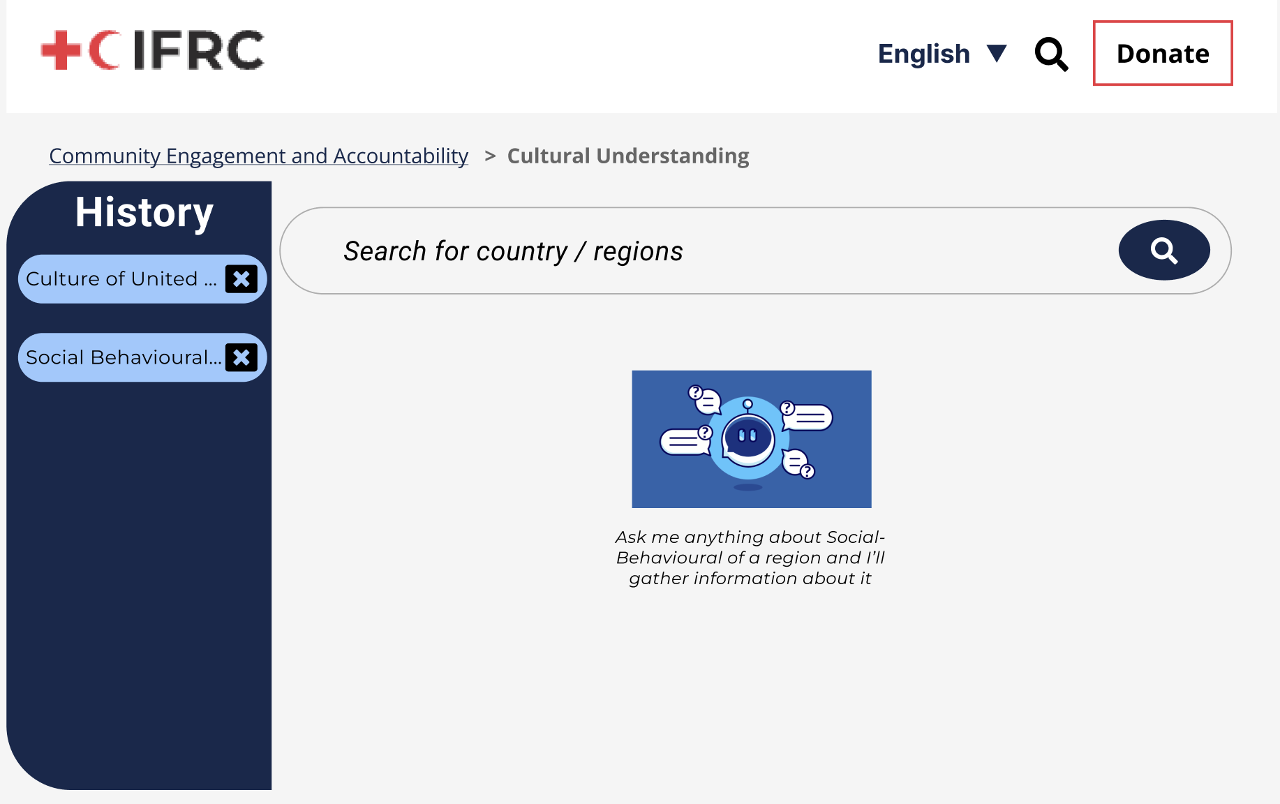
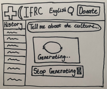
The prototype is currently waiting for the user to enter a query.
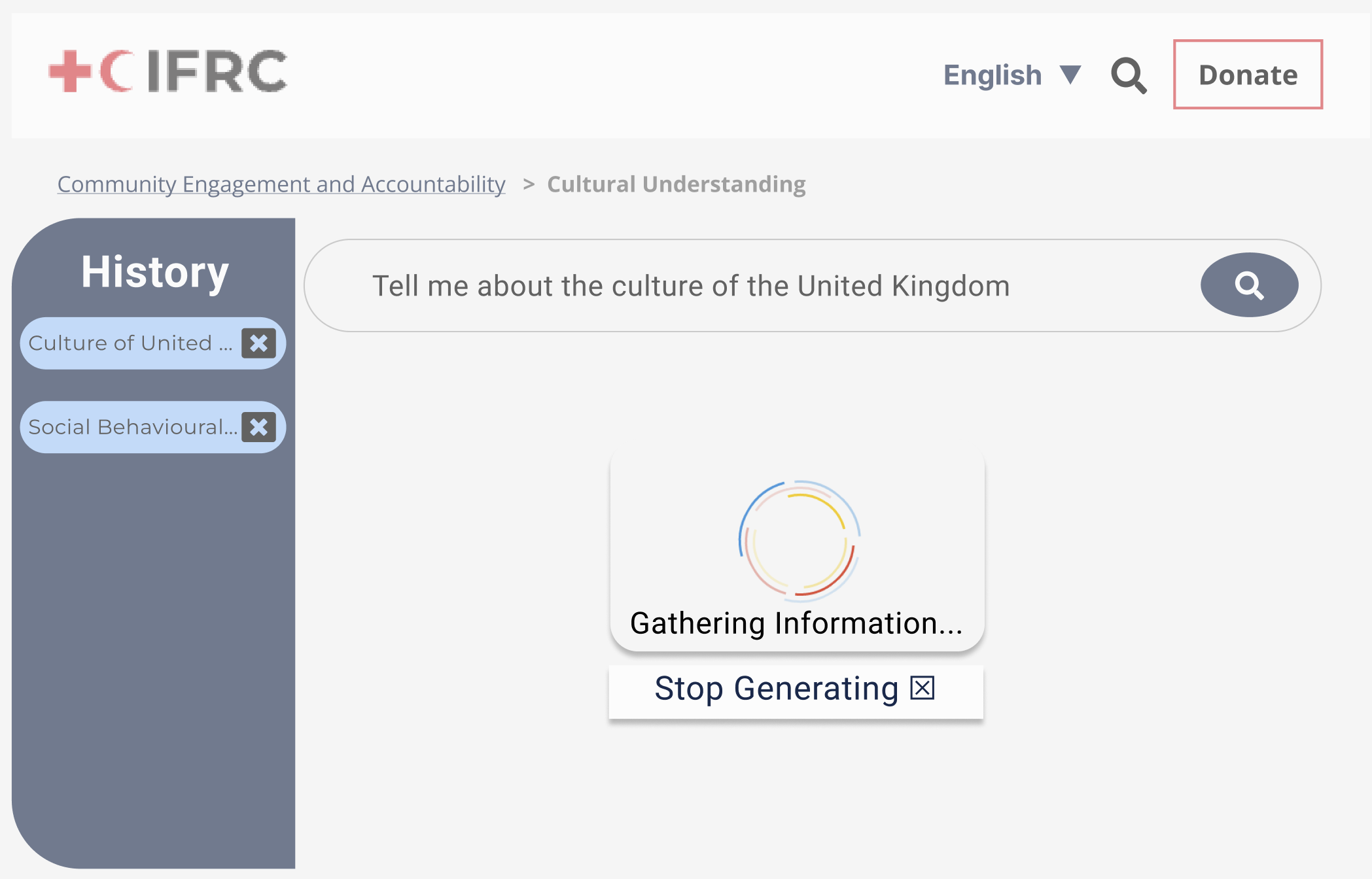
Here the user has entered a query. In practice, the amount of time required for the chatbot to respond to a query will vary, but it would normally be around 10-20 seconds.
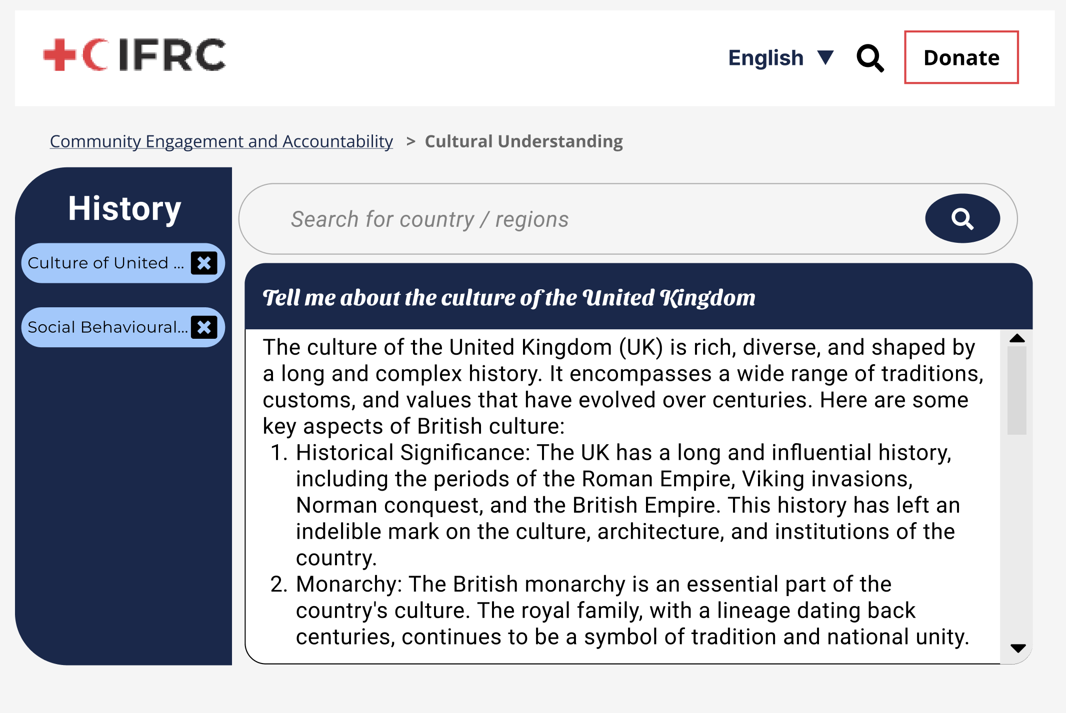
The chatbot's response.
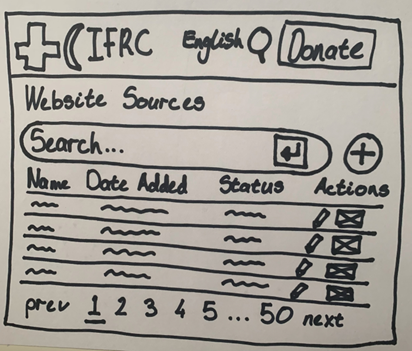
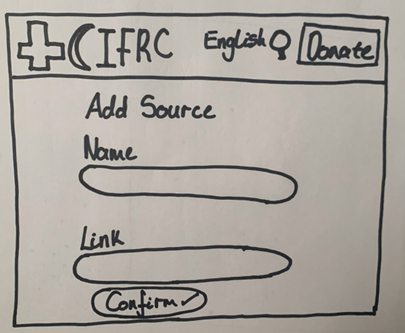
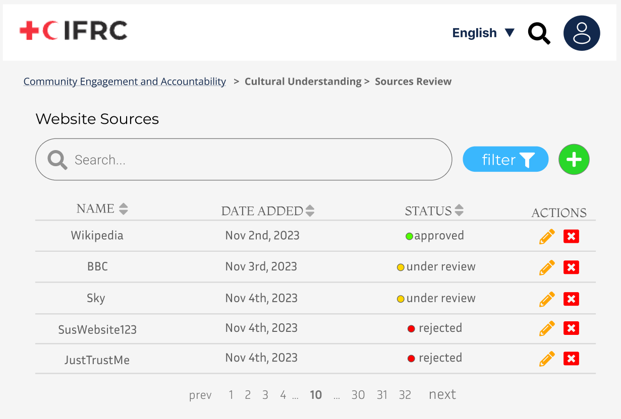
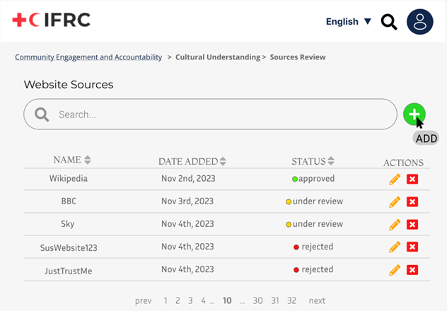
Data Source Management
The prototype allows users to explore different functionalities without any back-end processing. Users can view existing sources through a designated interface, add new sources via a straightforward form, and edit details of existing sources using an edit function. Additionally, the prototype features a search function, enabling users to locate specific sources. Please note that all interactions are simulated and do not affect or require any back-end systems.
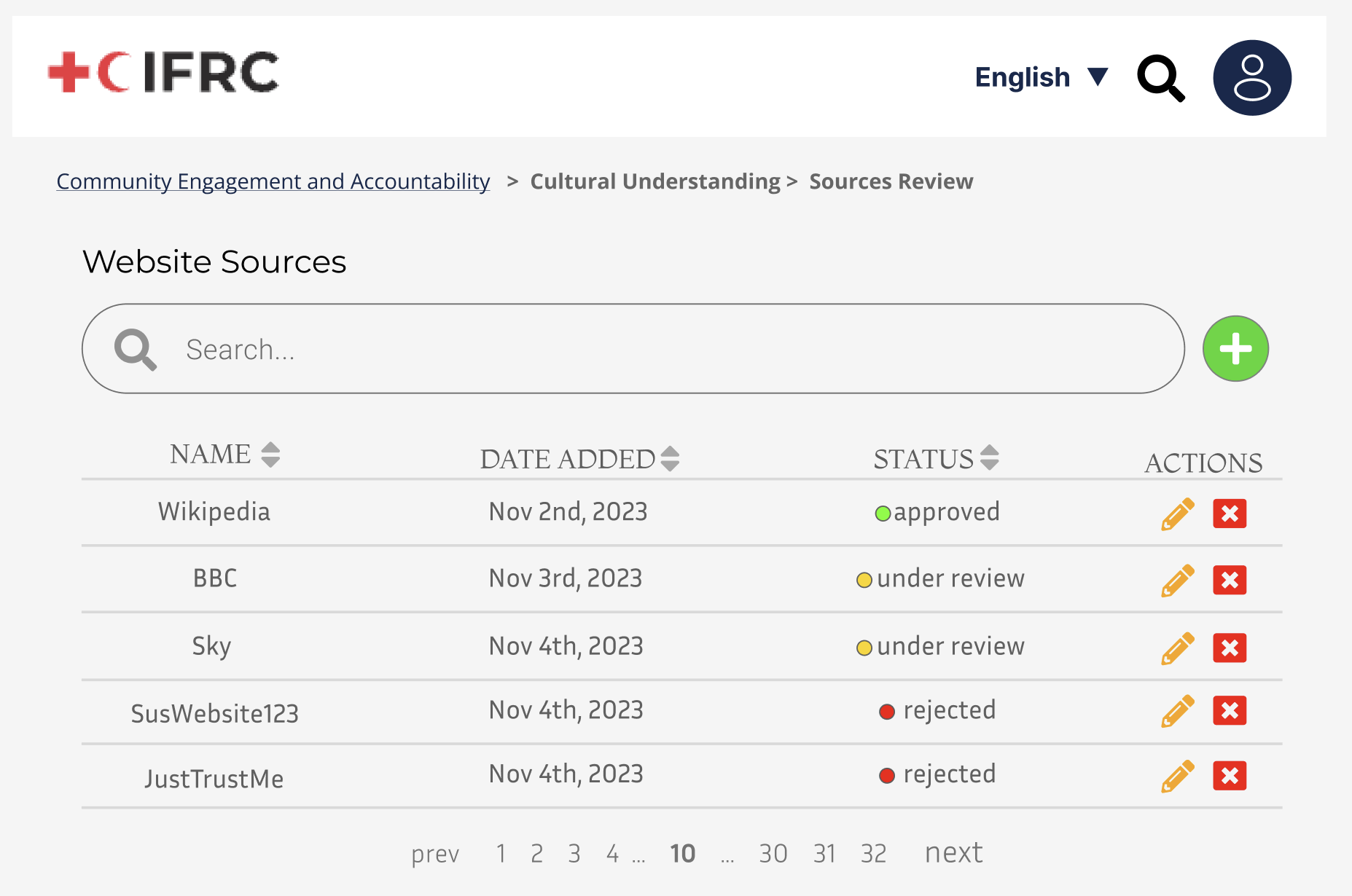
Users viewing the existing sources.
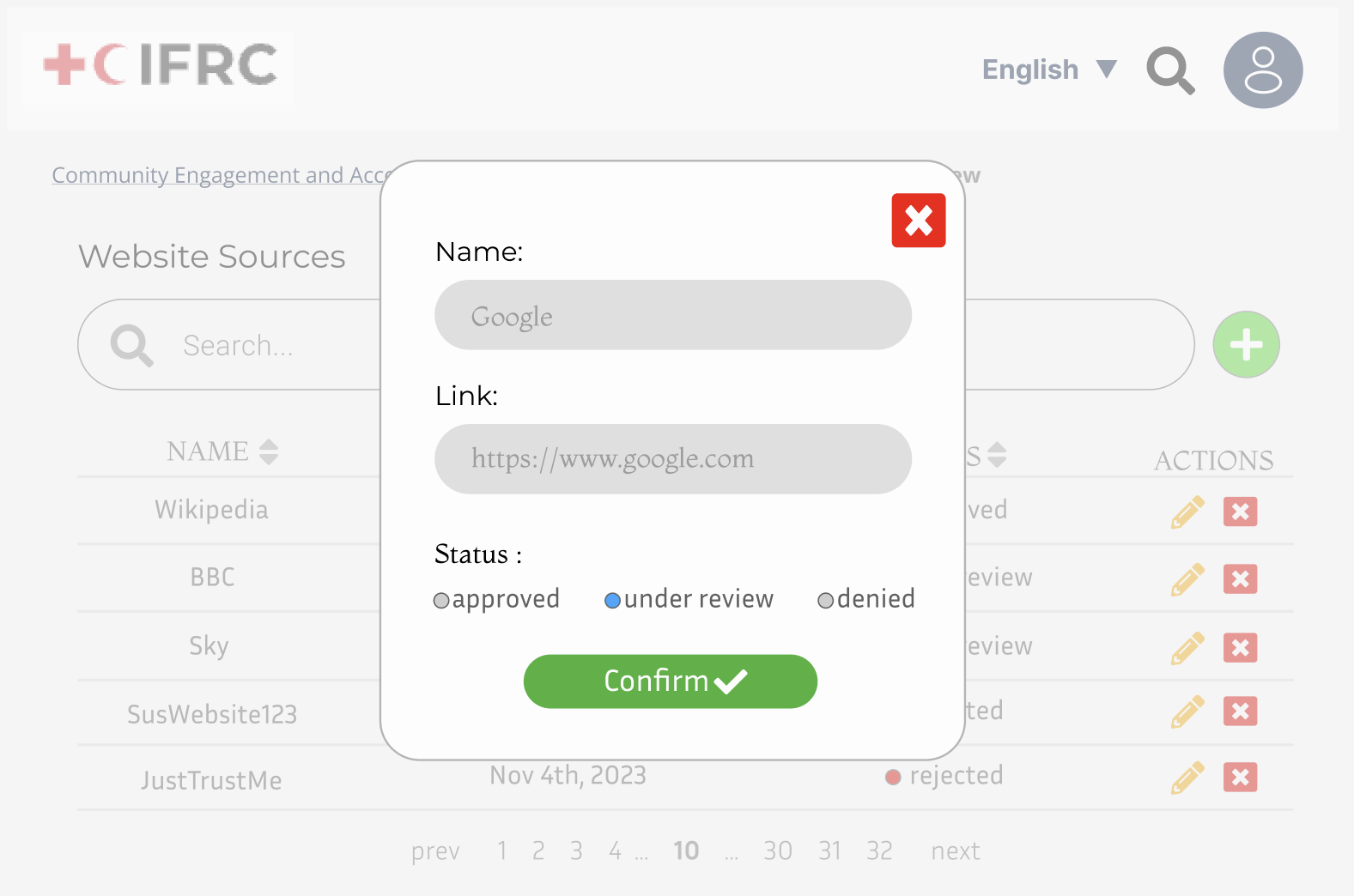
Users adding a data source.
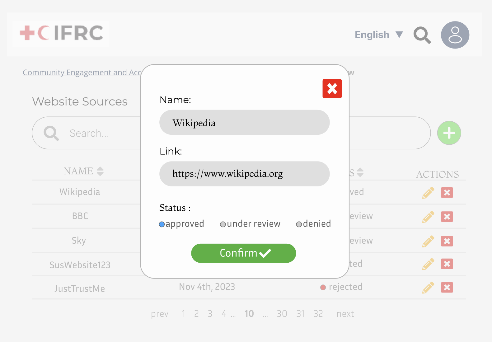
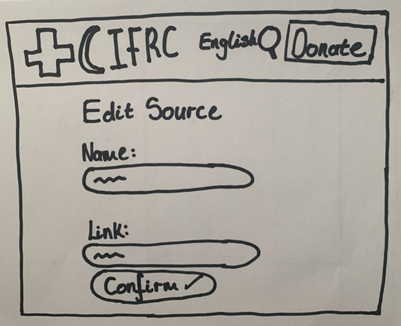
Users editing the details of an existing source.
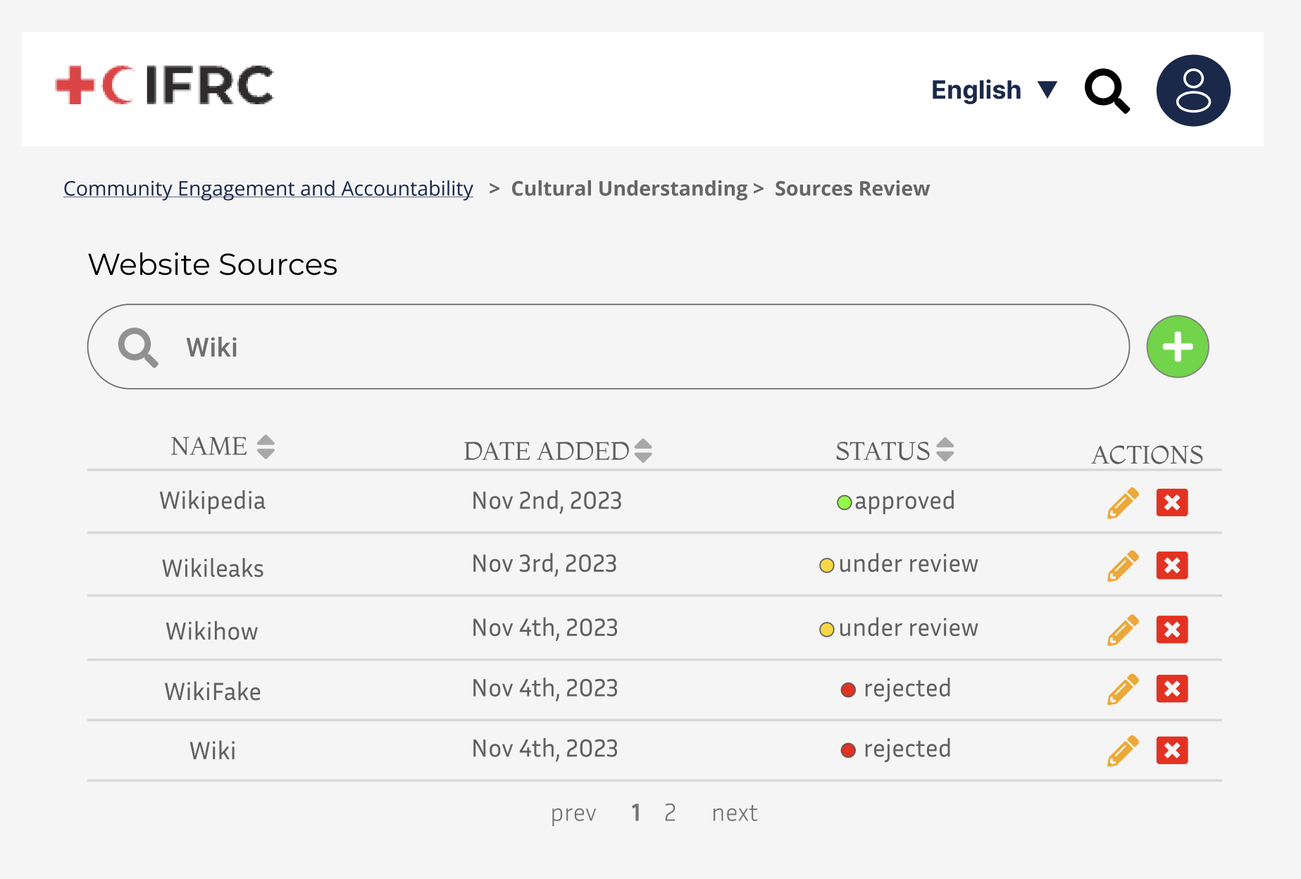
User's searching for a specific website. The search function is designed to work exclusively with the input 'wiki'.
Prototype Evaluation
We employed a heuristic evaluation to assess our prototype. This method is effective at quickly identifying usability issues based on established principles, allowing for rapid iterations in the design process.
| Heuristic | Problem | Solution | Severity |
|---|---|---|---|
| Recognition rather than recall | Though it is possible to filter status based on sorting, this is not immediately intuitive and requires user to remember how, diminishing from the user-friendliness | Include a filter dropdown that allows users to choose criteria to limit the rows | 2 |
| Help & Documentation | Icons in the Data Source Management are reliant on the user being technology proficient and hence intuitively understand them. However, this isn't inclusive to our other demographics | Add labels to each icon, which appear when the user hovers over it | 3 |
| Flexibility & Efficiency of Use | The search bar, while great in enabling user freedom to search anything, contrastingly, might overwhelm users and hence stump them when searching | Include Autocomplete into our search bar, such that users can swiftly generate a query and can lead to more exploration in their research | 2 |
Refined Prototypes
After the heuristic evaluation, we revised our prototypes to incorporate the valuable feedback received.

UML Class Diagram
Click on the image below to view the UML class diagram

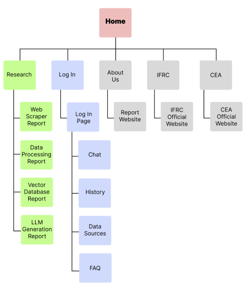
Site Map
The site map displayed here provides a comprehensive outline of our website's structure. showcasing the hierarchical arrangement of all pages and subpages to facilitate easy navigation and understanding of the site's content.
Flowchart
A flowchart is presented to offer a comprehensive understanding of the inner workings of our algorithm. The intentional design of the algorithm prioritizes simplicity, minimizing any potential confusion. However, it's important to note that the system does necessitate regular manual management for the addition or removal of validated and approved website sources. This proactive approach ensures the algorithm stays current and aligned with the most relevant and reliable data.