UI Design
Design Principles
We follow a structured, modern, and functional UI design that balances usability, accessibility, and visual clarity.
User-Centered Design
Our system is designed with the user in mind, ensuring intuitive navigation, clear interactions, and minimal friction. The chatbot provides real-time responses, the Kanban-style task management system enables easy workflow organization, and the interactive map search allows seamless data retrieval. Every feature is structured to reduce cognitive load and enhance usability.
Minimalism & Clarity
We emphasize a clean and distraction-free interface, using neutral colors and clear typography to highlight important information. Card-based layouts, structured spacing, and concise text ensure that users can quickly grasp essential details without being overwhelmed by excessive visual elements. Also the design of retrive on-off button avoid the potential misunderstand of the retrieval status.
Consistency & Visual Hierarchy
A unified design system is maintained across all components, with consistent typography, color schemes, and element spacing. Larger, bold fonts highlight key sections, while secondary information is subtly displayed, guiding users naturally through the interface and making interactions predictable.
Interactivity & Engagement
Dynamic elements, such as real-time chatbot responses, interactive map markers, and animated task progress indicators, make the system engaging. Users receive immediate feedback for their actions, ensuring smooth navigation and an intuitive, responsive experience across all features.
Sketches
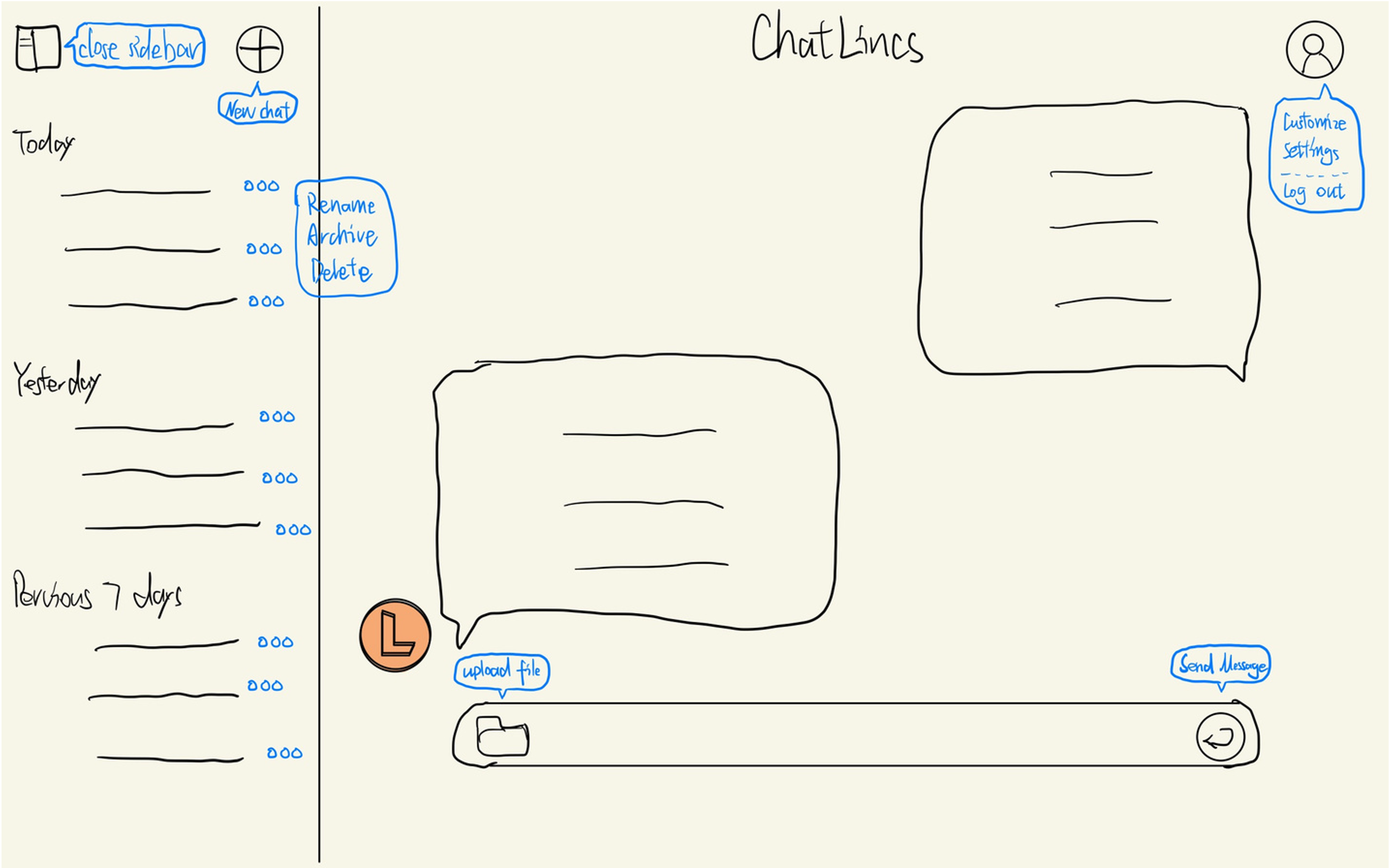
Our sketches were developed through team discussions to define the layout, functionality, and user flow of ChatLincs. These early drafts helped refine interactions, optimize usability, and gather feedback before prototyping.
The selected sketch outlines the chat interface structure, featuring a sidebar for chat history, a main chat window, and user settings. Key actions like file upload and message sending are strategically placed for seamless navigation, ensuring an intuitive user experience.
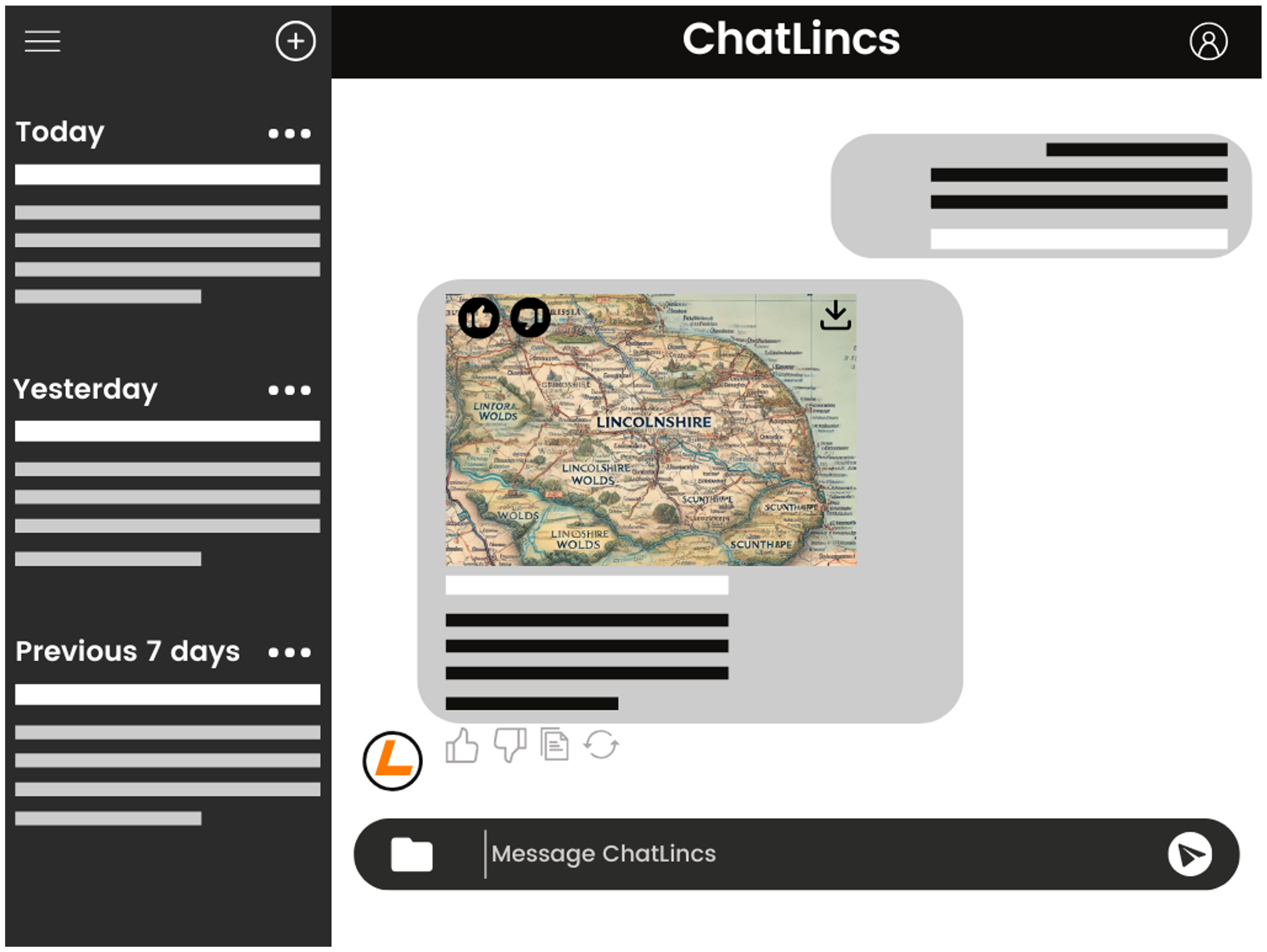
Prototype
This prototype presents the key features of the ChatLincs interface, designed to test usability and user interaction in the early design stage. The central display area highlights retrieved content such as maps or images, enabling users to visually engage with relevant information. A download icon allows direct saving of media, while interactive buttons below the content—like thumbs up, thumbs down, copy, and regenerate—encourage quick feedback and user engagement. On the left-hand side, messages are sorted by time (Today, Yesterday, Previous 7 Days), supporting easy navigation and content tracking. The layout emphasizes clarity, intuitive flow, and accessibility for a smoother user experience.