UI Design
Design Principles
Our UI design process for this project was rooted in a user-centered philosophy, tailored specifically towards the non-technical audience of Chanel's Creative department. We began by evaluating how end users—many of whom had little to no technical background—would interact with the application. Through continuous survey, meetings and feedback, the insights garnered informed every design decision, from structure to language.
Simplicity and clarity were our guiding principles. We prioritised a self-explanatory interface that could be easily navigated with minimal buttons and instruction, ensuring users could navigate the system intuitively and with confidence.
The project's UI design was based on essential human-computer interaction (HCI) principles, having emphasis on affordances, simplicity, scalability, and consistency for an optimised user experience.
Ultimately, we have strived to and succeeded in creating a user experience that minimises friction and maximises efficiency, aligning with the needs of its intended audience at Chanel.
Core Design Principles
- Simplicity & Clarity:
- Consistency:
- Affordances & Signifiers:
- Scalability & Responsiveness:
Ensured that the interface remained clean and easy to understand, reducing unnecessary complexity. Utilised minimalistic design and intuitive layout to enhance usability.
Maintained a uniform design language across all screens, including typography, colours, and iconography by creating and utilising reusable components and custom style properties.
Utilised visual cues to indicate how elements should be interacted with. For example, buttons are styled to visually respond to user interactions by changing color on hover and press, making them look clickable. This ensures that interactive components are easily distinguishable from static elements.
Developed a responsive layout using container elements that automatically adjust the size and positioning of content depending on the screen size. This allows the interface to stay user-friendly whether it's viewed on a desktop or a tablet screen.
Visual Identity & Colour Palette
Upon discussion with Chanel, we decided to incorporate the company's colour palette into the design of the application. This colour-palette ensured that the project aligned and reinforced the organisation's visual identity—making it recognisable to the end users—while creating a seamless user experience.
Reports Colour Palette
Colours used for creating the reports in Power BI.
#1D1D1B
#EBD2C1
#AB3E34
#C2B28A
#253145
#E0ADC3
#D3DDBE
#F8D8A2
#DFBCAB
User Interface Colour Palette
Colours used for creating the navigation bar, header, and profile page in Power Apps.
#FFFFFF
#EDEDED
#E6E6E6
#000000
UI Design Evolution
The evolution of the UI design was consistently guided by feedback from both our TAs and end-users, gathered during in-person lab sessions and meetings respectively. Additionally, the design was further refined in response to ongoing changes in project requirements from the client.
Initial Prototype
The original prototype was developed in Figma to simulate the app's functionality from the perspective of the Head of Visual Creative. In this role, the user has access to all team reports, with a dynamic navigation menu that facilitates seamless transitions between each team's reports.
With the objective of creating this interface, the development of the user interface was divided into two key components: the navigation bar and the main dashboard, with the aim of creating an intuitive and efficient interface.
Navigation Menu - Version 1

- Key features:
- Feedback:
A button that would automatically bring users to their team's reports, and a button that would automatically bring the user to their individual reports.
To update the buttons for improved clarity, ensuring that each button clearly indicates its intended purpose for the user. To add an additional screen to collate the logged-in user's information - profile page.
Navigation Menu - Version 2
- Key features:
- Feedback:
The button visuals for the Team Reports and Individual Reports screens have been updated to enhance clarity regarding their functionality. Additionally, a Profile Page button has been added to the bottom of the navigation menu, providing users direct access to their profile page.
To make the navigation menu expandable so that button labels can be displayed for better clarity. Additionally, feedback was received for the profile icon to be repositioned to the top of the navigation menu to improve the hierarchy of icons. Feedback was given for the additional refactoring of the button icons to make its use clearer.
Navigation Menu - Final Version

- Key features:
Labels have been added to each button to maximize clarity for users. The navigation menu can be expanded for further guidance when users are uncertain about which button to select. The team and individual report buttons have been redesigned to ensure greater certainty in their functionality. Additionally, an expandable button for the navigation menu has been pushed to the bottom to enhance the hierarchy and overall user experience.
Report Dashboard - Version 1
- Key features:
- Feedback:
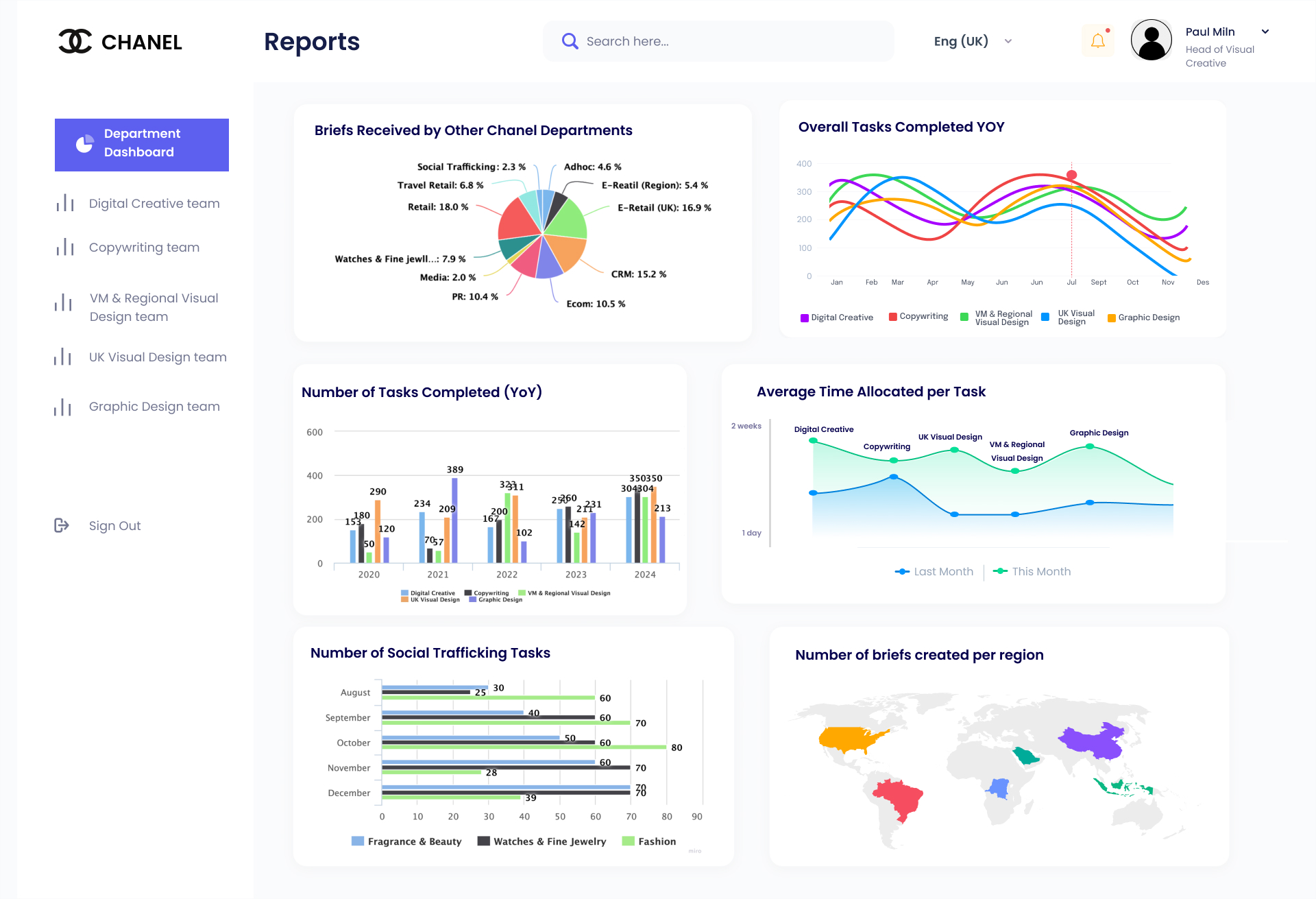
Key reports, as requested by end-users, have been integrated into the Power App. Each report can be enlarged and dynamically updated based on the filter function located on the right-hand side of the dashboard.
To optimize the embedding of the dashboard, the layout will be adjusted to reduce visual congestion, ensuring the graphs are more spacious and easier to interpret. Additionally, by incorporating the client’s specified color palette in the graph design, the overall aesthetic will align with the client’s branding, providing a more cohesive and professional visual experience for the end users.
Report Dashboard - Final Version
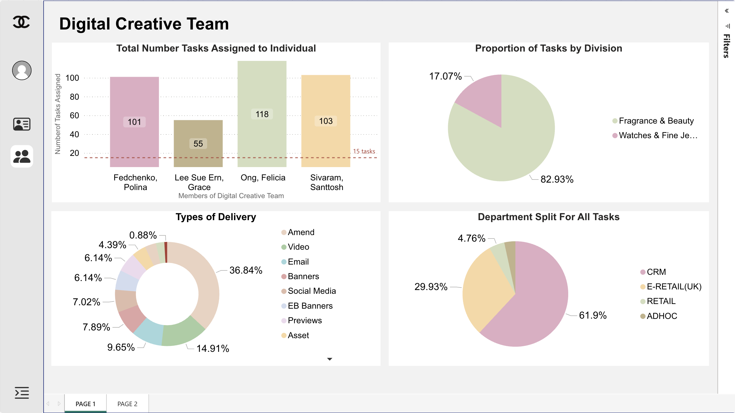
- Key features:
Key reports have been organized across Page 1 and Page 2, accessible via the bar near the bottom of the dashboard. Users can seamlessly switch between pages to analyze the reports. Additionally, elements within each report have been enlarged and optimized for improved clarity. Users also have the ability to enlarge reports by selecting them for a more detailed view.
Conclusion
The platform’s design underwent multiple iterations to ensure alignment with the expectations of both the client and academic supervisors. This outcome was made possible through rigorous team-based evaluation, in-depth discussions, and further research into key principles of Human-Computer Interaction (HCI) design.