Sketching Designs
Initial Sketches
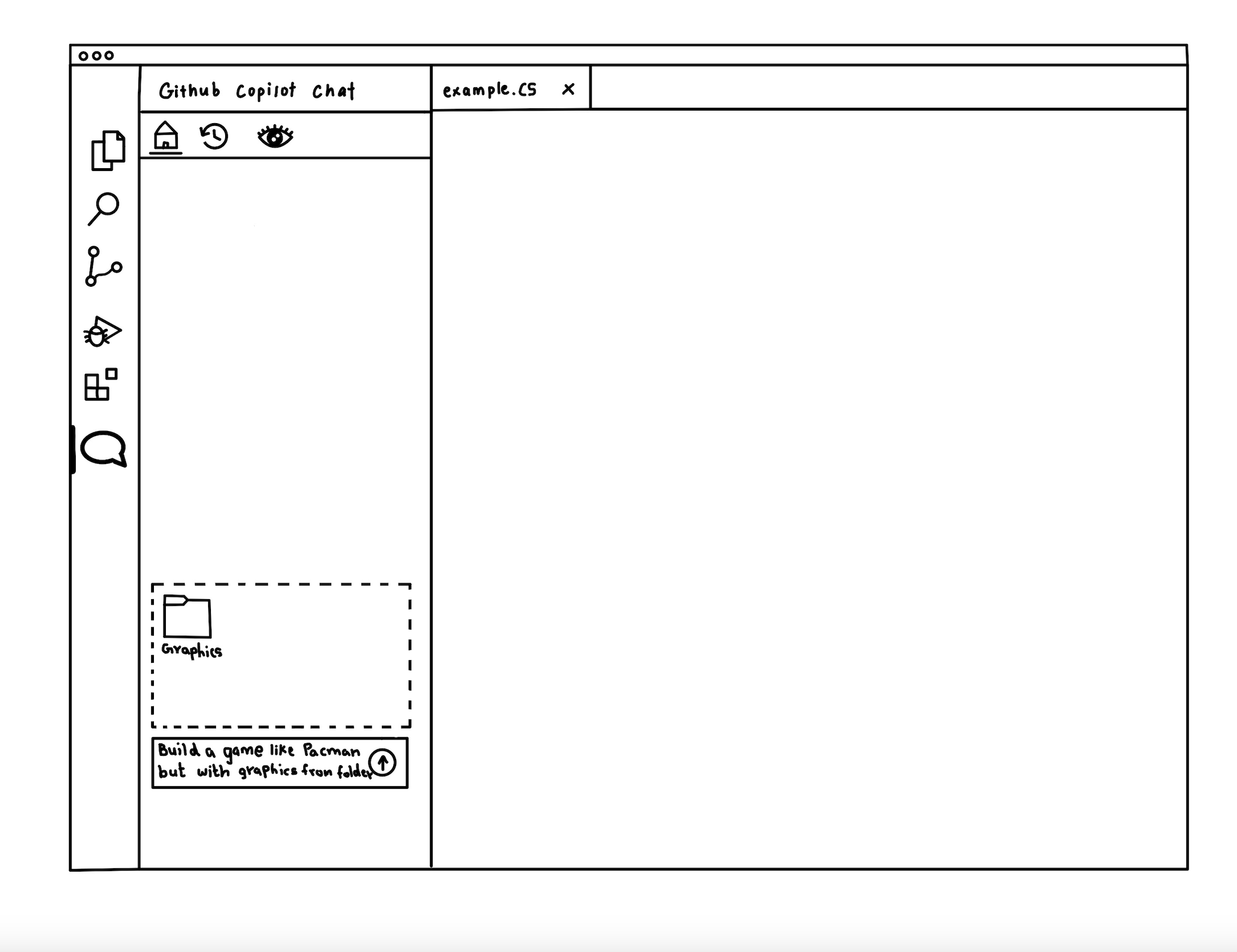
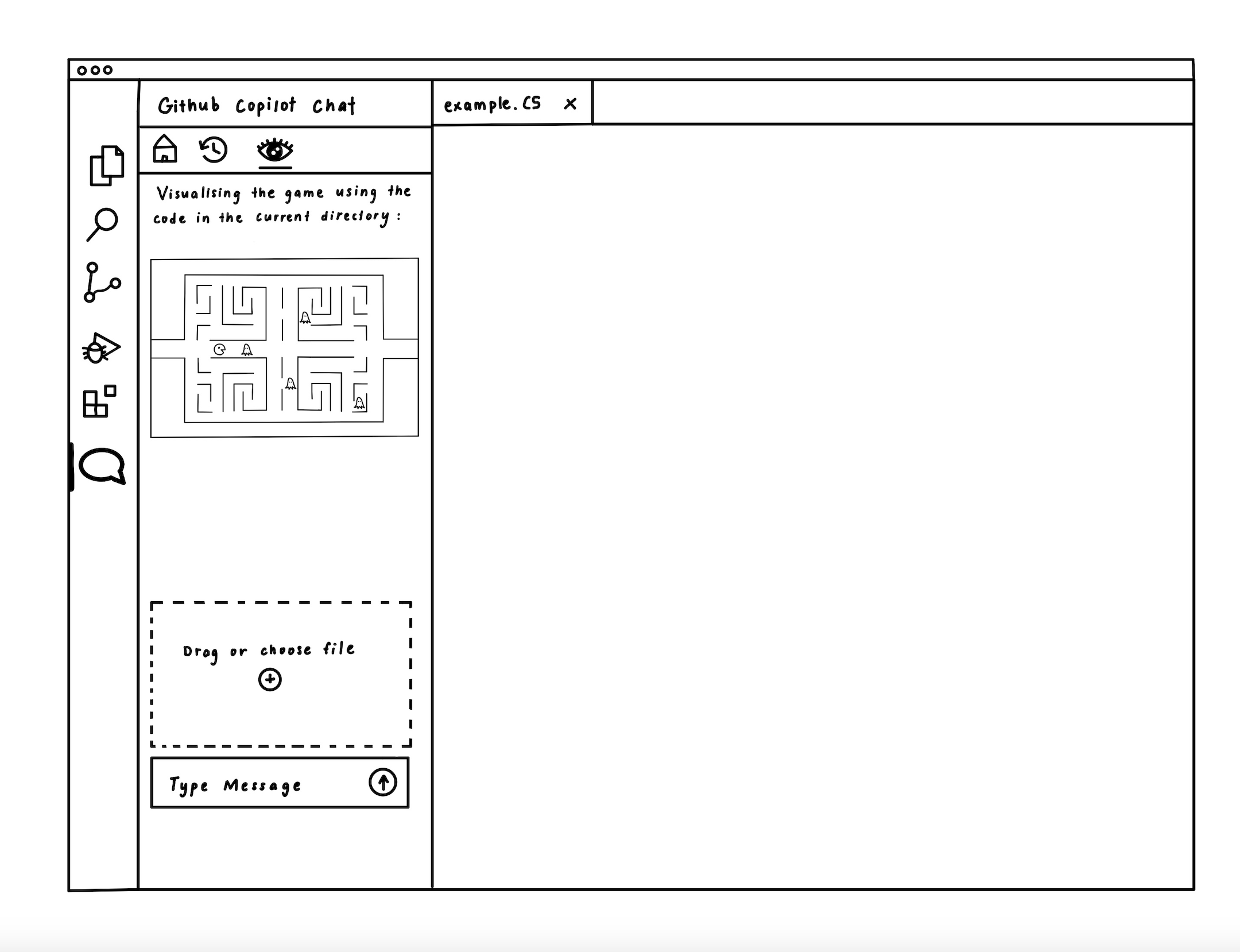
The initial sketches for the PixelPilot extension illustrate a user-friendly interface tailored for children learning game development. The first sketch shows the main view integrated within VSCode, featuring a live preview that visualizes the game based on code in the current directory. This visual feedback helps bridge the gap between code and outcome, making the development process more intuitive. A drag-and-drop file area allows users to upload assets, while a message box supports natural language prompts—creating a conversational and accessible experience.
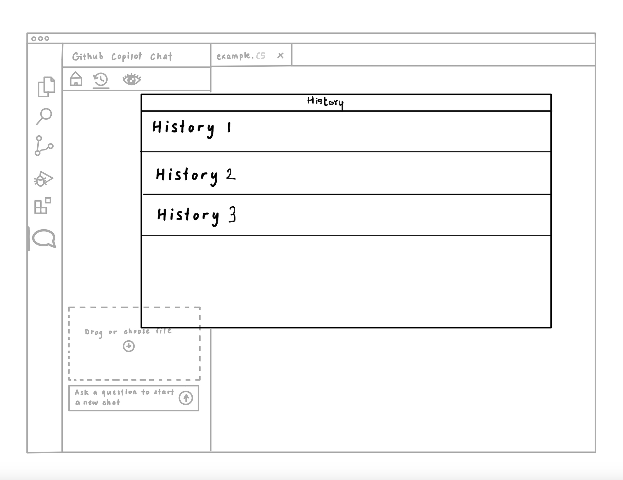
The second sketch introduces a chat history feature, allowing users to revisit previous sessions through a dropdown menu. This encourages iterative learning by helping children reflect on earlier attempts, restore previous versions, or track progress over time.
The third sketch focuses on asset-driven customization. Users can upload a folder of graphics and prompt the extension to build a game using those assets, such as "Build a game like Pacman but with graphics from the folder." This supports creativity and ownership, allowing young users to personalize their games with ease.
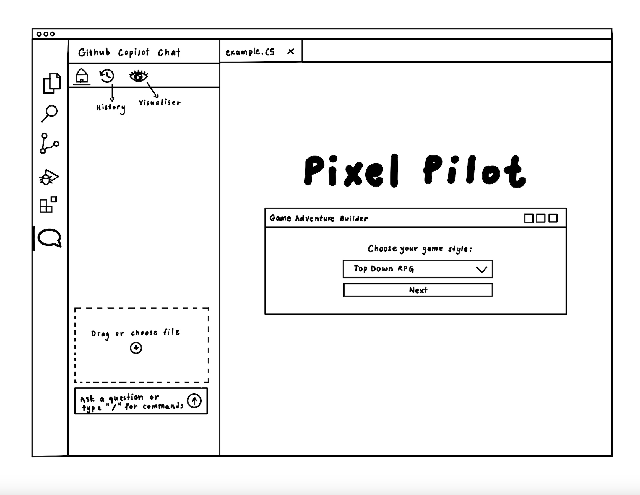
2nd Sketches
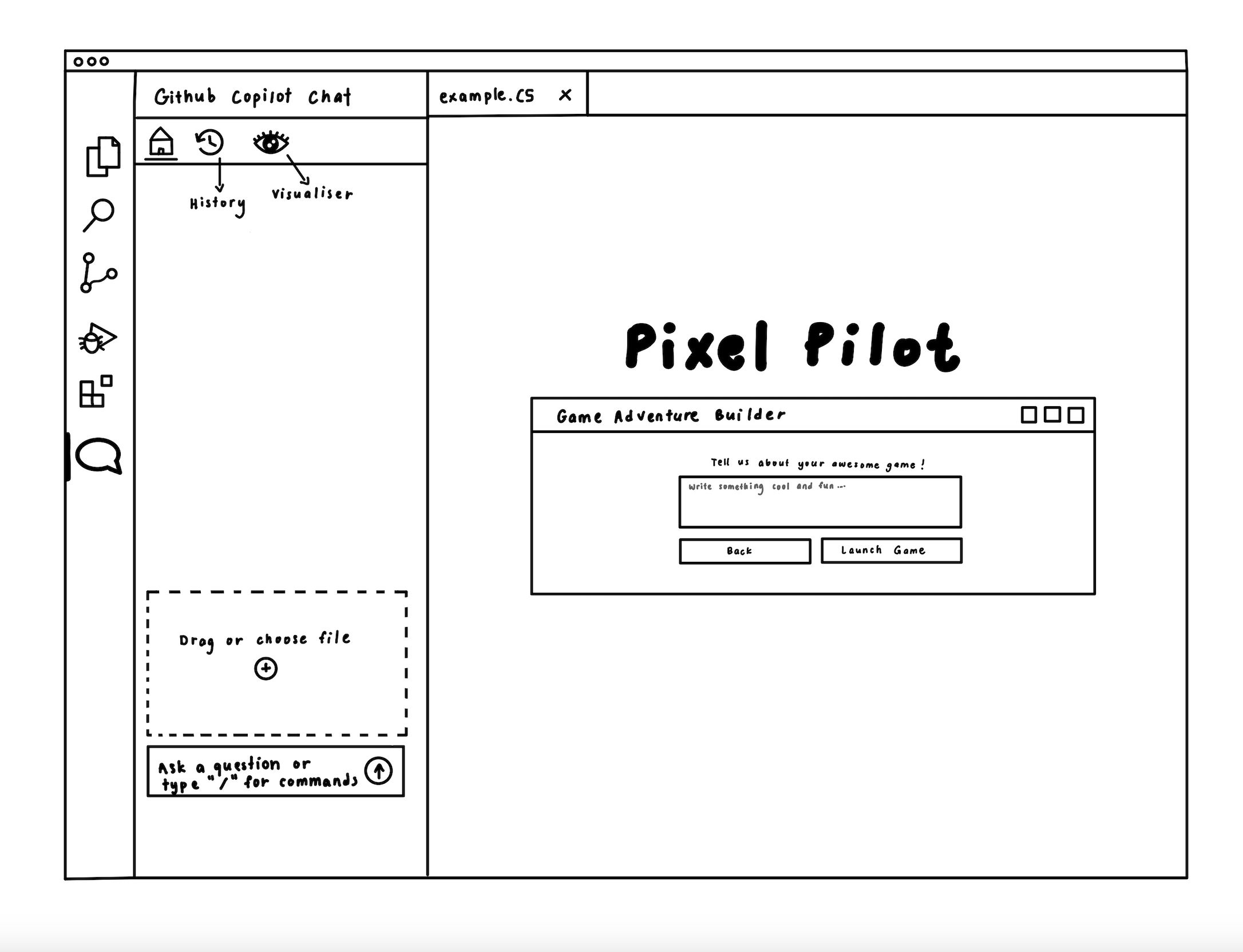
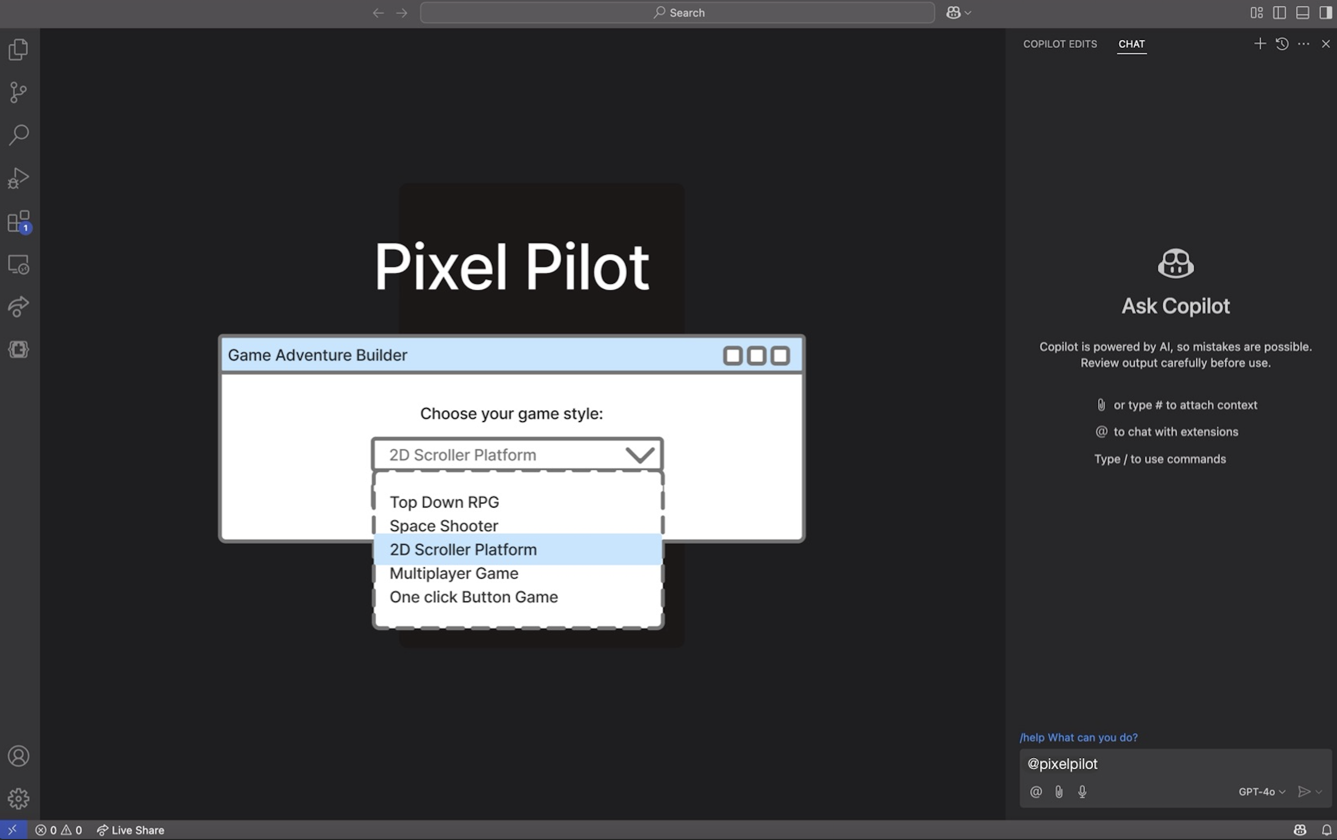
The updated sketches introduce a more guided and user-friendly approach to game creation within the PixelPilot extension. The first sketch features a Game Adventure Builder panel where users can select a game style (e.g., "Top Down RPG") from a dropdown menu. This structured flow makes it easier for children to begin their projects without feeling overwhelmed.
The familiar VSCode sidebar remains, including the History, Visualizer, drag-and-drop area, and prompt input, maintaining consistency with earlier designs. This layout supports both freeform interaction and a more directed experience.
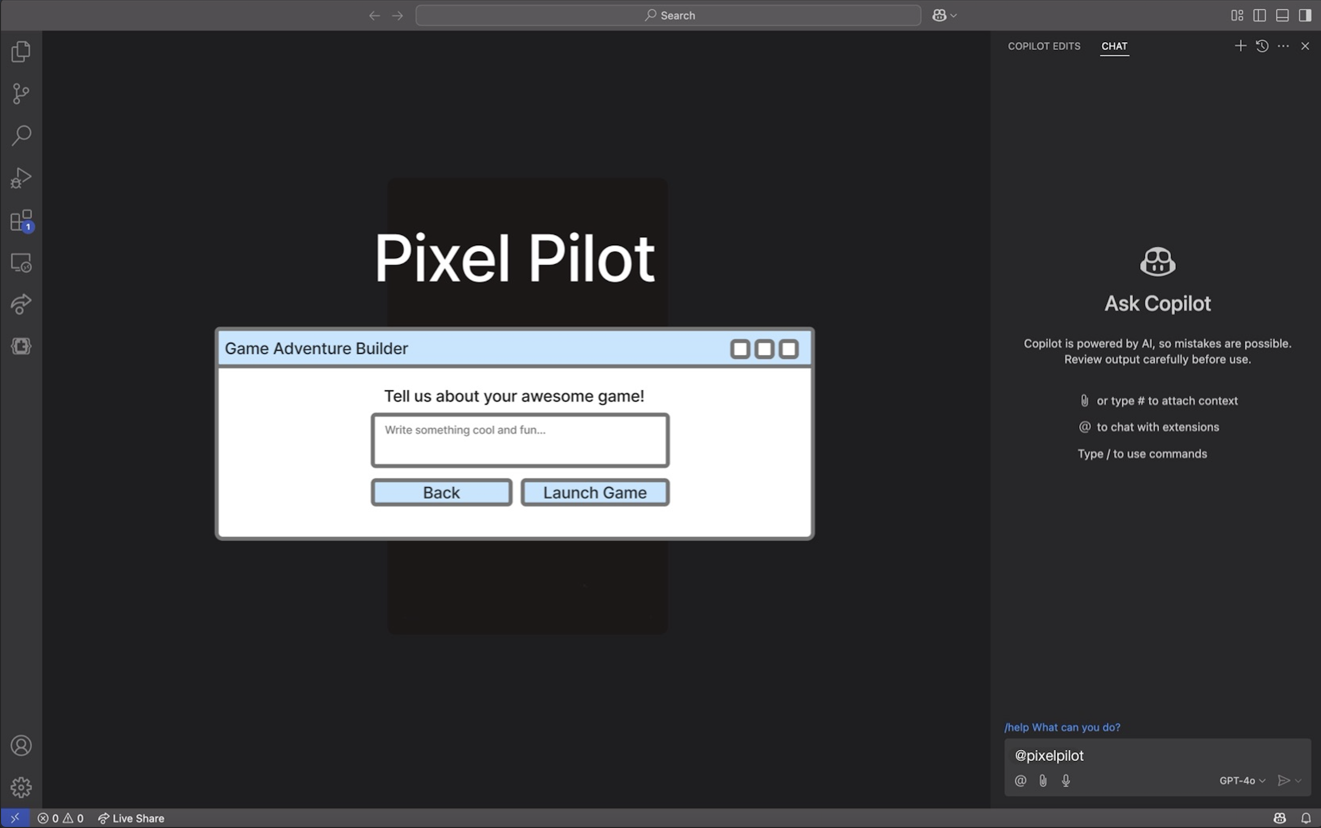
In the second sketch, the builder progresses to a prompt asking the user to describe their game. With buttons for “Back” and “Launch Game,” it suggests a simple step-by-step flow that encourages creativity while ensuring ease of use. These improvements help lower the learning curve, making game development more accessible and engaging for young users.
Prototypes
The prototype was then created using the user's requirements and the sketches. This prototype was created with the intention of further investigating our product's usefulness during the early stages of design. Pressing the 'Next' button after selecting an option from the drop-down menu is the first step for the user. The user can enter a prompt about the game they want to make on the final page.
Final Design
The final user interface differs significantly from the first drawings and prototypes created during the project's first several weeks. Our design evolved gradually as we worked on the project and considered the elements we wanted to include with the customer.

NEXT_LEVEL.EXE
Ready to Explore Our System Design?
Discover the technical architecture behind Pixel Pilot's retro-inspired game development environment.