UI Design
Design Principles
Design principles in User Interface (UI) design provide guidelines for creating interfaces that are clear, consistent, and intuitive for users. While there are many frameworks and heuristics, the overarching goal is to ensure the interface helps people accomplish their tasks with minimal friction.
The main ones that we considered are:
- Simplicity: The interface should be easy to use, with minimal clutter and distractions. Essential tasks and elements should stand out. The main tasks that the user will perform are scrolling through the logs, filtering, creating filter groups, and interacting with the LLM chatbot. To make these stand out, we highlighted the buttons corresponding to these tasks in bold colours, with text and icons to ensure there is no confusion in their purpose.
- Consistency: Elements across the UI should behave and appear in a predictable, standardized way. We ensured this by keeping the font the same across the webpage, and only using bootstrap styling, which prevents different buttons having different styles. The uniform layout makes sure that there is a shallow learning curve in using the log viewer.
- Visibility: Important controls, information, and feedback should be easily seen and found by users. This should not be an issue with our log-viewer, as all the functionality is listed within 1 webpage, and so the user will find this easy to navigate.
- Feedback: The system should inform users about what is happening at every stage, from confirmations to progress indicators to error messages. This principle is used a lot regarding the user’s interaction with the LLM. While the bot is thinking, ellipses are used to indicate this process; the user is also given live updates about the direction in which the LLM is thinking and its complete thought process at the end.
- Tolerance: Designs should be flexible and forgiving of user errors, allowing users to correct mistakes without severe penalties or frustration. A specific examWple would be date-time filtering. If the user enters an invalid format date, the web-app simply shows no matching records, rather than showing error messages for small typos.
Sketches
Initial Sketch
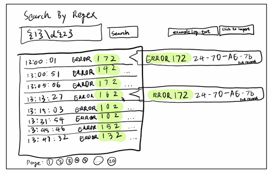
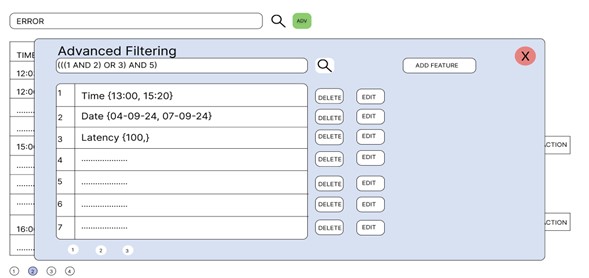
This was our first sketch of the web page UI. It consists of 2 main components - the search bar in which users can type substrings or regexes to be matched, and the “add filter” button. From the 3rd picture, it can be seen that the user can use set theory like notation to have complete control over how each filter is applied on the dataset.
Improved Sketch
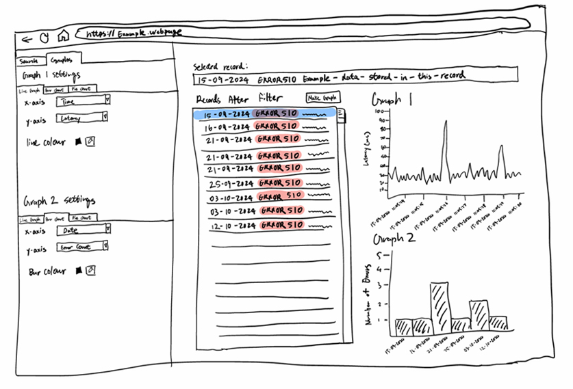
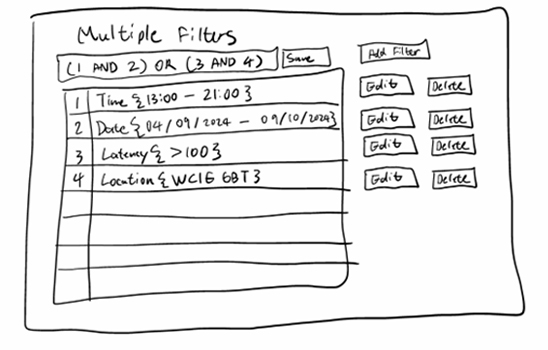
This sketch extends on the initial idea by splitting the dataset into 2 parts - one half has the complete dataset, and the other half has only the filtered records. Clicking on a record in the filtered section would take you to its position in the complete records. We also decided to add unique highlighting colours for each filter to help the user distinguish between them easily.
Prototypes
Initial Prototype
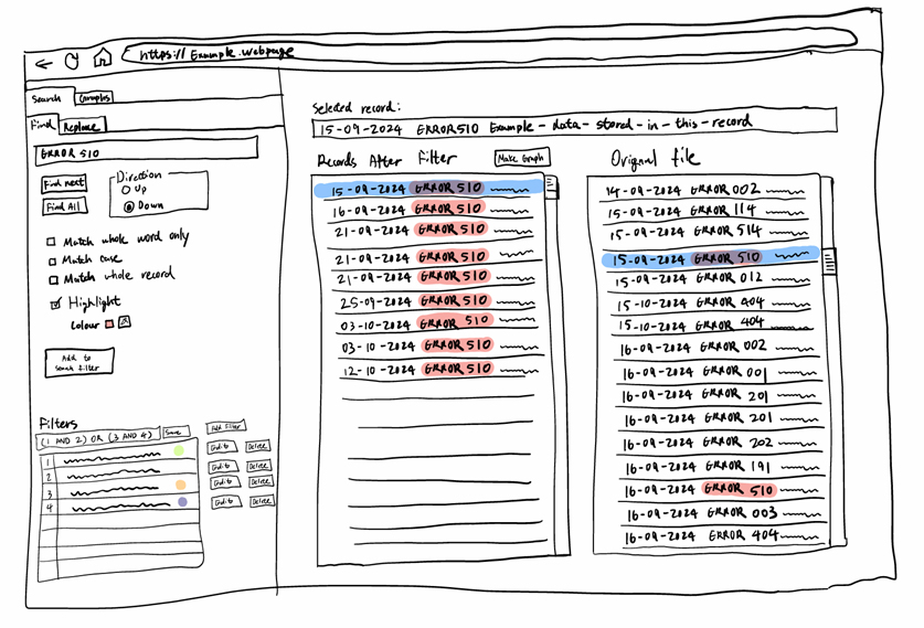
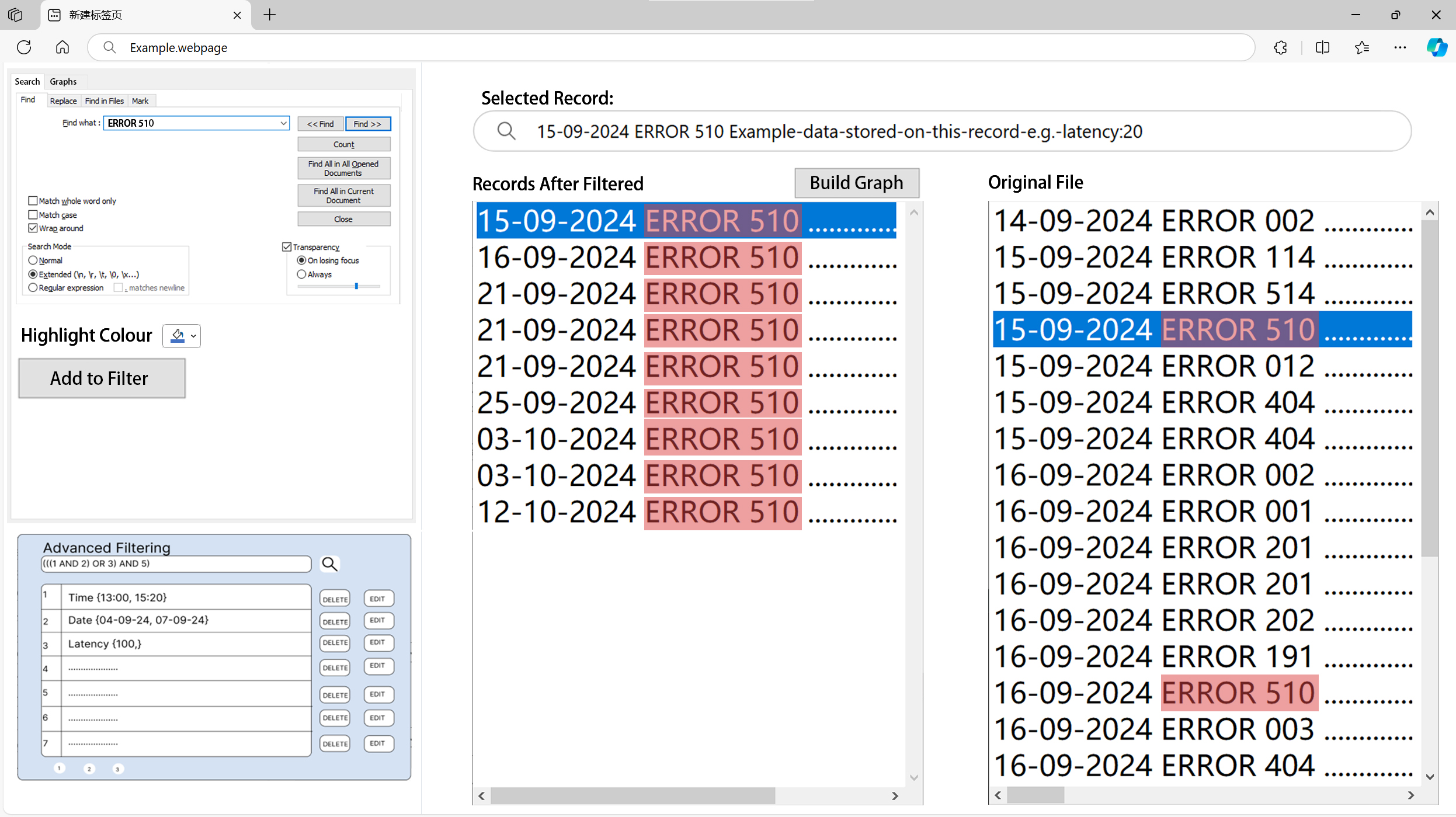
We fleshed out the sketches into more realistic website designs to present to our clients. For the first prototype we improved it by opening a modal box for advanced filtering instead of opening a new page for creating and applying filters. This provides a smoother experience as the user does not have to keep pressing the home button to view how the filters have affected the data.
Evaluation
Pros:
- Complex and selective filters can be applied through set theory.
- High level of customisabilty with user modifiable filters.
Improvements:
- Due to the high complexity of the advanced search tool, a guide/documentation should be provided on hover similar to the assistance provided by code editors.
Cons:
- Must learn Regex and basic set theory/logic to maximise value of platform.
- Queries may be slower due to complex JOIN operations that have to be performed for AND/OR clauses.
Improved Prototype
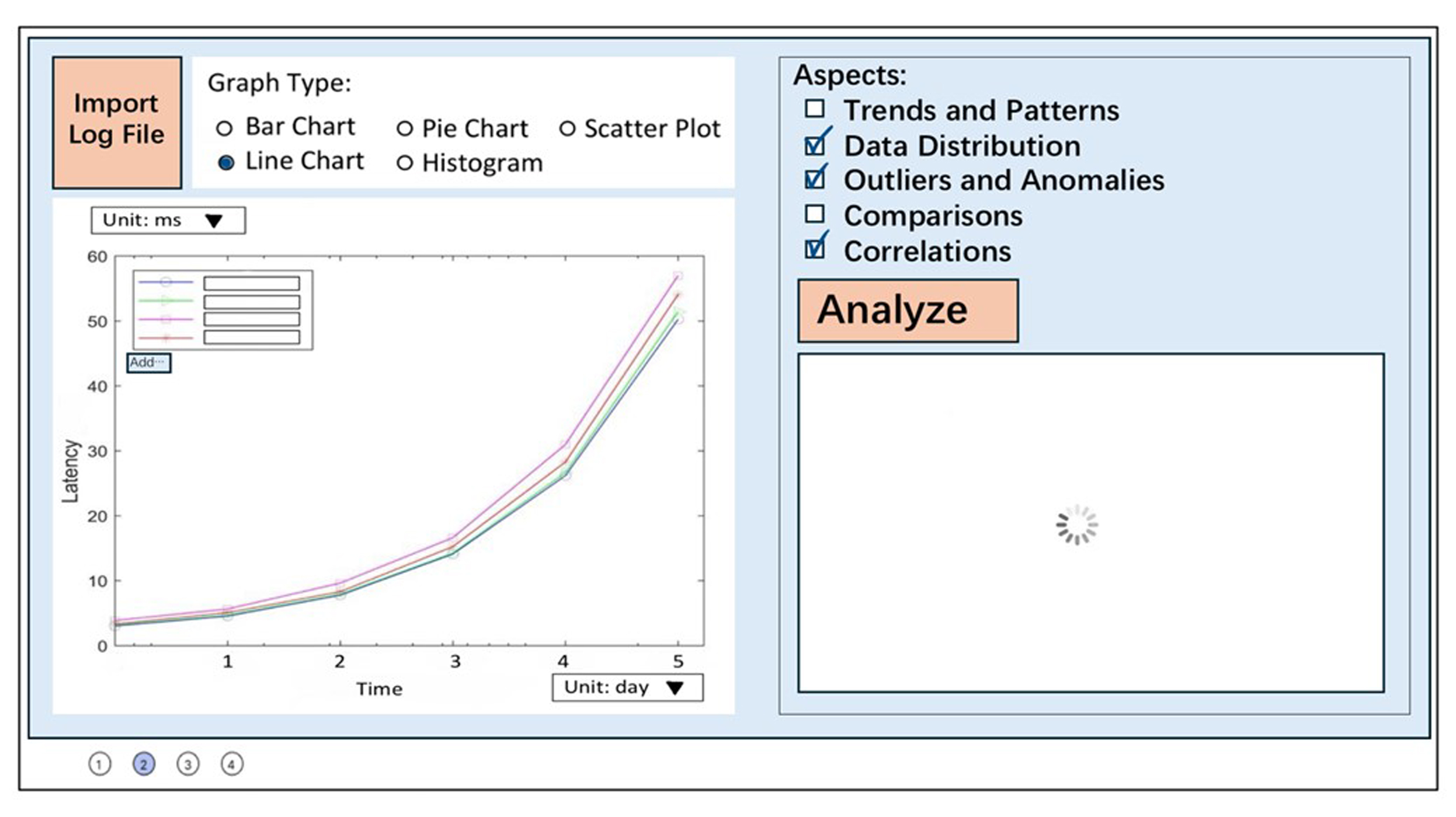
The second Figma prototype is largely similar to the sketch, but we improved the graph viewing page. We decided to embed a data analytics tool into the graph page, which would identify outliers, find trends and even do predictive analytics.
Evaluation
Pros:
- Simple and intuitive, does not require any technical knowledge.
- Have highly customisable features for the graph and analysis.
- Compact design can improve efficiency of workflow.
Improvements:
- Due to the high complexity of the advanced search tool, a guide/documentation should be provided on hover similar to the assistance provided by code editors.
Cons:
- Too much clutter on the page can overwhelm users.
- Graphing system is not fully customizable by the user due to fixed tickbox options.
- Provide more options and have search bars instead or implement an API such that the user can provide a script on precise graph configs.
Final UI
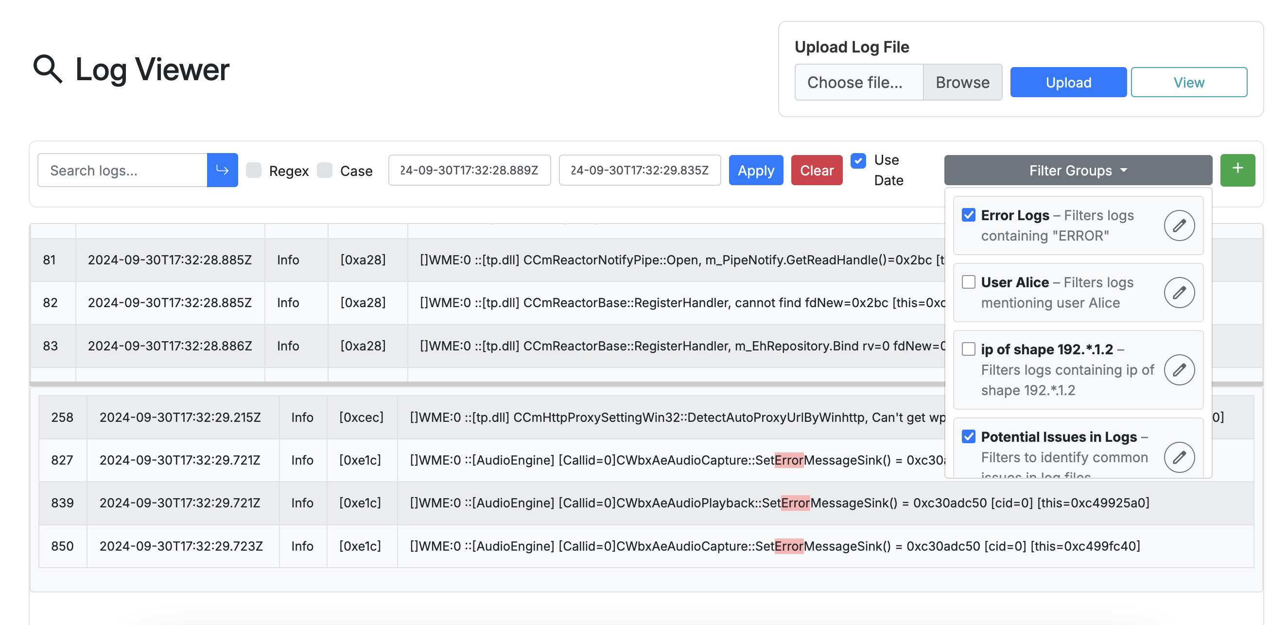
For the final UI we received weekly feedback, and were able to shape it exactly to their preference. Our clients liked the idea in prototype 2 where the dataset was split into 2 sections, with one half showing all the data, and the other showing only the filtered records. They also appreciated how each filter can have its own unique colour. We added to this by implementing a colour wheel that allows the user to choose precisely the colour they want for a specific filter. We also implemented a default colour scheme that generated an unused random colour for new filters.
Finally we added the concept of “Filter Groups.” A filter group allows the user to save a set of filters. Therefore, the user can easily reapply a combination of filters on the data instead of having to manually configure the same filters each time.
However, since they had already implemented data plotting and analysis in their existing tools, they did not need the graph dashboard. Finally, our clients mentioned that when filters are chained it should be done through the OR operator (Filter 1 OR Filter 2 OR Filter 3 etc). Due to this, we modified the prototypes to remove the set theory-like notation to simplify the design.
The final Log Viewer UI is clean, compact, and efficiently designed, making excellent use of space without feeling cluttered. The font is neat and readable, and log entries are displayed in a consistently aligned table for easy scanning. Interactive elements like Apply, Clear, and Upload buttons use strong, contrasting colors for intuitive use. Filter groups are neatly organized in a dropdown panel with checkboxes and editable icons, allowing quick toggling and customization.
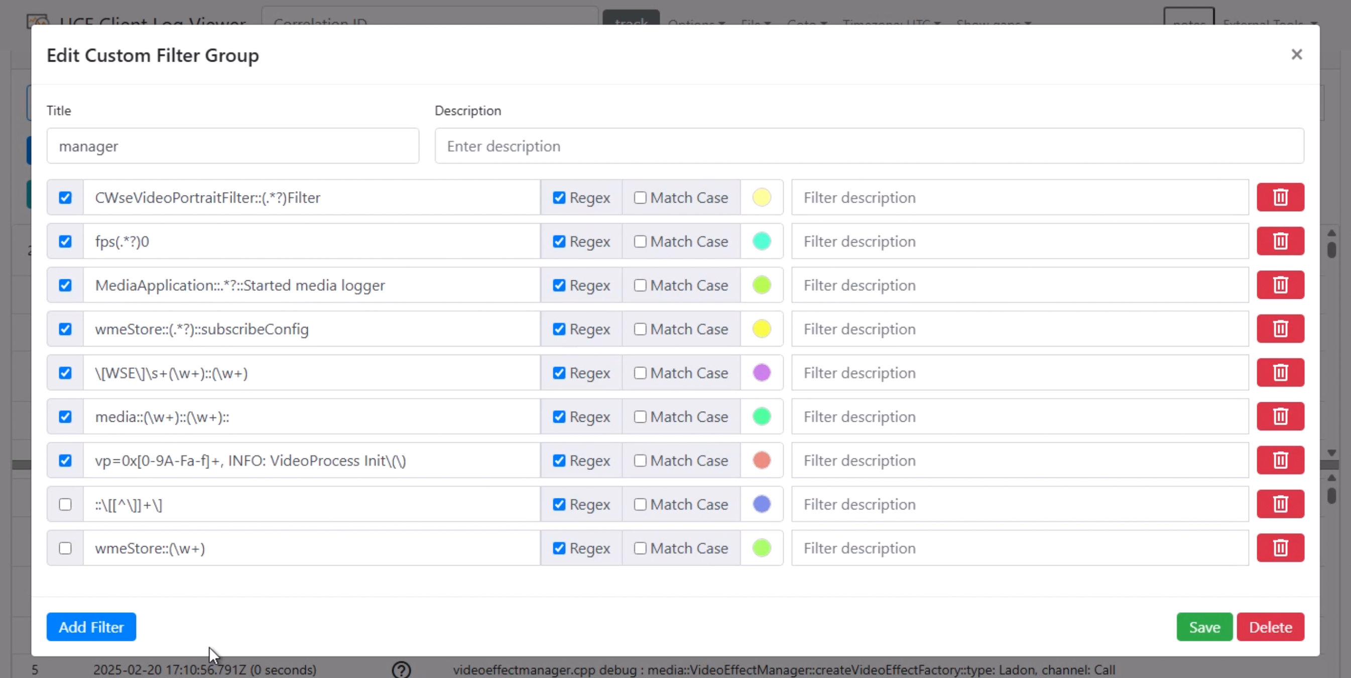
The Add / Edit Custom Filter Group window follows the same clean and efficient design language as the main interface. It features a scrollable layout that enables users to manage numerous filters within a single view, making smart use of space without overwhelming the screen. Color circles allow users to easily assign and customize colors for each filter entry, enhancing visual organization. Each filter includes intuitive controls such as activation checkboxes, along with Regex and Match Case toggles, offering quick and precise inline adjustments to filter behavior.
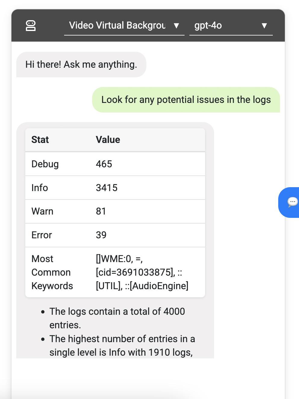
The AI summary assistant window adopts a conversational interface, designed to resemble modern AI chat applications, making interactions feel natural and engaging. The layout is streamlined, with clear separation between user input and AI responses using distinct background colors for easy tracking. The font and spacing are comfortable to follow, and the section uses minimalistic icons and dropdowns to maintain a polished, unobtrusive look.