HCI & UI Design
Users
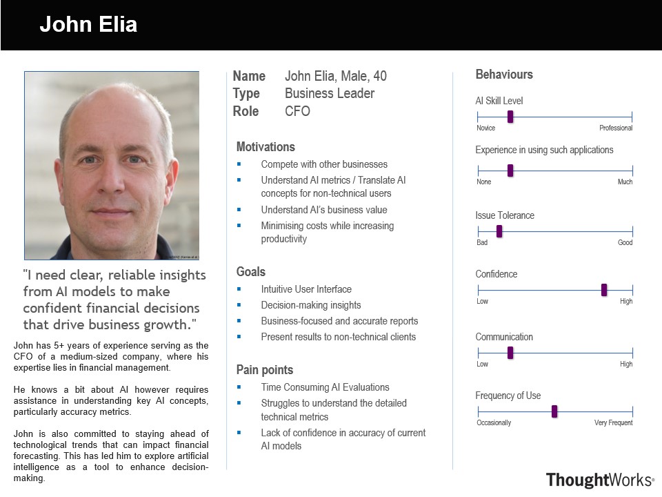
Persona 1
John is under pressure to prepare a quarterly report for an upcoming executive meeting. He needs to show how recent AI-driven insights have streamlined operations and influenced strategy. He opens Business Edge and sees a high-level summary of key metrics. The intuitive layout helps him quickly identify insights and export a simplified report highlighting AI's impact. This efficient data extraction saves time, allowing John to refine his presentation and confidently showcase AI’s contributions to strategic goals.
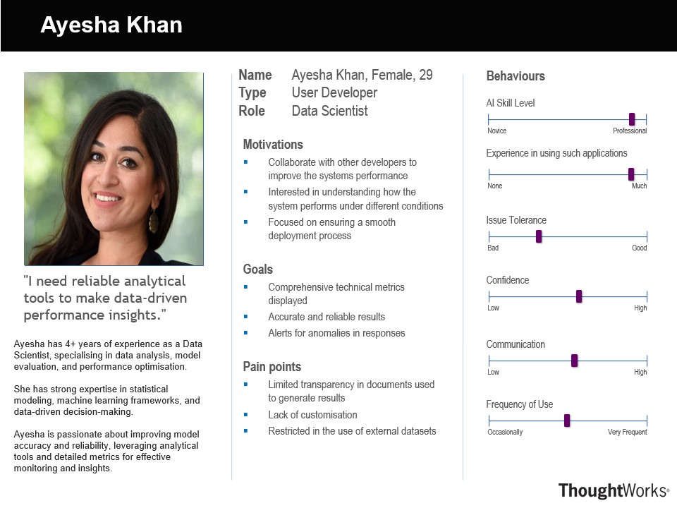
Persona 2
Ayesha, a Data Scientist, has received a request from the business team to analyse a large volume of documents for key insights. Tasked with streamlining the document analysis process, she opens Business Edge to leverage its advanced NLP capabilities. She uses the platform’s intelligent analysis and retrieval features to extract relevant information, identify patterns, and generate summaries. This efficient workflow enables Ayesha to quickly derive meaningful insights, empowering the business team with data-driven decisions.
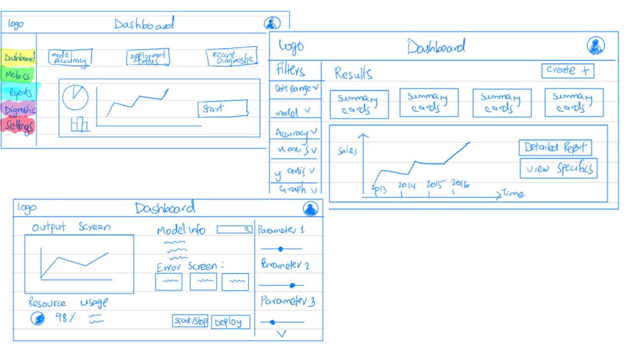
Initial Sketches
These design alternatives were sketched as a result of first iteration to explore different layouts and functionalities that cater to both business leaders and developers. Each view has unique features tailored to specific user needs, ensuring usability and adaptability for all stakeholders.
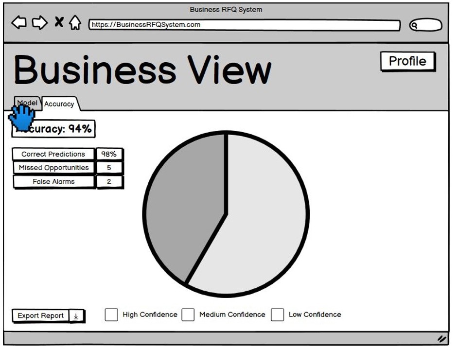
Initial Prototype
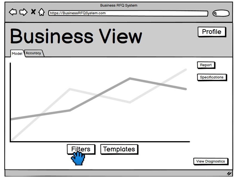
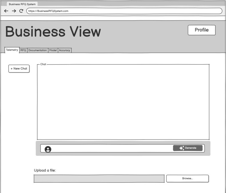
Here are the initial prototypes of our web application. We have designed a range of pages to cater to different user needs, including business leaders and developers. The prototypes are designed to be user-friendly and intuitive, with a focus on providing a seamless user experience.
Improved Sketches
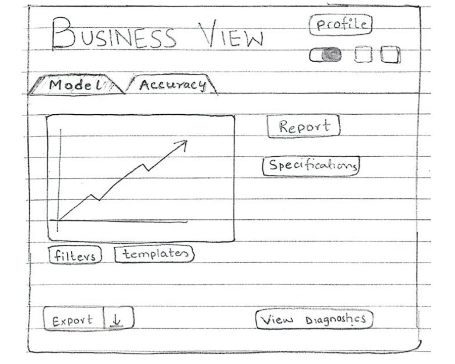
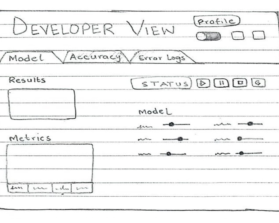
Based on user feedback, these refined sketches for both the Business View and Developer View prioritize intuitive navigation and functional clarity. Users expressed a preference for the updated designs, as they mirror familiar UI elements, making navigation straightforward and minimizing the learning curve
EVALUATION AND FEEDBACK FROM CLIENT/EXPERTS
We decided to carry out heuristic evaluation using 3 of Jakob Nielson’s Usability Heuristics as time and resources were limited.
| Heuristic |
Problem |
Solution |
Severity |
|---|---|---|---|
| Help and documentation |
Lack of help or support button |
Add a help button where user can find it when needed |
2 |
| User Control and Freedom |
Lack of an undo or back option if user makes an error |
Add a back or menu button |
3 |
| Aesthetic and minimal design |
The different metrics of the model should be more visible |
Replace the dropdown option of the metrics with a button bar |
1 |
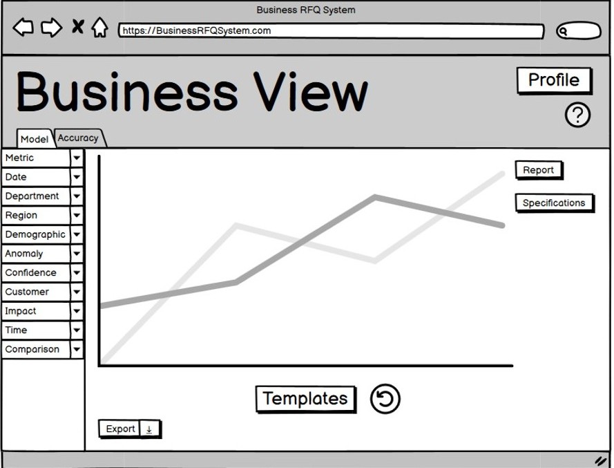
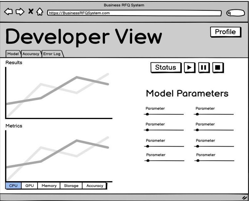
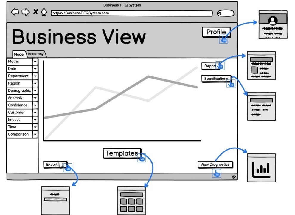
Improved Prototype
Based on the feedback we received, we refined our prototypes to create a layout that is more streamlined and logically organized. We enhanced usability by incorporating large buttons, intuitive icons, and brief tooltips, making it easier for users to quickly understand and identify each feature.