Sketches
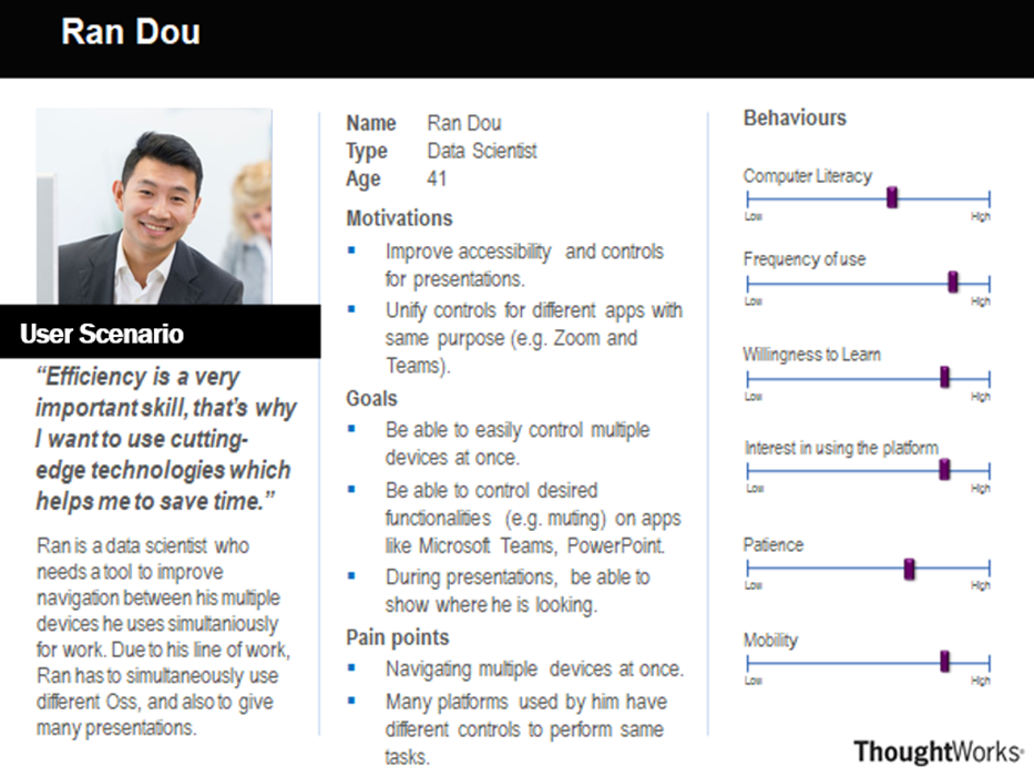
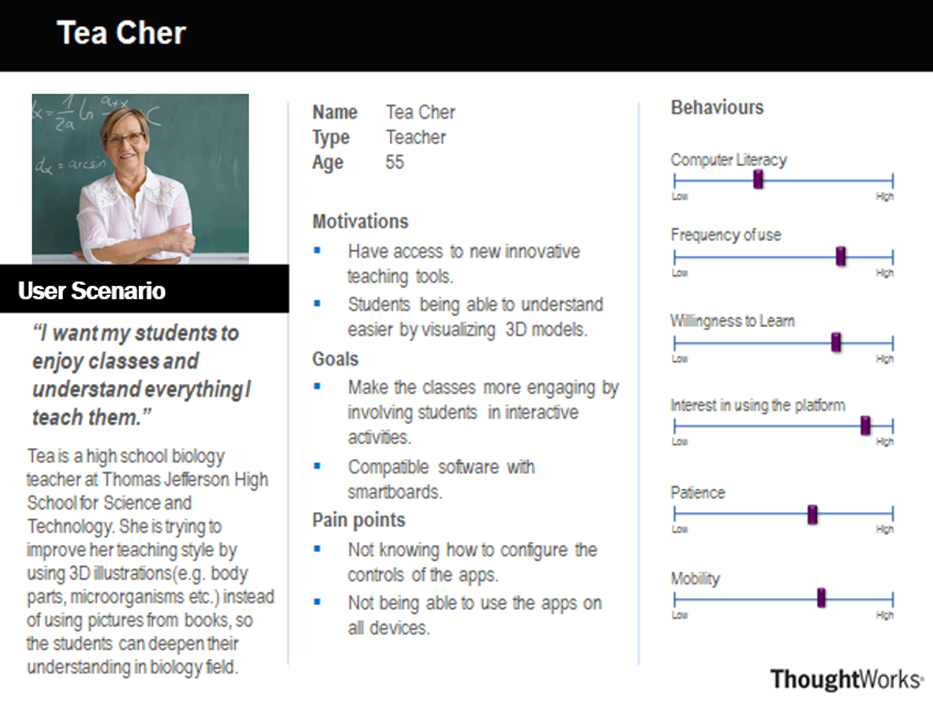
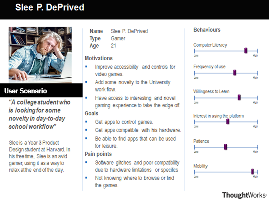
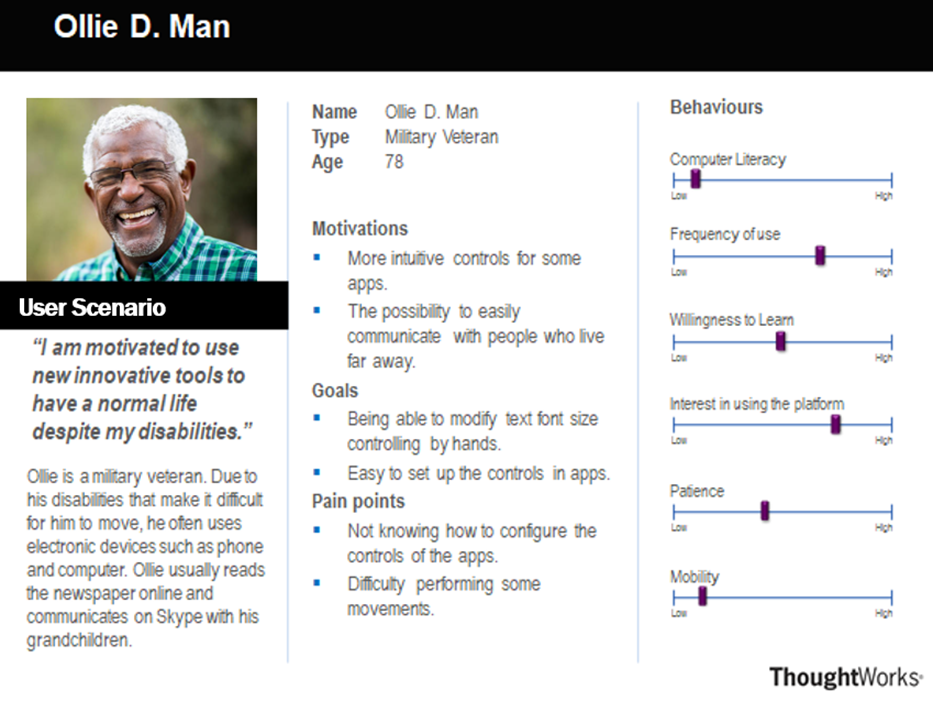
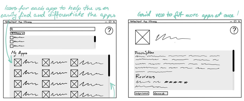
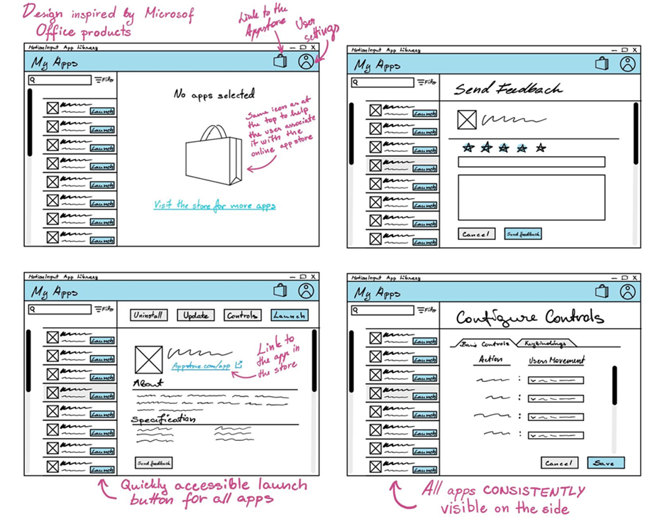
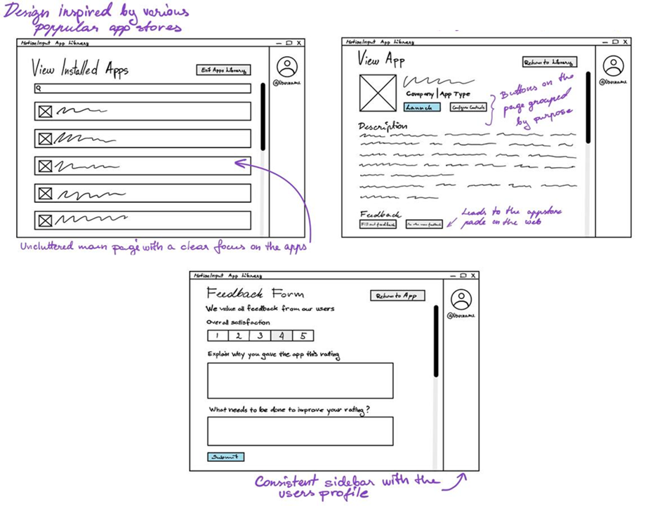
With the data collected from the user interviews for a proposed app-library for MotionInput, as well as looking at the considerations ascertained from our personas, we were ready to produce early design concepts in the form of sketches. We produced multiple sketches, allowing for different interpretations of the initial user requirements for the interface, and to showcase more design ideas, allowing us to choose and combine the best ideas before beginning the prototyping phase.
Sketch 1
Sketch 2
Sketch 3
Initial Prototype
The initial prototype was developed out of the design ideas illustrated from the earlier sketches. They served as an actual platform to exhibit and allow potential users to interact with our designs, so they can provide meaningful feedback now that they understand how we interpreted their user requirements. Similarly, it allows us to see the feasibility of our design choices, both allowing us to reflect and continue our development of the interface. The prototype was created using Mockflow, an online
Homepage
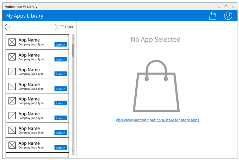
This is the default opening interface, showing a list of installed MotionInput apps on the sidebar
App sidebar and description
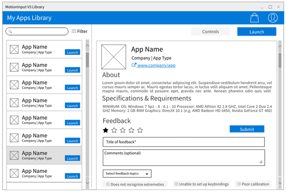
When an app from the sidebar is selected, its description page appears on the right, showing an 'about', 'specification and requirements', and 'feedback' section.
Configure controls tab
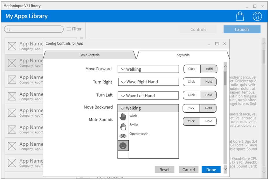
Pressing the 'controls' button on the app description interface will cause a popup window, where the user can see basic controls and will be able to select a MotionInput gesture corresponding to that action.
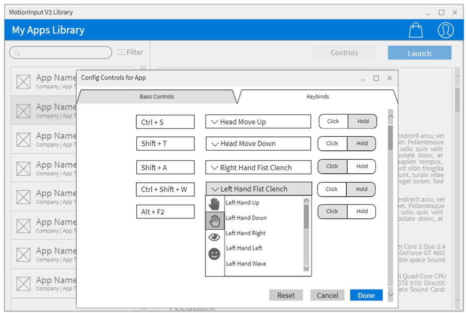
Similarly, they can also set-up specific keybinds. They can also choose the type of action performed using the keybind, if application. This can either be a single click or press, or a hold.
App sidebar and description

When an app from the sidebar is selected, its description page appears on the right, showing an 'about', 'specification and requirements', and 'feedback' section.
Heuristic Evaluation
We performed a heuristic evaluation of our prototype by inviting several evaluators to inspect our interface. During the evaluation sessions, members of the team were present as observers, recording the concerns expressed by the evaluators and guiding them through the interface. As a result, we gathered a list of usability issues along with the corresponding usability principles that the evaluators believed were violated. Subsequently, we assigned a severity to the issue, and provided a potential solution. These solutions/changes were used in the design considerations for the updated prototype.
| Issue No. | Description | Heuristic | Solution | Severity (0-4) |
|---|---|---|---|---|
| 1 | On the Library home screen, the link to the web app store is too cluttered and thus ignored by the users on the first glance. | Aesthetic and Minimalist Design | Remove the actual URL address and change text to “Visit store for more apps”. | 2 |
| 2 | There is no way to display the apps in a different order. | User Control and Freedom | Add a sort icon, which allows users to sort by different options such as recently opened (default) or alphabetically (app or company name). | 3 |
| 3 | Not immediately clear what the purpose of the store icon is on the blue bar, which is to send the user to the app store website. | Recognition Rather Than Recall | Add a tooltip to the store icon, which when hovered over, provides a description that the icon leads to the MotionInput app store website | 3 |
| 4 | There is no way for the user to read about the app and documentation such as frequently asked questions. | Help and Documentation | Add a "?" icon, which, when clicked, will display information about the app, frequently asked questions, and developer credits. | 2 |
| 5 | On the sidebar, the filter button gives the impression that it is the search button. | Recognition Rather Than Recall | Add a visible “Search” button after the search bar so in addition to pressing the “Enter” key the user could also start the search by clicking the button. | 2 |
| 6 | The "controls" button on each app's description page is misnamed. The actual functionality provided when the button is clicked is more akin to a settings function. Similarly, configuring settings is not as accessible as the button is only accessible after clicking on an app. | Flexibility and Efficiency of Use | Rename the "controls" button to settings to better represent its functionality, and add a grey cog icon for each app in the sidebar so that the apps settings can be accessed without clicking on the app in the sidebar. | 2 |
| 7 | On the app description page, the about section appears to be too long and thus making the whole page uninviting. | Aesthetic and Minimalist Design | As default only show a short section of the “About” description and add a “show more” toggle for the user to access the rest. | 1 |
| 8 | When the user is configuring basic controls/keybinds, the "click and hold" tabs may be confusing, as they do not immediately describe what that refers to, which is whether the control is supposed to be held or not. | Help and Documentation | Add a "?" icon which when hovered over, provides an explanation of the "click and hold" tab. | 2 |
Revised Prototype
After carrying out our heuristic evaluation and acquiring solutions to the highlighted issues, we iterated and reworked our prototype design. The numbers shown in text correspond to a design consideration from the identified issue in the heuristic evaluation table.
Homepage
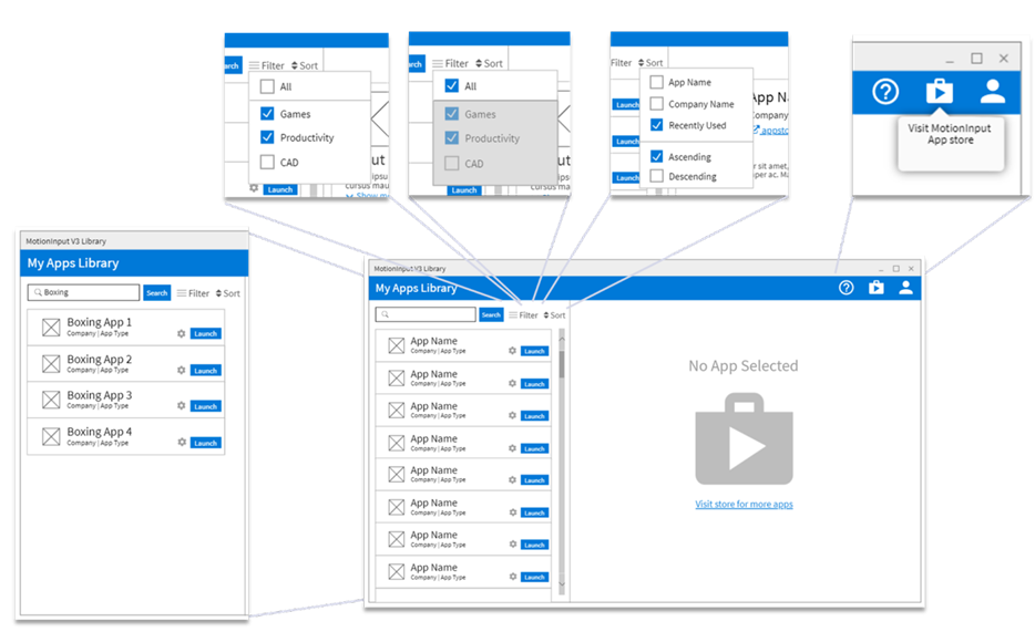
The general interface has been updated with updated icon styles, and an inclusion of a "?" icon (4). The hyperlink text under the large shopping bag icon has been simplified to read "Visit store for more apps" (1). On the sidebar, a cog icon has been added beside each "launch" button representing app settings. A sort icon has been added beside the filter icon, allowing the user to now choose how they want the list of appears to be ordered by. The design of the search bar has been charged to a square style, and a search button has been added (5). Hovering over the small store icon causes a tooltip to appear (3).
Help page and App description
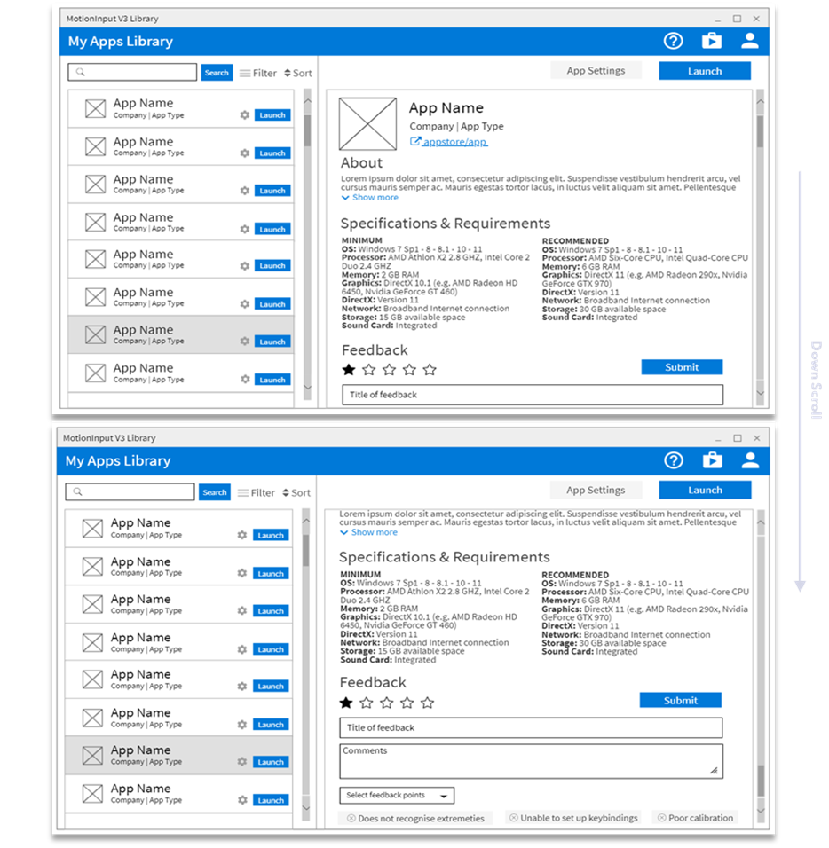
The app description interface has been updated so that the hyperlink beside the app icon directs the user to its app store page, and instead of displaying all of the text in the "About" section, a small part of it is shown with a "Show more" button. Likewise, the "Controls" button has been renamed to "App Settings" (6).
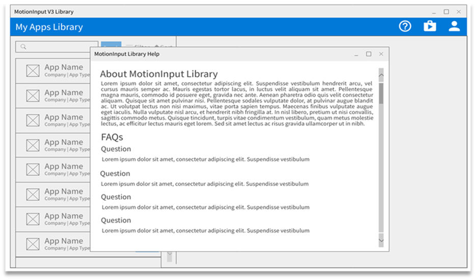
Pressing the "?" icon leads to a popup window, which displays an about section and FAQs for user information (4).
App Settings (Controls) Page
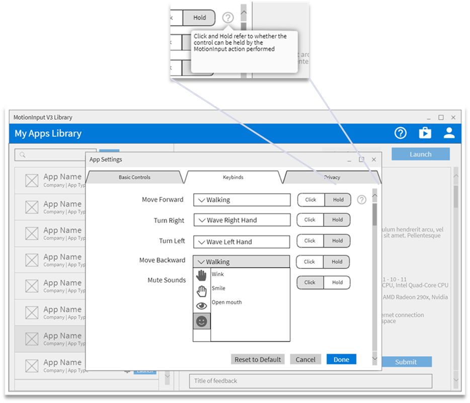
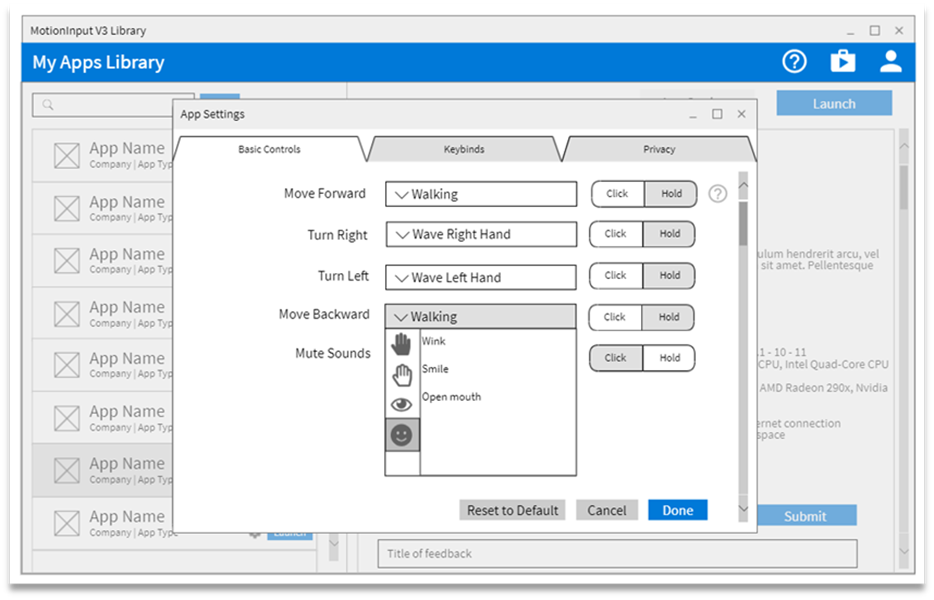
Pressing the "App Settings" button launches a popup window (previously Controls window) which contains tabs for basic controls, keybinds, and also privacy settings now. A "?" icon is added beside the first basic control/keybind, which when hovered over, will describe what the click and hold tab is meant for (8).


