Calibration is especially important for our solution to work well. Therefore, we have made careful decisions about how to display and clearly explain instructions for calibration to the user.
First sketch
We drew a rough sketch of how our very first solution would register points. Our algorithm has changed since our first solution and therefore the calibration window has had to change too, but we still kept the idea of the dots. The dots symbolise target points for the user to point, which can easily be interpreted. A simple message is displayed in the middle of the screen to guide people on what to do when these dots appear. The colours of the dots will change to let the user know the progress of calibration and the counter will increase.
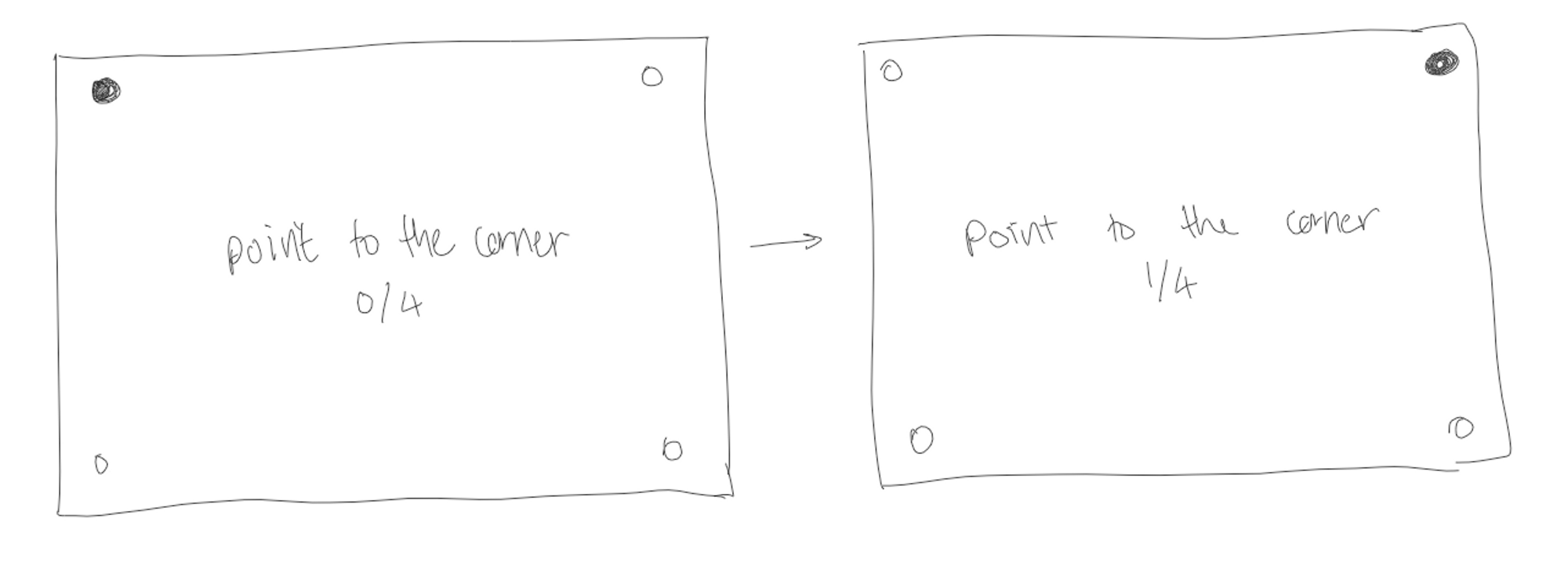
The very first Calibration Window
Based on our sketches. We use bold and contrasting colours and font to make the directions stand out. The target points which are inactive will be made smaller whilst the active target point will be made a different colour and bigger so the user knows which one to point to. Below is a screenshot of the very first calibration window we made.
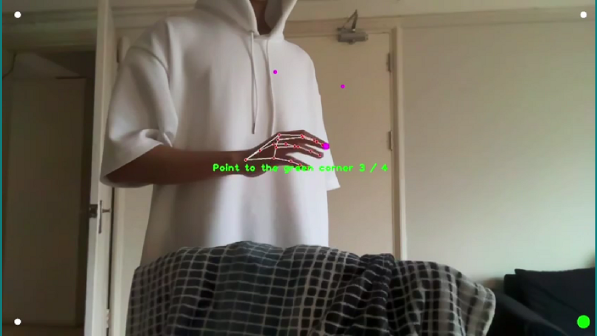
The New Algorithm and Calibration Window
Our new solution with machine learning called for a new calibration window. The new solution would require far more target points across the whole screen. Each of the targets will appear and blink and each time they do blink the radius of the targets will decrease to let the user know how much time there is until the target point will disappear and a new target point appears. This gives them more time to prepare since the points can appear and disappear quite quickly to reduce the time it takes to calibrate. However, not too fast that it is difficult to move to the target within the time frame. Below is a screenshot of the new calibration window we made.
Removing distractions and confusion
Evaluation
User Acceptance testing unveiled problems with calibration. With feedback from our simulated testers as well as observing their actions and where they struggled the most we evaluated our calibration window.
Severity Ratings
We used the following severity ratings to evaluate the problems we found, and using these ratings we conducted a heuristic evaluation of our calibration window:
- I don't agree that this is a usability problem at all
- Cosmetic problem: need not be fixed unless extra time is available
- Minor usability problem: fixing this should be given low priority/li>
- Major usability problem: important to fix, so should be given high priority
- Usability catastrophe: imperative to fix before the product can be released
| Heuristic | Problem | Severity | Solution |
|---|---|---|---|
| Error prevention |
The user does not know where to point and they get confused by the background |
4 | Change the background to plain black. |
| Flexibility and efficiency of use | There is no way to exit the window and restart if the user make a mistake or if they want to leave calibration. | 3 | The user can exit the calibration window by pressing the 'ESC' key. |
| Accessibility | People struggle to see the dots because there is poor contrast between the background and the colour of the dots. | 3 | Change the background to plain black. |
Detailed Analysis
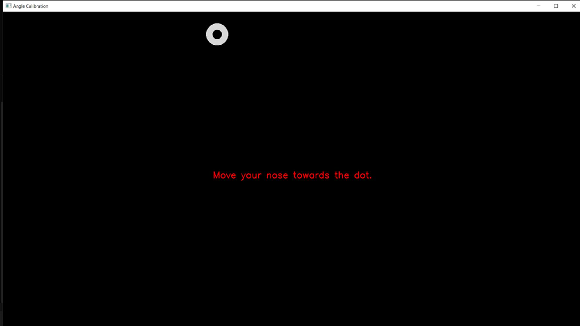
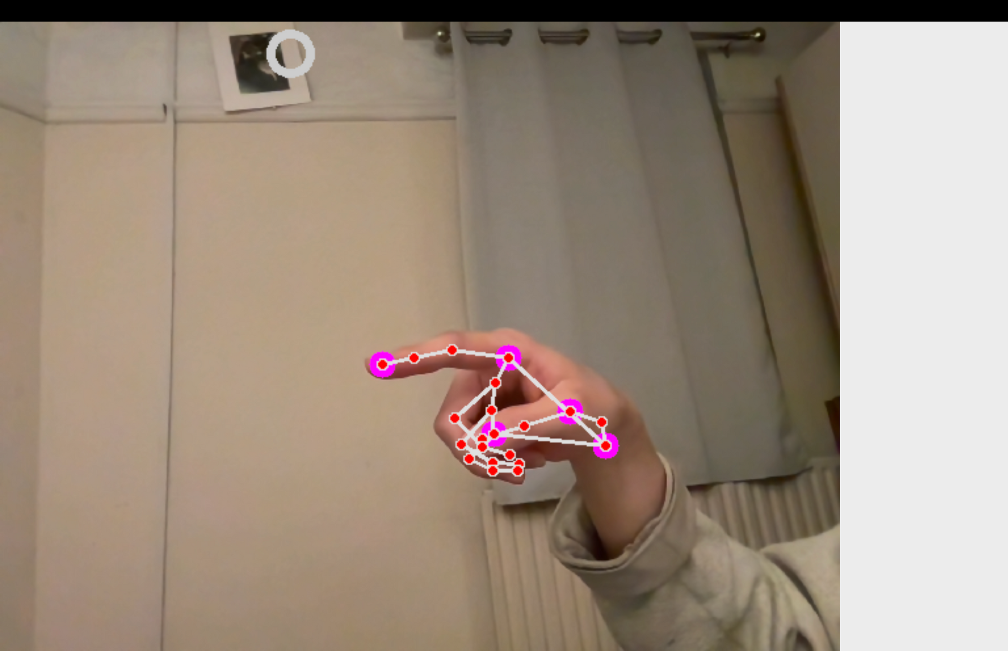
This new calibration window worked for the majority of the time however, can be confusing and distracting when the camera stream is also being displayed in the background. With some user acceptance testing, we discovered people will find it difficult to differentiate between if they are following the dots on their screen or if the hand on the camera is following the dots. This is a problem we face especially because the camera is at an angle from the user which the user shouldn’t have to remember or take note of when calibrating. Instead, we made the background blank so the user will be looking at their reflection on the screen and seeing themselves following the dots. It also offers a greater contrast between the colours of the dots and the background.
On the other hand, we do have some problems still. The user won’t know if they are in the camera and if they are positioned well so the camera is picking up their face or hand. To solve this, we display the camera stream at the beginning and allow the user time to adjust their position to ensure they are in the frame. And, if anytime during calibration they move out of frame, they are prompted to move back into the frame.
Finally, the window was made to adjust to the size of the screen. We want the user to register the points that will span across the whole screen, therefore, this will encourage the user to move the hand or face across the whole rather than just a small proportion of the screen.
More specific directions are given, depending on which mode we calibrate. For hand mode, the message will say ‘Move your hand towards the dot’. The revised calibration window is shown below.