With the rapid digitalization of our world, it is becoming more and more important to carefully design applications to make them as user-friendly and accessible as possible.
Our product specifically focuses on making mapping technology more accessible, which is why it was crucial to adhere to established accessibility protocols, namely WCAG 2.2 [1], and also the mainstream Nielsen's 10 Usability Heuristics for User Interface Design [2]. On top of that, we also continuously discussed our design decisions with our partners who work in the digital accessibility industry (GDI Hub, Soundscape, ERI).
The most relevant design principles and their implementation are briefly described below.
The widget should be accessible and have customizable functionalities to suit people with a variety of disabilities.
The widget should always keep users informed about what is going on through appropriate feedback within a reasonable time. Users should never feel lost or confused on where they are going, additionally they shouldn't be misled by outdated information.
The widget should be in multiple languages, with vocabulary familiar to the user. This reduces the learning curve and makes the app more intuitive.
Users often perform actions by mistake and scroll far away from the current location on the widget. We must allow them to undo these actions, giving users confidence to explore the app without fear of irreversible mistakes.
Users should not have to wonder whether different words, situations, or actions mean the same thing. This reduces confusion and improves learnability.
Good design prevents problems from occurring in the first place. Either eliminate error-prone conditions or check for them and present users with a confirmation option before they commit to the action.
Minimize user memory load by making elements, actions, and options visible. Users shouldn't have to remember information from one part of the interface to another.
The design has to be flexible and efficient, and there should be shortcuts ofr experienced users to use the system more efficiently.
A simple minimalistic design keeps the interface clean and focused on the task at hand.
Error messages should be expressed in plain language, precisely indicate the problem, and constructively suggest a solution.
Provide help and documentation to assist users in completing tasks.
We began by sketching our initial ideas based on user requirements, accessibility needs, and design considerations. Using an iterative approach, we refined our sketches to improve usability, ensuring a clear and intuitive experience.
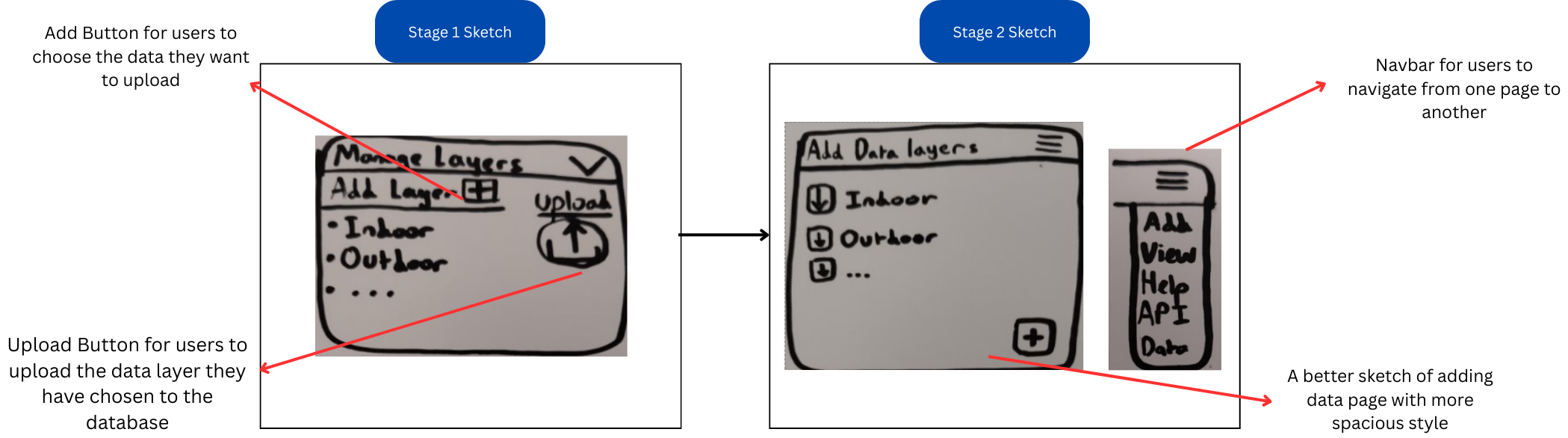
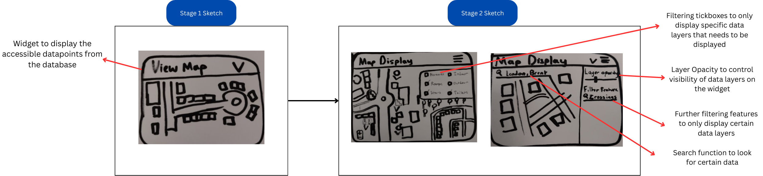
The first prototype was designed based on Sketch 1 to bring our initial ideas into a structured and interactive format. Using Figma, we created a digital prototype to refine the user interface, layout, and functionalities before moving into development. The purpose of this prototype was to provide a visual representation of the database website and the widget while testing and validating user interactions and workflow efficiency. It helped ensure that the accessibility features were intuitive and user-friendly while identifying potential usability issues before implementation.
The first prototype was designed based on Sketch 1 and hence lacked a lot of functionalities. Based on the first prototype, we decided to give an evaluation to further enhance the features and UI of the prototype.
| Heuristic | Problem | Solution | Severity |
|---|---|---|---|
| Choice Maximization | Only a few types of databases available that users can download | Create various types of databases and not only classify them into outdoor and indoor | 2 |
| Ease of Access | No user manual present, no search function for widget | Create a "How to use" section in the menu bar for website, and add search bar to find data points for widget | 2 |
| Accessibility | The widget will not be accessible for people who are visually impaired | Create a speech interface in the widget that can search for locations | 3 |
| Enhanced User Engagement | Users cannot add or contribute their own data they want to | Create a page that allows users to add data into the database | 3 |
| Clarity and Context of Data | Users do not get information about geolocation points on the widget | Create a segment to give information about the geolocation point | 1 |
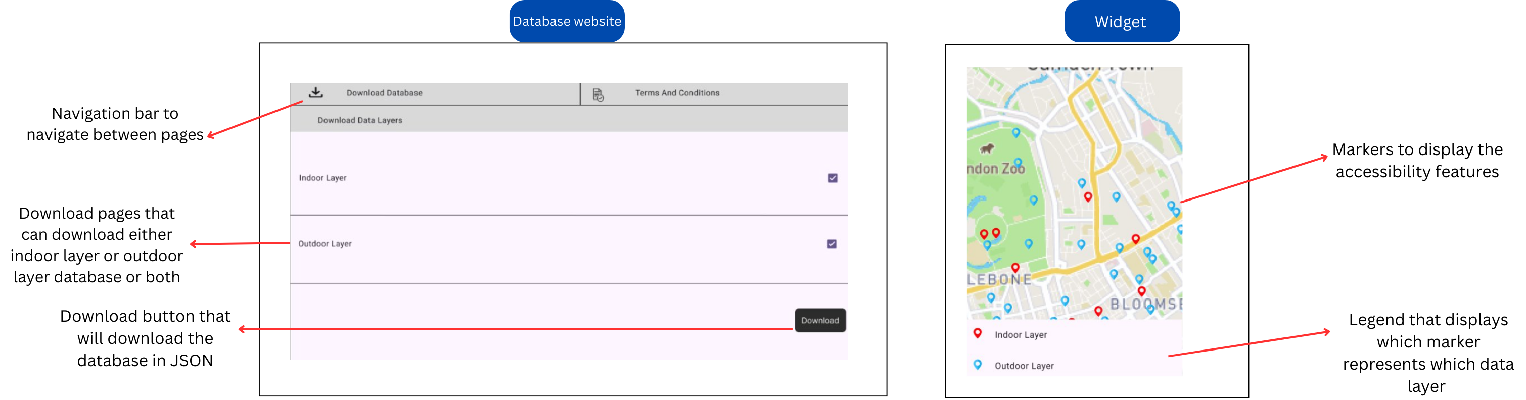
Based on sketch 2 and evaluation of prototype 1, we created a second prototype that solves the issues of prototype 1.
The second prototype was further evaluated to note down the functions to keep and improvements to be made, which are going to be implemented in the development phase.
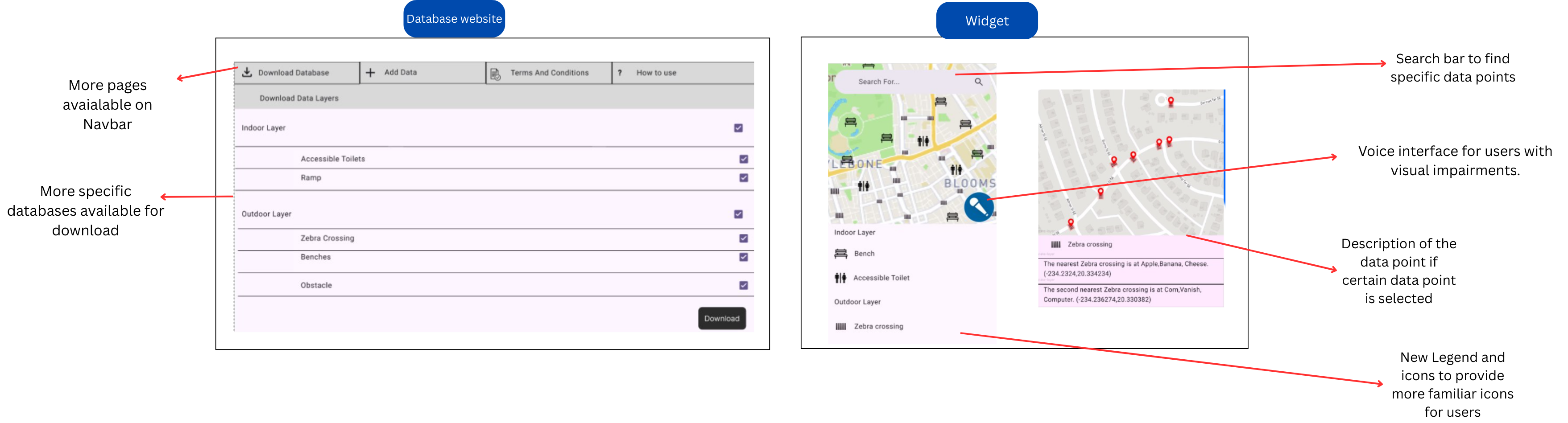
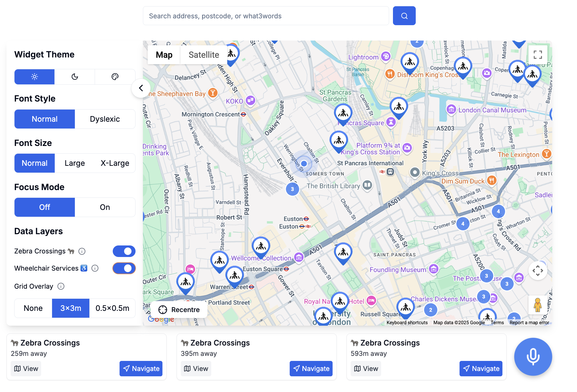
The final UI implemented the evaluation made on prototype 2 with much better styling and functionalities. The final UI for both widget and database website is very different from the prototypes as some of the requirements have changed during the development phase.
[1] "Web Content Accessibility Guidelines (WCAG) 2.2," W3C, Sep. 2023. [Online]. Available: https://www.w3.org/TR/WCAG22/
[2] J. Nielsen, "10 Usability Heuristics for User Interface Design," Nielsen Norman Group, Apr. 1994. [Online]. Available: https://www.nngroup.com/articles/ten-usability-heuristics/