| ID | Requirements | Priority | State | Contributors |
|---|---|---|---|---|
| R1 | Database with accessibility-focused data layers (at least wheelchair services and zebra crossings), with support for multiple resolutions (0.5mx0.5m, 3mx3m). | Must | ✓ | Levon |
| R2 | API functionality to receive coordinates, object type and reliability flags of data points and load them into the database. | Must | ✓ | Levon |
| R3 | A widget where selected data layer geolocation points are represented on a Google-maps like background with markers. The widget must be easily integratable into websites. | Must | ✓ | Lenart, Levon, Amir |
| R4 | Add what3words grid overlay and colour the cells the datapoint cover to depict spatial information. | Must | ✓ | Lenart |
| R5 | Functionality that locates the user and locates the closest points, ordered by Manhattan distance. | Must | ✓ | Lenart, Amir |
| R6 | Dark and yellow mode to improve accessibility. | Must | ✓ | Lenart |
| NR1 | Efficient handling of data retrieval and storage for fast real time API requests. | Must | ✓ | Levon |
| NR2 | Clear documentation for API and widget integration. | Must | ✓ | All |
| R7 | A visual webpage representation of the database where data can be downloaded and uploaded in a JSON format. | Should | ✓ | Junwoo |
| R8 | Data points in widget should have icons for better user experience. | Should | ✓ | Lenart, Amir |
| R9 | Widget should have dynamic options that the developer can specify. | Should | ✓ | Levon, Amir |
| R10 | Link to navigate to any datapoint via Google Maps. | Should | ✓ | Lenart |
| R11 | Widget should have text-to-speech and speech-to-text functionality for hands-free navigation. | Should | ✓ | Lenart, Levon |
| NR3 | Clear documentation for uploading / downloading data on the database website. | Should | ✓ | Junwoo |
| R12 | Users of widget can report additional accessibility features of data points through a form. | Could | ✓ | Lenart, Levon |
| R13 | Database website has an intuitive UI with icons and drag-and-drop functionality. | Could | ✓ | Junwoo, Amir |
| R14 | Data layers such as traffic lights and an obstacle layer (tables in front of cafes, bollards) are added. | Could | ✖ | - |
| NR4 | Telemetry data for API monitoring performance and usage. | Could | ✖ | - |
| NR5 | Scalable system for easy addition of more data layers. | Could | ✓ | All |
| NR6 | Mobile support for the widget. | Could | ✖ | - |
| R15 | We will not develop our own navigation technology. | Won't | ✓ | - |
| NR7 | The database will not allow any other format than the specified one to be received (like photos). | Won't | ✓ | - |
| Key functionalities | 100% Completed | |||
| Optional Functionalities | 50% Completed | |||
Throughout the course of the project our focus slightly shifted from these stated initial requirements. After talking with members of the visually impaired community, our partners, and representatives of charities, we shifted our focus to not only show accessible data, but to also make the widget as accessible and easy-to-use. That is why we added features such as focus mode, dyslexia font style, marker clustering and different font sizes.
| Work packages | Lenart | Levon | Junwoo | Amir |
|---|---|---|---|---|
| Project Partner Liaison | 30% | 30% | 30% | 30% |
| Requirements analysis | 25% | 25% | 25% | 25% |
| HCI | 15% | 15% | 35% | 35% |
| Research and experiments | 20% | 25% | 15% | 40% |
| UI Design | 45% | 20% | 15% | 20% |
| Backend | 10% | 90% | 0% | 0% |
| Frontend - Widget | 60% | 25% | 0% | 15% |
| Frontend - Database Website | 0% | 5% | 90% | 5% |
| Organizing User Testing | 30% | 30% | 30% | 10% |
| Testing | 30% | 35% | 20% | 15% |
| Report Website | 25% | 25% | 25% | 25% |
| Blog and Monthly Video | 10% | 10% | 10% | 70% |
| Overall contribution | 30% | 30% | 23% | 17% |
Note: We weighed some components of the table more important than others which is why the Overall Contribution percentages do not completely add up.
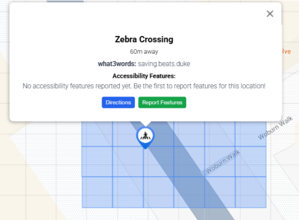
Figure 1: Grid Bug
Our end product was predominantly made with accessibility in
mind. This is why it was crucial that we tested regularly
with end-users while also consulting professionals in the
field of accessible technology. We also ensured we were
following the accessibility standard
WCAG 2.2.
We had weekly meetings with industry professionals (GDI Hub,
SoundScape, Esri UK) who had been developing with
accessibility in mind for years. We also got help from a
blind user at the beginning of the project to help us
establish requirements, and also had 2 testing sessions
(predominantly UI-focused), first with non-visually impaired
and then also with 8 visually impaired users. The visually
impaired users found the design clear and intuitive, and
especially found the focus mode and the dark theme very
useful. The general feedback was very good, as the users
found the high costumizability incredibly useful, while at
the same time not finding the design too cluttered due to
our "hide sidebar" feature. Even when asked to be very
critical, the testers gave our design an average score of
8.2 / 10. We also got great feedback on this front from our
partners who specifically complemented the clean and
familiar design, and user-friendly features such as marker
clustering.
With this in mind, we give our User Interface a score of
great.
We successfully implemented all functionality according to
our MoSCoW requirements. Our widget has touch-screen and
voice-activated functionality, while also having a variety
of customizable accessibility-friendly end-user tested
features that allow easy use (high-contrast dark theme,
yellow theme, focus mode, dyslexia-friendly font, marker
clustering, what3words support). The integration with
what3words also allows the users of the widget to quickly
talk about their location in case of an emergency. We also
have a community-run feature where users report additional
accessibility information, enriching our datasets.
Furthermore, the geolocation API automatically finds the
user's location, while the integration with GoogleMaps's API
allows for street view and navigation.
With this great variety of functions, we give ourselves the
score of great.
Throughout the development cycle, our team followed strict
testing conventions for the backend, ensuring the database
and the API were properly tested with Unit tests. We also
noticed no performance issues with larger amounts of data.
As the most important part of our product is a
frontend component, most of the testing was done by manual
user testing. This was conducted weekly by the team and
clients, and also three times by the end-users. All the bugs
we discovered in these sessions were addressed.
With this in mind, we are confident in our system's
stability and give ourselves a score of
very good.
The system is very efficient and works perfectly also on
less capable devices. We took care too call the GoogleMaps,
Azure Speech and what3words APIs only when necessary to
avoid any latency problems. We also ensured that only data
within 10 miles of the user is displayed on the widget,
ensuring fast load times. However, when deploying on Azure,
we had to settle for a cheaper plan to save cost, which
could be a problem if in the future the traffic to our API
becomes too large.
We give ourselves the score of very good.
Our widget can be easily integrated into any webpage as a
React component and adapts to fill the designated area on
websites that support React. Our database migration
functionality also allows for backward compatibility of the
system. However, note that the widget is more suited for
devices with the landscape view rather than portrait view.
We recognize this as quite a significant
shortcoming, as it allows users to plan their journey at
home on laptops, but only allows users with tablets to
actually use the widgets on the go. Furthermore, when
testing with different browsers, we realized that even
though the widget works perfectly on the most popular
browsers (Chrome, Safari), however, the text to speech does
not work on Firefox. Even though this is not our fault, but
the Azure Speech SDK - which is the UCL preferred web
service, it is still a shame.
Neither mobile support nor packaging the final product as an
npm package were in our Must-haves or Should-haves. However,
as the project developed, we realized that in order to have
a very usable product, we would have to package it up.
Unfortunately, due to numerous type errors when trying to
package the widget, we were unsuccessful. Because this was
our priority, we also did not manage to implement mobile
support. Because of this, we give ourselves only the score
of adequate.
We took great care to make the backend as scalable and
maintainable as possible. That is why we implemented
database migrations which would allow storage of even more
accessibility-related features for each datapoint in simple
way. We also developed a sophisticated API framework that
allows us to easily issue new API keys of different access
level. This ensures maintainability of the system when both
the number of users and features grows. The backend adheres
to good coding practices and is well documented.
However, there is room for improvement, especially
in the widget code. Even though adding new data layer
functionality is relatively simple, the code should have
been documented better and more effectively split up into
individual files for clarity.
We give ourselves the score of good.
The project was well-managed with regular updates and clear
communication between team members. We conducted weekly
half-hour meetings with our partners every week before our
lab sessions. This allowed us to get constant feedback
throughout the project, while also forcing us to have
something new to demo and show every week. The convenient
time of the meeting before our sessions also allowed us to
split the workload for the next week after getting feedback.
We had a developer groupchat where internal deadlines were
set and specifics were discussed. We also used GitHub's
issue tracking functionality for major changes.
While we did manage the project well, the whole process
could have been improved by also opening GitHub issues for
smaller additions for better clarity. We also did not
enforce internal deadlines harshly enough, which meant that
workflow was significantly more congested close to
deadlines.
That is why we give ourselves the score of
good.