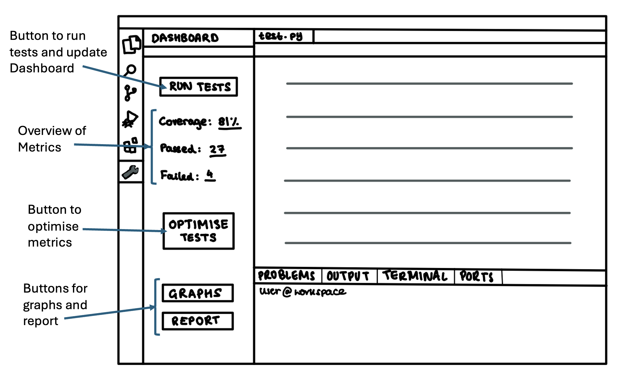
Design Principles
We first defined the following design principles to guide the creation of our user interface:
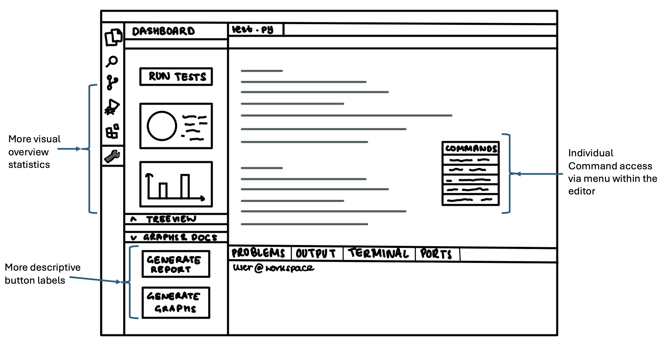
Simplicity and Clarity
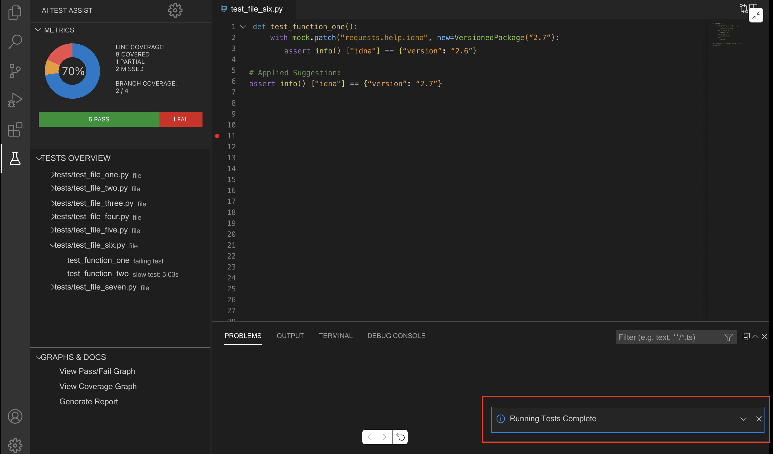
The interface should be intuitive and minimalistic with clear visual cues that do not confuse the user. For example, labels, icons, and tooltips should be used to provide unambiguous explanations. A clutter-free design ensures users can process information quickly without being overwhelmed, enhancing their overall user experience.
Feedback
The design should provide the user with feedback, including immediate responses to their actions and important messages—such as errors, confirmations, or system states—should be displayed clearly at the right time. This will ensure the user has a seamless experience and reduces any confusion.
Consistency
The UI should follow common design patterns so users can intuitively understand how to interact with it. Consistent placement of navigation elements, buttons, and actions ensures predictability and will help remove any potential confusion. Standard conventions, for example left-side navigation and top-right user settings, should be maintained where applicable.
Familiarity
Familiarity reduces the learning curve, and so our design should use terminology and conventions that are familiar to the user, and not those creating the system. Our extension should adhere to VS Code’s UX guidelines in order to follow the best practices for creating extensions that seamlessly integrate with VS Code's native interface and patterns. By employing familiar conventions, users can quickly understand and navigate the extension without needing extensive onboarding. This ensures a smoother user experience, allowing them to focus on their tasks rather than learning a new interface.
Visibility, Readability and Accessibility
All features in our design should be easily accessible to users. Essential features, statuses, and options should be prominent and easily accessible, and users should not have to search for crucial actions. The UI should be designed with sufficient contrast to ensure readability for all users, including those with visual impairments. Text should also be readable across different screen sizes, with reasonable font colour and style choices. Colours in the UI should be chosen carefully to highlight essential elements without causing strain.
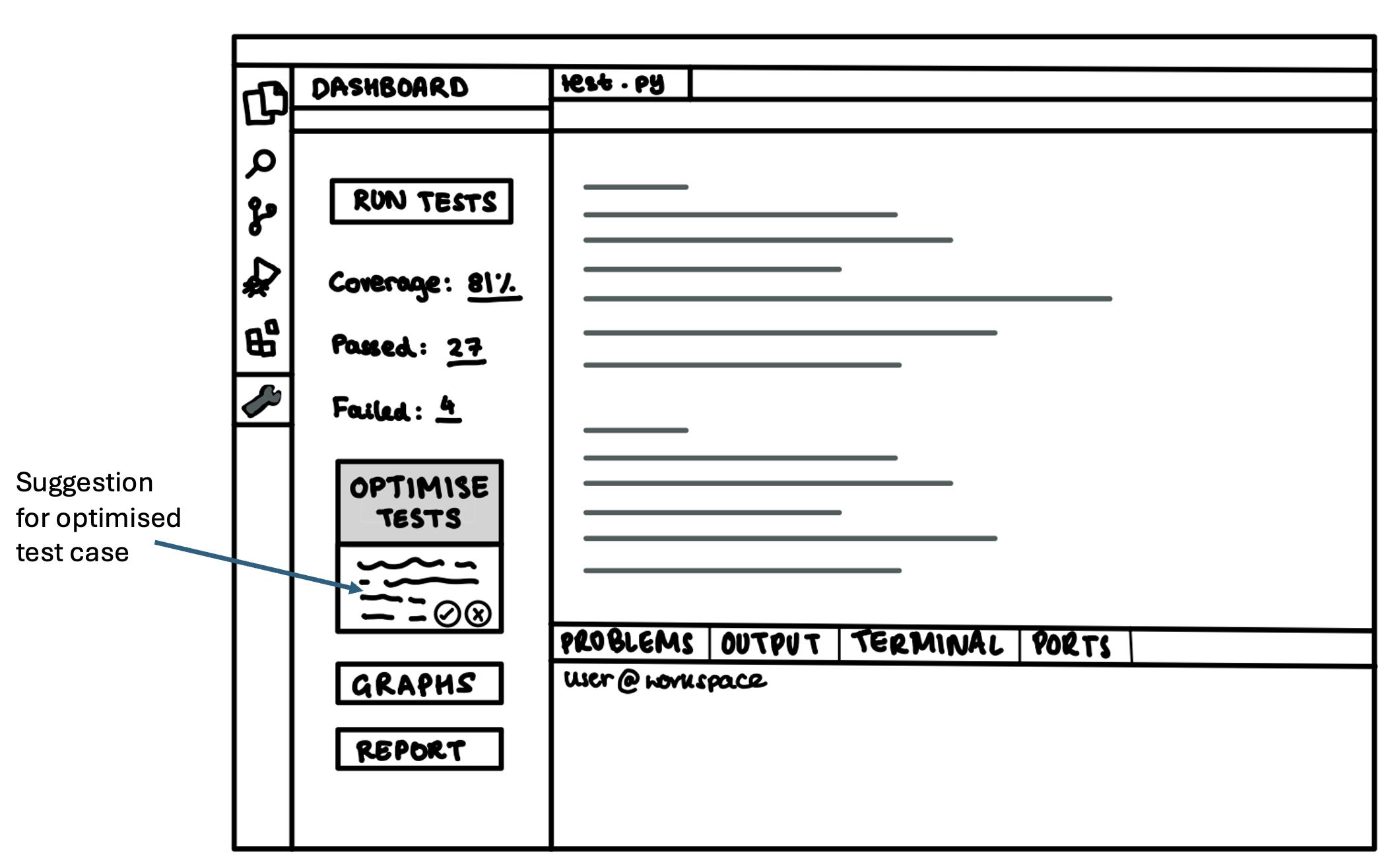
Action-Oriented Design
Action-orientated design will ensure our design is user-centred by prioritising active user engagement. To do this, the design should clearly indicate possible actions by leveraging affordances (what users can do) and signifiers (cues that guide them). This will help users intuitively navigate and interact with the system, reducing confusion and enhancing usability.
Structured Information Flow
The interface should present the most relevant information first, revealing additional details only when needed. This approach minimises cognitive overload and helps users focus on key actions. By structuring content with a clear emphasis on importance, the design ensures a smooth and intuitive user experience.