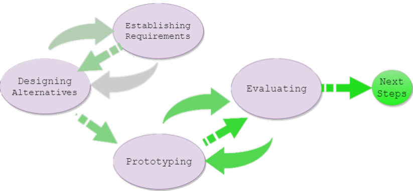
Initial Idea
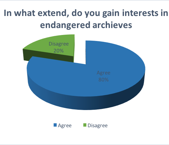
Based on our first set of requirements and our understanding of the project we started sketching rough prototypes of our website. Some of our first ideas - enabling users to log in, and having a way to randomly display the data- were aided by a small survey(2) ch.7 and (5) we conducted with possible users, which we conducted to better understand our audiences' interest.
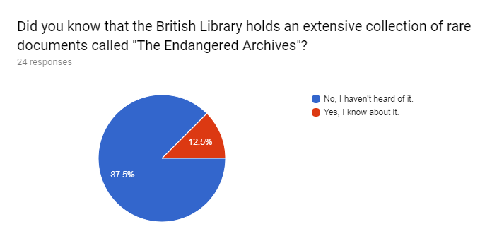
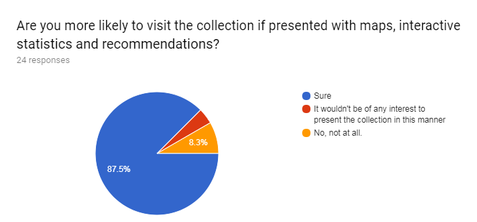
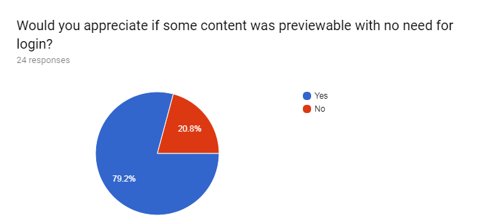
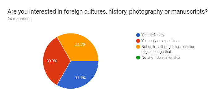
Some of the most interesting answers are displayed here. Even though most users wouldn't have apreciated a login feature we still decided it could be useful. This option, as we can see on the next set of requirements was left out, as our clients didn't wish for such a feature. Another interesting finding of our survey was that most people do not know about the existance of the Endagered Archives, which shows that our project could really be used to make people interested in these archives.
Non-functional Requirements
Constraints
We have also noted down some constraints on the actual development in this section. We will reference this and add to it as coding and testing comes to play in our project.
| ID | Description |
|---|---|
| 1 | The system must be a website |
| 2 | The system must work with the metadata embedded in a server-side database |
| 3 | The database should be an SQL one for legacy issues |
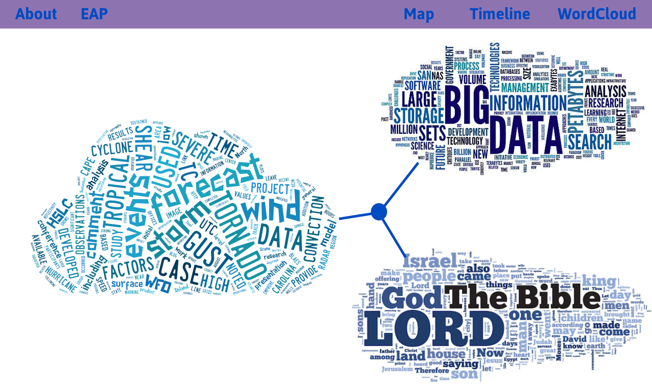
| 4 | The system should provide at least 5 different visualisations |
| 5 | The system could make use of frameworks like D3.js and three.js for data visualisation |
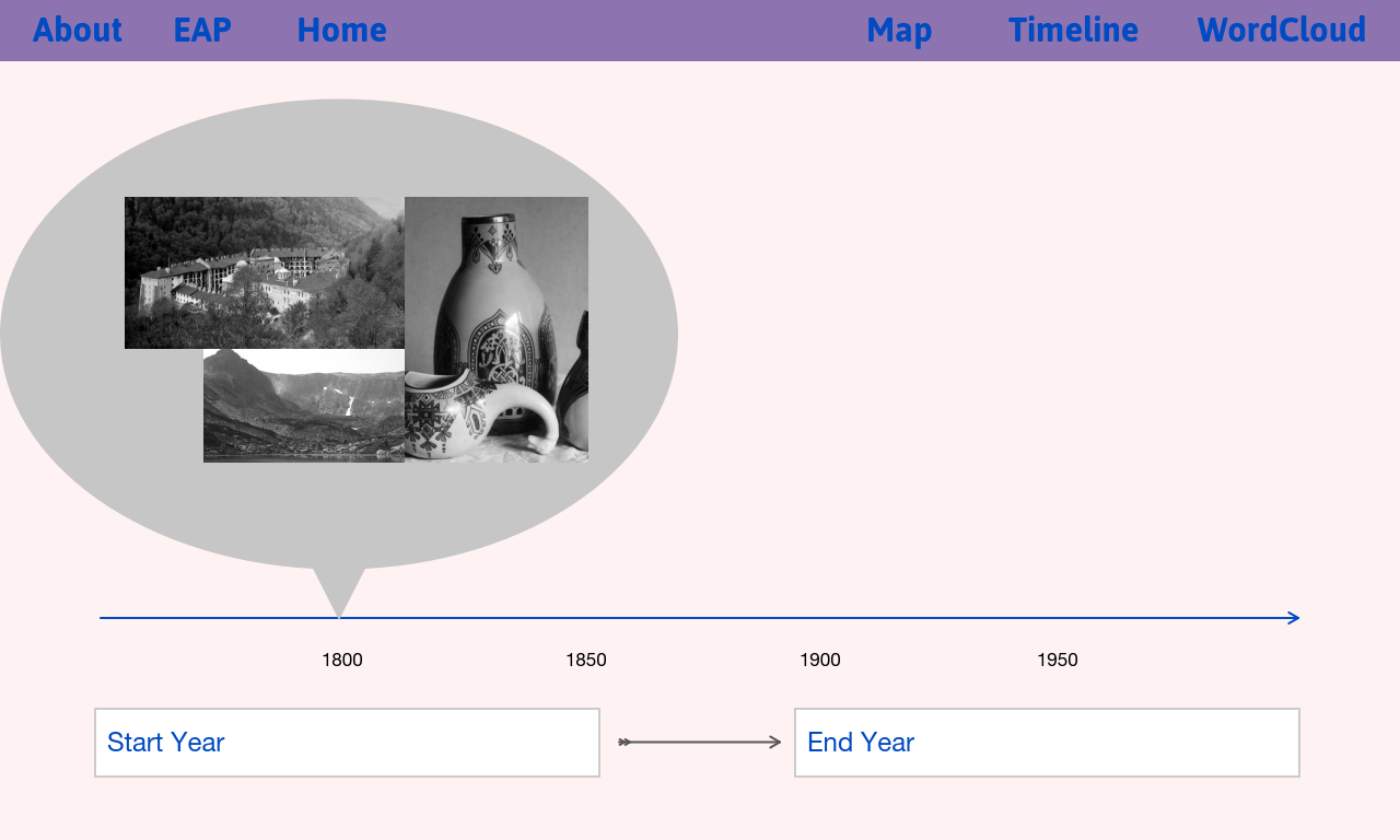
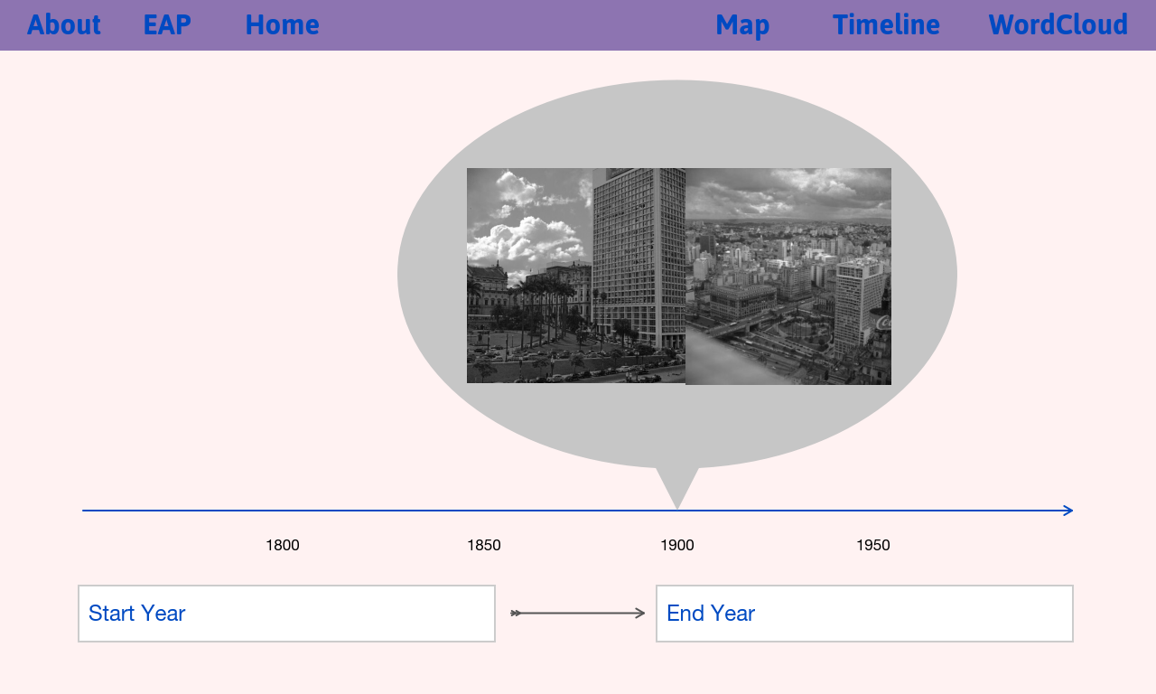
Wireframes
Wireframes
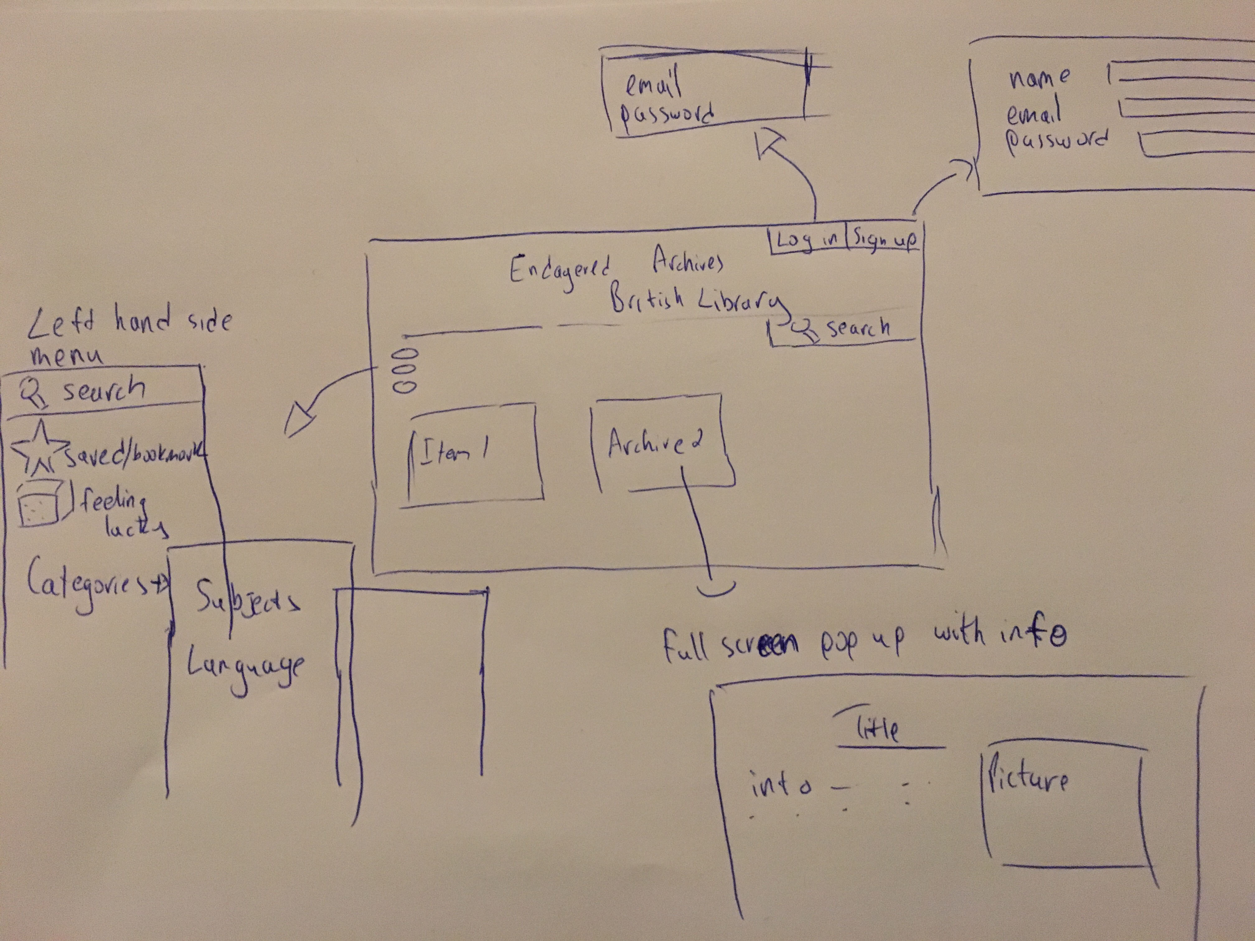
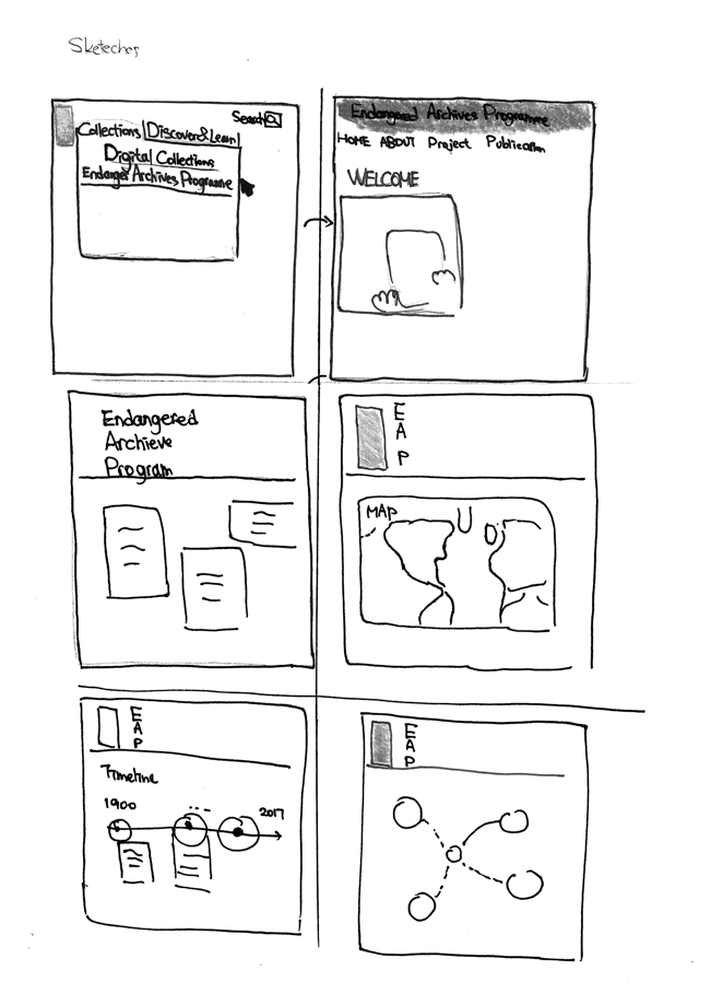
Once we had our requirements and storyboards, we came up with a quick hand-drawn sketch, which is showing the flow of the website. Then we improved the sketch, which is showing the precise functionalities that will be presented in the result. After that we created our first prototype according to our sketches, using proto.io.
Heuristic Evaluation
| Problem no. | Loaction & Description | Heuristic(Nielsen) | Solution | Severity |
|---|---|---|---|---|
| 1. | No documentation provided - or any tutorial explaining how to use the site. | Help and Documentation | Add a small tutorial explaining the user how to use the website | 3 |
| 2. | No way for the user to go to the main page once he leaves it. | User Control and Freedom | Added a home button available througout the site | 4 |
| 3. | No way for the user to go forward/ the next item in a collection. | User Control and Freedom | Could add next and previous buttons once the user reaches the items of each collection | 2 |
| 4. | Map background similar to page's background. | Aesthetic and minimalistic design. | Change and use more contrastic colour. | 1 |
| 5. | No search button available after leaving the main page. | Flexibility and Efficiency of Use | Added a search button in all/most pages. | 3 |
| 6. | The user cannot know if the item he is searching for exists. | Error prevention/Help users recognise, diagnose and recover from errors | Add a new screen letting the users know that the item search doesn't yield any results or have a real time search that will inform the user beforehand. | 2 |
| 7. | The search feature doesn’t allow for suggestions at the moment. | Recognition rather than recall | Add a suggestion feauture in the search bar- google style. | 1 |
| 8. | The homepage could get loaded with too much information. Maybe it would be better if it didn’t show any random archives and be more minimalistic. | Aesthetics and minimalistic design. | Don’t think it is a problem. Maybe in the end we could skip the tumblr-esque design but at the moment we find it helps our users. | 1 |
Severity ratings
0 = I don't agree that this is a usability problem at all.
1 = Cosmetic problem : need not be fixed unless extra time is available.
2 = Minor usability problem: fixing this should be given low priority.
3 = Major usability problem: important to fix, so should be given high priority.
4 = Usability catastrophe: imperative to fix before product can be released.
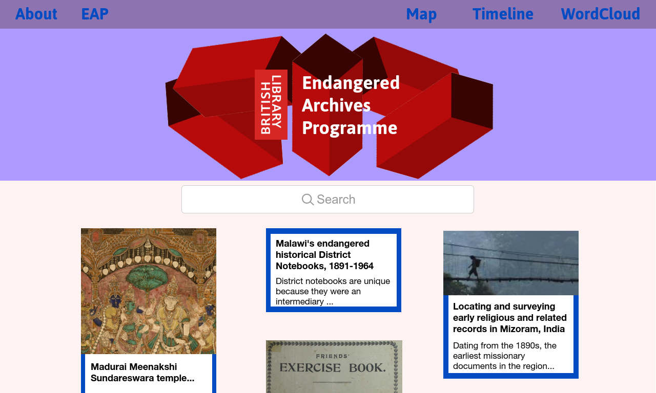
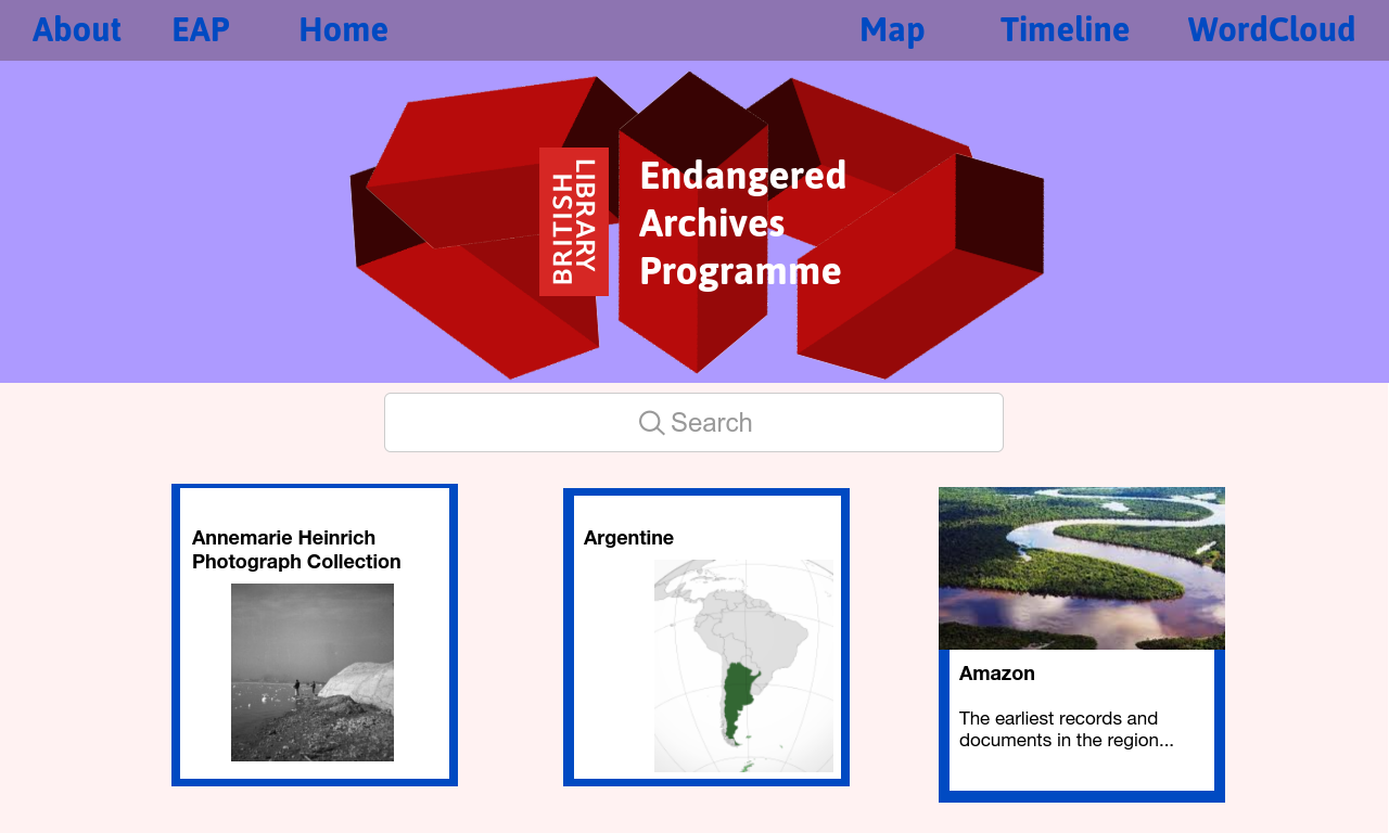
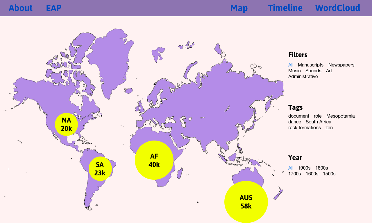
Final Prototype
The proposed prototype is shown

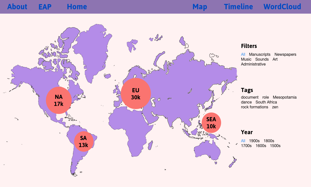
When interacted, it becomes....
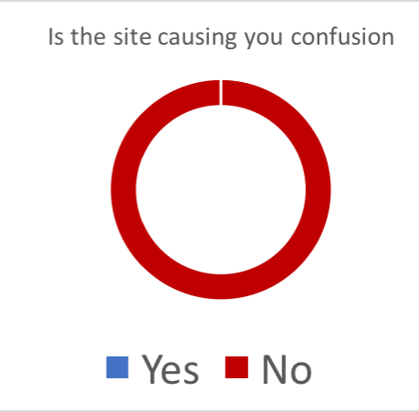
User testing
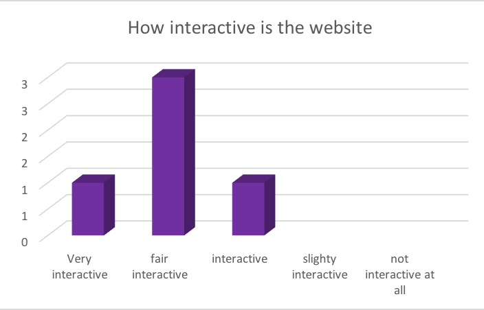
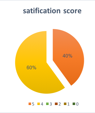
In order to conclude our evaluation, we have asked five users to complete tasks and complete a survey while browsing our prototype website.(6) The propose of tasks and survey is to understand how well the navigation of the website is presented, how much satisfaction does the website present, how deep can the user explore in the website, as well as general feedback. The result shows that all users could complete the designated task. Some of the results are presented in graphs and charts (Highest satisfaction was 5 for the diagram on the right).
Video
This is our 3-minute video, where we briefly demonstrate our team's prototype...
Reaching the conclusion of our design steps...
We naturally think what comes next...
Use software like Open Refine, to clean and better sort our metadata.
Use word recognition algorithms(i.e. bag of words technique) to find new categories to sort our data.
Research into three.js(etc) and other similar products to get a better idea of what visualistations we can do.
Decide into which programming languange and available libraries we will use.
Ultimately, create a website that is fun, intuitive and interesting with at least 5 visualisations of the Archives.