Achievement Table
| ID | Description | Priority | State | Contributors |
|---|---|---|---|---|
| 1 | The system must display the metadata and/or its contents in an eloquent manner. | Must have | Completed | All |
| 2 | The system must group similar content based on the fields and attributes found in the metadata Excel spreadsheet. | Must have | Completed | Stefanos, Andrei |
| 3 | The system must allow overviews of relevant and meaningful subsets of the collection. | Must have | Completed | Andrei, Stefanos |
| 4 | The system must present the user with intuitive visual ways to browse the collection. | Must have | Completed | Stefanos, Andrei |
| 5 | The system should make use of the hierarchical organisation of the data to create layered statistics and visualisations. | Should have | Completed | Andrei, Stefanos |
| 6 | The system should use the location of the items to group them appropriately and show a compelling interface for it. | Should have | Completed | Andrei, Stefanos |
| 7 | The system should use the date of the items to group them appropriately and show a compelling interface for it. | Should have | Completed | Andrei, Stefanos |
| 8 | The system should use the date of the items to group them appropriately and show a compelling interface for it. | Should have | Completed | Stefanos, Andrei |
| 9 | The system should feature some items on the front page as a periodical update. | Should have | Completed | Ringo |
| 10 | The system could make use of different subsets of data to propose other statistics and visualisations. | Could have | Completed | All |
| 11 | The system could allow some visualisations to be searched via keywords | Could have | Completed | Ringo, Andrei |
| 12 | The system would use image processing techniques to highlight important elements in photographs and group them by tags. | Would have | Not Completed | None |
| Key functionalities(must and should) | 100% | |||
| Optional functionalities(could and would) | 70% |
A list of known bugs
| ID | Bug Description | Priority |
|---|---|---|
| 1 | A small number of images not working, as they are broken in the EAP database. | High |
| 2 | A couple of word-clouds produce unwanted results, due to some data given to us being random/dummy. | Medium |
| 3 | Front page periodical update - we cannot get the pictures to be the same size and not having some of them stretched, this is a compromise between uniformity and quality | Low |
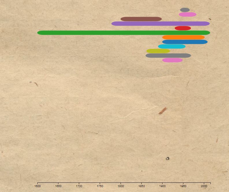
| 4 | Sometimes in the timeline visualisation, if the user doesn’t wait until all the objects are displayed and quickly changes between views, some of them will not be created/deleted but will just get stuck on display without any functionality. The picture below shows the bug. | High |
Individual Contribution Table
| Work Package | Andrei | Stefanos | Ringo |
|---|---|---|---|
| Cient Liaison | 20% | 60% | 20% |
| Requirement gathering and analysis | 45% | 35% | 25% |
| Research | 50% | 25% | 25% |
| UI Design | 20 % | 30% | 50% |
| Programming | 35% | 33% | 32% |
| Testing | 32% | 33% | 35% |
| Bi-weekly Reports | 30% | 40% | 30% |
| Visualisations | 25% | 65% | 15% |
| Front-End Development | 30% | 30% | 40% |
| Back-End Development | 70% | 20% | 10% |
| Website Editing | 20% | 30% | 50% |
| Poster and Video | 10% | 45% | 45% |
| Website Hosting | 90% | 5% | 5% |
| Overall contribution | 33% | 35% | 32% |
| Roles | Back End Developer, Researcher, Programmer | Client Liaison, Report Editor, UI designer, Programmer | UI Designer, Front End Developer, Website Editor |
Critical evaluation of the project
User interface / user experience
Our main focus when developing this site was the user experience by interacting with our visualisations. In that part we can say that we have achieved our goal, as our approach of not giving all the information out, and letting the users click to discover more, paired with the interwebbing of two of the visualisations leave the user curious and force him to spend more time exploring.
On the other hand, this left us with minimum time on working on the other aspects of the user interface, as it was something not considered crucial by our clients. Therefore, some elements may look rough or old-fashioned; for example our choice of background due to a request of our clients, or the use of standard css and bootstrap and not trying to encompass more modern technologies. This is mainly evident on our homepage. However, our homepage has no intrinsic value and its just a place for the visitor to start his journey, and we believe that this takes away too little of the experience to worry about. However, given some more time, we would have first spent it towards our general UI.
Functionality
All our MoSCoW requirements were implemented, except the image recognition one, which was a would have. In the process of developing the application, we realised that this goal was much different than what the clients wanted to, and not worth investing our time.
Stability
We noticed some slight problems with stability when the number of items displayed or processed is large. Namely, when all the 321 projects are displayed in the Countries-Projects visualisation transitions tend to slow down. However, we decided against limiting the projects shown, as this would subtract from the overall picture the visitor will get about the origins of all the projects.
The same can be said about the word clouds. We have limited the available projects from 321 to around 120, leaving out those that had more than 10 thousand words to process. This has dramatically reduced loading times, but since each time 4 random projects are picked, there will be times when more than two big ones will be picked, which will slow down our app.
Project Management
The team concerned itself with management from day one of the project. The environment, work guidelines and ethics we setup were democratically discussed in repeated meetings until we agreed on the standards for enhanced communication.
We have used the software development friendly messaging app “Slack” for internal communication. We held pools for task splitting and decision making, we shared files, wireframes and ideas and we connected it to our personal calendars for milestones and deadlines.
We used “Trello” for documenting our process, from its incipient form to building specific functionalities. Our Trello repo could serve as a blueprint to repeat our experiment, with step by step instructions on the developments, ideas and algorithms we worked and delivered upon. We used it as a measure of completeness of the main functionality, and also as a way for the others to quickly understand someone’s progress. In this way we have achieved local deployment of a skeleton app in half a week on all our devices.
Using Git consistently and with standardised commits also contributed to our progress. Git proved to be helpful in documenting change, reverting decisions and developing new features without disturbing working ones. We feel like we became proficient enough with it that it did not hinder our work capacity, but it added to our strength.
Maintanability
There were several approaches to make the project more maintainable. We were constantly running the program on our local machine and when a bug we detected, it was corrected in short notice. Actions were taken to enhance the performance of the application, for example, preloading some of the data to avoid running the API, which requires more time to load the application, as it was done in the languages visualisation. Additionally, we omitted possible chunks of data that would be too big to process on the client side, as is the case in word clouds were we only allow projects with less than 10 thousand words to be drawn, as more words than that would slow down the app.
Future Work
How could the project be extended if you had another three months
There are plenty of things we could have done if we had three more months into the project, Firstly, we would have fixed all the bugs mentioned in the List of Known Bugs part. We would then go on to improve the general feel of our website. We admit that in some ways our U.I. feels outdated and this is something that we would like to change given that we had the time, in order to encompass more modern and minimalistic designs, and make it as fluent and easy to the eye as possible.
Secondly, we would like to link more of our visualisations together. Some possible links could be made between the material type and the countries visualization, as it was already done with the languages treemap. Another possible link would be linking the word clouds with the projects visualisation and when the user selects a project, in addition to all the info displayed about the project a word cloud could also be created. Finally, concerning changes in our visualisations, we would love to give more choice to the user as to how to filter data: i.e. Select a specific date range in the timeline visualisation, or search for keywords when 4 projects are drawn as word clouds.
Thirdly, we would have loved to give a try to image recognition software. This type of software could uncover many more relationships hidden in our data, but it would also help immensely in classifying them. As their aren’t strict rules for the documentation of the data entered in to the EAP database, and a lot of things have changed in the past 14 years since the Program first started in data storage and categorisation, we can see that a lot of the data are of poor-quality. This is where new data recognition techniques could be handy, for example in better classifying the date of photographs from the 20th century, or the material an archive or manuscript is printed on.