Potential devices
Our app was designed to be browsed by normal web browsers. However, we decided to choose big screen devices(laptops and desktops) as our potential devices. This is because in smaller smartphone screens much of the clarity and info will not be displayed clearly and the visualisation’s message will not be communicated to the user. Since a lot of the work will recognise mouse hovers and clicks, which will provide additional information to the user, we would prefer our work to be browsed in personal computers and not tablets as that functionality will be lost.
Front-end technologies
Node and ExpressJS

Node.js provided with a common ground for development. Linking the object model through mongoose and running the app with express are advantages of software development attached to the access to the npm package library. Express takes care of the details of running a server behind closed doors, while mongoose allowed us to change the structure of our database multiple times across the development lifecycle, delivering a version that was compressed to the best of our ability and that was still easy to work with.
Django is a framework we used to develop another project on. But a more attentive search to how it links to Mongo revealed that we needed a Python driver of the likes of PyMongo. Those multiple middlewares would have added unnecessary complexity to our project. So we decided to discard Django framework, and try a JS framework on the server side. This kept a cohesive feel to the code and it lead to a better collaboration between the front end developments and the back end routing, because we knew the possibilities of our languages.
Back-end Technologies
MongoDB

Figuring out the back end is a feat we have accomplished studying technologies and understand the way they work together. We tried SQL in the first place, using Microsoft’s Access platform for relational databases. SQL seemed a reasonable choice due to the many relationships of child-parent that the data displayed. The importing of data from Excel and/or csv was unfortunately really slow and defective for our purposes, so we switched focus to MongoDB, a NoSQL database that didn’t hold account for these relationships, whose deployment process proved to be much more achievable.
Using mongoimport never failed us and we had a setup that was well documented from the beginning so that when the data was updated extensively (like when we added all image links), we knew how to update the data and how to keep backups. We learned that Mongo is also very fast with aggregate queries and that it’s document model is very extendable. Having this tool to aid our data searches and grouping, we went to study which frameworks would best work with it.
Visualisations Libraries
D3.js and Chart.js


Our choice for visualisation libraries had to be the hardest design decision we had to make, as there is a huge number of them, for various purposes and written in various programming languages. After some research we narrowed it down to two categories: javascript libraries and python libraries. As we weren’t really familiar with any of the languages we decided to give python a try. While it was easy, most python libraries we could find didn’t pay a lot of attention to the small details of a graph or visualisation and all of the examples looked crude and simplistic.
We then decided to try javascript libraries, a choice which we should have done by the beginning as javascript is a web-based programming language and would be easier to link with html and all the other components(frameworks and database). We still had a huge variety of options: leaflet.js , three.js , chart.js and d3.js.
Starting from leaflet.js we could see that it is one of the best visualisation libraries for maps, but as it could only do maps we decided against it, as it was too limiting. We were glad to know that our clients had already set up a map using the Google’s Map API and that maps weren’t really needed. Moving on to three.js, a library specialised in 3d visualisations. However as it was made clear by our clients, they wanted their visualisations to convey meaning and be simple to understand and therefore we ticked three.js of the list.
Finally a choice had to be made between chart.js and d3.js. Both had a lot of examples, good documentation and seemed easier to learn than leaflet and three.[1] [2]However, there were more tutorials on d3 and the possibilities seemed endless unlike chart.js which only allowed for a limited choice of charts. As a result we, devoted our time and energy into learning d3 from various sources, some of them being courses on lynda.com and youtube.
More on technologies...
OpenRefine
Our first job was to clean up the data. Our clients recommended Open-Refine and we also decided to research other tools to see what else is available on the market. In the end a choice had to be made between Open-Refine and Trifacta.

Open-Refine had a lot of pros, as it was already recommended by our clients, and it was a formerly a Google tool. Additionally, there was plenty of online documentation around it. Trifacta on the other hand looked more versatile with a cleaner UI. We decided to go with Open-Refine, which had less of a real use for our data. That is because both Open-Refine and Trifacta had trouble dealing with more than 20 thousand records and we had more than 330 thousand. They did provide the first insights into the contents of the database, they highlighted some problems of syntax, like the same country being referred to in different ways (Russia and Russian Federation), the lack of relevant start and end dates at the top of the hierarchy or two or three cases were something was written with a lowercase letter instead of all capitals. To our client’s credit, the data was really uniformed and apart from very secluded cases, no errors could be found at this stage. All in all, data cleaning took less effort than expected but at least we got even more familiar with our data and its categorisation.
Data structures and algorithms
We have written two types of algorithms on the backend. The first kind values the hierarchical structure of the data and makes use of it to extract the layers and the relations of inclusion between parts of the collection. The others are algorithms that flat out the records and look for meaning behind the numbers that add up. The first would return a JSON file emulating a tree, where each object contains an array of children, whereas the second type returns arrays of data. The data structures used in further development on the front end are therefore different.
We take advantage of the hierarchical ones to display the content types under bubbles of different radius, significant for how frequent a material is in the collection. Also they are used in the word cloud where we look only at words under a specific project.
Flat out algorithms are used when counting languages across the archive or when assessing the country for each project.
Most of the algorithms concerning layers make use of regex form for the identifiers of the children of a known parent. Some are more specific, requiring for the returned records to have additional features. One example would be the timeline, a product of both hierarchical thought and overview. Upon clicking on a project from the ones first displayed, the user gets 50 random items from that project (at any level of the hierarchy below project) that also have an image link. This requires filtering individual results in terms of whether they are or not photographs.
Searching works with regex as well, applied to the title column, and the results returned are also scrambled so that the first ones don’t always show up at the same query. While this is very primitive and makes no judgement on the relevancy of the results returned, it was the fastest development we could have implemented. Also our clients specified clearly that they don’t need a textual search, because it would replicate functionality found already on their website. In spite of that, we decided to give our user a means to explore the data more specifically, redirecting to the original site at short notice for functionality already present there.
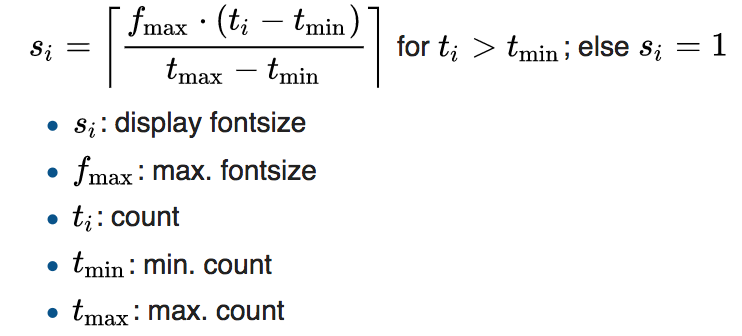
word-cloud and frequency algorithm was implemented on the visualization.First, Word cloud is an visual data-visualization contains of single words. In our EAP project, we uses word-cloud to present some of the EAP projects. These word-clouds are generated according to its frequency, the higher of the frequency, the larger of the size of the word. Stop words are eliminated before the algorithm runs. The size of the word is calculated by formula :
T-distributed stochastic neighbor embedding[3], a machine learning algorithm was considered to learn the pattern and find similarity in words. However, due to incompleteness of some EAP data. We could not define the training set for projects. The visualization has to be discarded regrettably.
References
[1][2]https://www.moesif.com/blog/technical/visualization/How-to-Choose-the-Best-Javascript-Data-Visualization-Library/
[3]http://jmlr.org/papers/volume9/vandermaaten08a/vandermaaten08a.pdf
Summary
After taking all the options into consideration as described above, we have concluded that our best options were the most used and well documented ones. Therefore, we choose the popular MongoDB - node/express.js combination for our whole skeleton. As for the front-end we again choose the popular framework choice - bootstrap, since we didn’t want to experiment and waste time on other resources. Finally, D3.js was the choice for our visualisations. Comparing D3 to any other visualisation library available, it was immediately clear that it is steps ahead its competition something which we can confirm now that the project is completed. All in all, when looking back to our design choices, we feel that they were correct as they enabled us to develop our system seamlessly without having to backtrack to our second options.