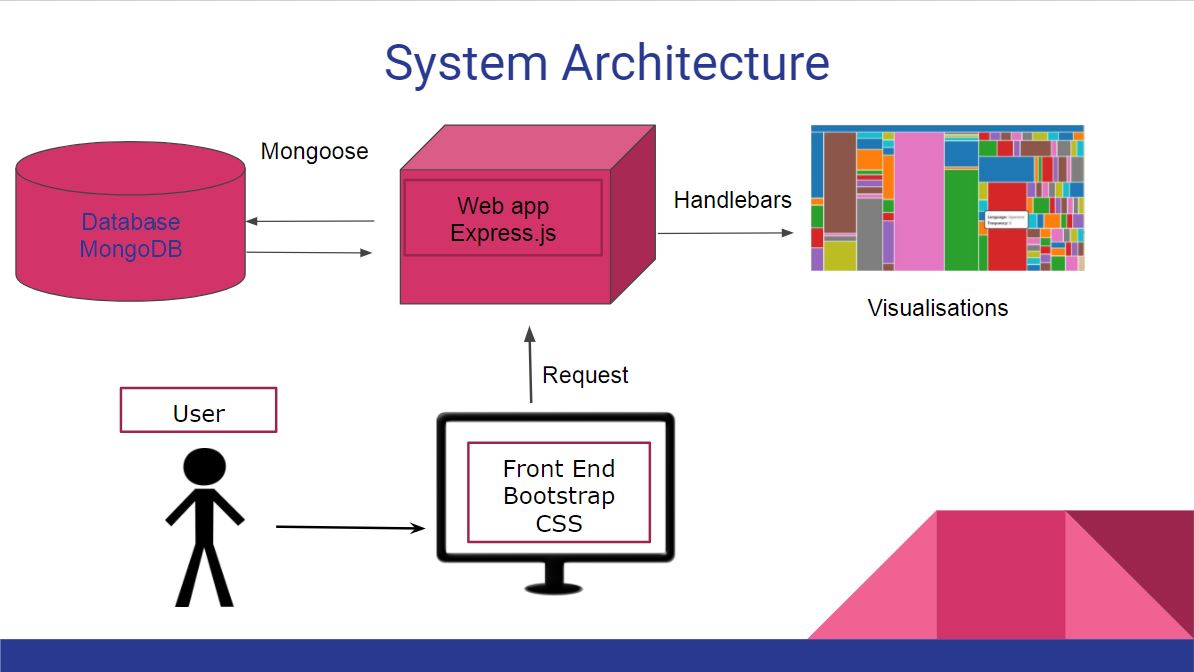
System Architecture Diagram
Our web app makes use on multiple technologies that dictate the structural arrangement of its components and the flow of data from the server to the client. We have a web app based on Node.js, using npm modules to secure the connection to the server and to the database: express.js and mongoose. In this way our app is central to the development process while the overhead created by those components it is responsible for its minimal.
Mongoose links to an object model of the data we have in store in the database. Data is pulled seamlessly from it with the aid of queries addressed to this model. The database is deployed either locally or on the cloud, with the change of a single URL in the mongoose connection.
Express handles all the server management overhead that would clutter the javascript written. It implements a way to render pages dynamically with the aid of handlebars - closest we get to the front end in the system architecture.
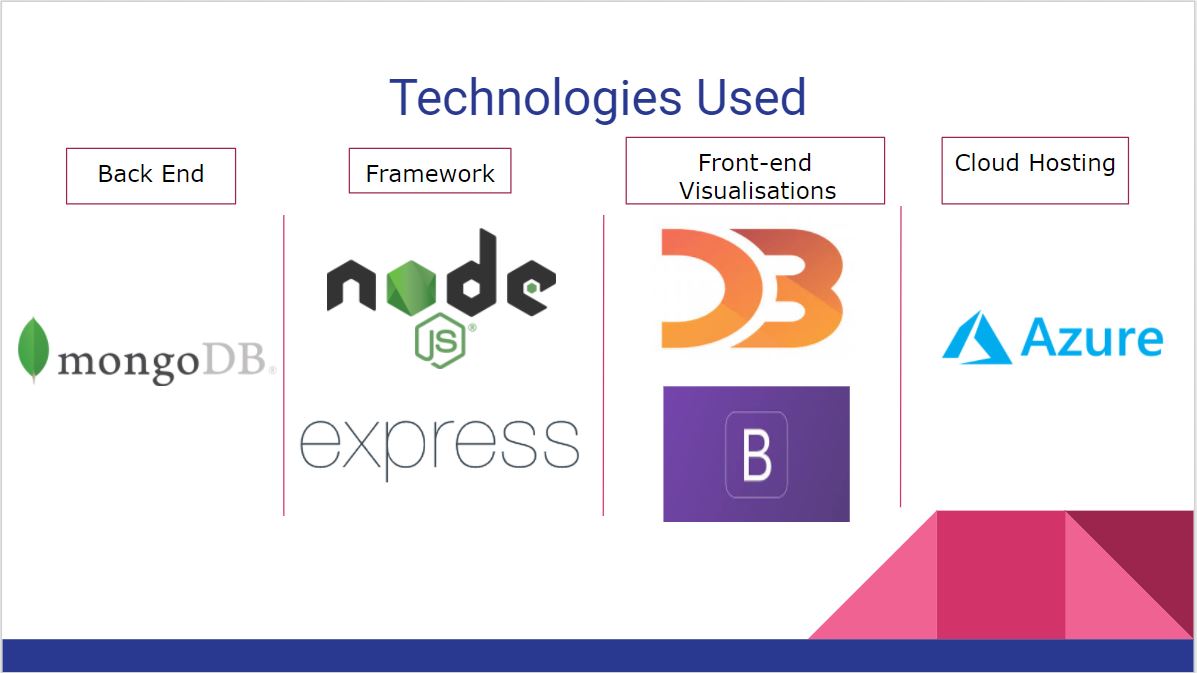
Technologies Used
Our solution was built with the consecrated technologies: mongoDB as the database, express.js as the middleware and visualisation libraries like D3.js for the front end. Both express.js and mongoDB are modern, capable of scaling and responsive to our needs. D3.js was used for all our visualisations, displaying content from the database in real time to the client-side. Of course, as with most standard web development, bootstrap was used along with the standard css and html. Finally, due to our clients request, we have hosted the application online in Microsoft Azure, a cloud computing and hosting service.
Design patterns
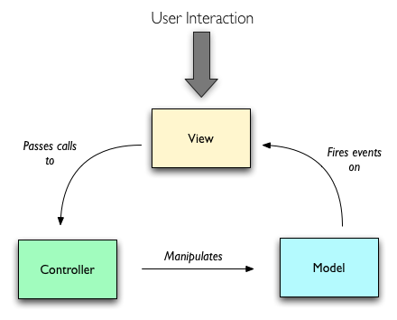
Model View Controller
One structural rule apparent from the beginning of developing a working skeleton was the Model View Controller pattern. 3 interconnected parts work together to bring the app to life. View - the first one, consists of our UI and all functionality that interfaces with the user. It is able to process his requests and to send signals to the controller. We have represented it by the use of the npm module handlebars to render the contents of our views folder, consisting of dynamic html puzzle pieces, rendered when needed and with the right data injected inside of them. The controller defines the application behavior by giving user actions meaning on the back end, returning model responses. We seen it as the sum of our algorithms, most encompassed within the “completerecords.js” route file. The Model holds our data to some standard we have specified. We use mongoose as a model supplier inside the “record.js” model file.
In using this pattern, apparent from the way we’ve grouped the folders, we ensured flexibility and also it made easier the task splitting we have done throughout the year.
REST
REST (Representational State Transfer) was used to simulate having a specific subset of data for each functionality. It allows us to create very clear URL names that are called as GET requests to aid in the construction of the visualizations. We did create so many different responders that we thought we could call the whole part of the app concerning JSON returning an API. We give some examples of the most used API calls across the website.
| URI | Returns/Ourcome |
| /api/alllanguages | returns a JSON with all the languages and their prevalence |
| /api/hierarchyallmaterialtypes | returns a hierarchy of materials used across the collection |
| /api/homepagelinks | returns 3 random projects containing images along with their image links |
Facade
Facade pattern shows the user data without cluttering him with undesired information. The user only requests for obvious subsets of the data and he is presented only with what is relevant to that particular visualization. We have catered the needs of the user and translated them into backend requests.

This involves redirecting all requests to a single class (our “completerecords.js” file) and making it responsible for how it deals with it at further more complicated and data specific levels of the app.
We have restricted the use of internal “_id” column inside Mongo to just the server side, because it made no sense for the API to return such information.
Module
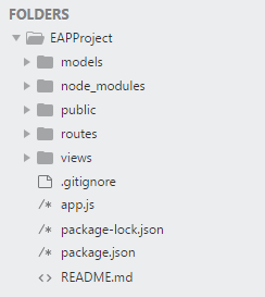
Modules have been used to make the code manageable at a later stage in the project lifecycle. We split the obviously different functionalities into different parts of the project that communicate between them through calls and messages. In this way our development was in no way obstructed by too much complexity to deal with.
All things front end have found a place inside public, from which resources are loaded inside of the handlebar views. They make the visual skeleton of the app. They deal with anything from css styles to the visualizations themselves.
Upon them we added the logic and the data. Data is dealt with in the models folder, from which we define how the data should be interpreted when it is pulled from Mongo the first time. The logic is comprised inside the routes folder.
All is put together by the app.js file, running the modules imported from npm, requiring the code we wrote, and starting a server linked with the database:
Middleware
Middleware functions exist in the routes, executed in between the request and receiving the response. They usually call the next function in the call stack. They link the database with the UI.
As it seems, it is a very important pattern for web apps, one that we couldn’t have done without.
This pattern had some major benefits: middleware functions don’t interfere with each other because of chaining, which makes the final code more reusable. It also allowed the application not to care about response and request format, because they are handled separately throughout the middleware chain. The developers can add or change responsibilities between packages by simply changing middlewares or creating new ones.
Data Storage
Our data is comprised of a single type of fundamental document: the Record. The record model contains all relevant information for all visualizations. Each of our visuals chooses its facade for what data is useful in that context.
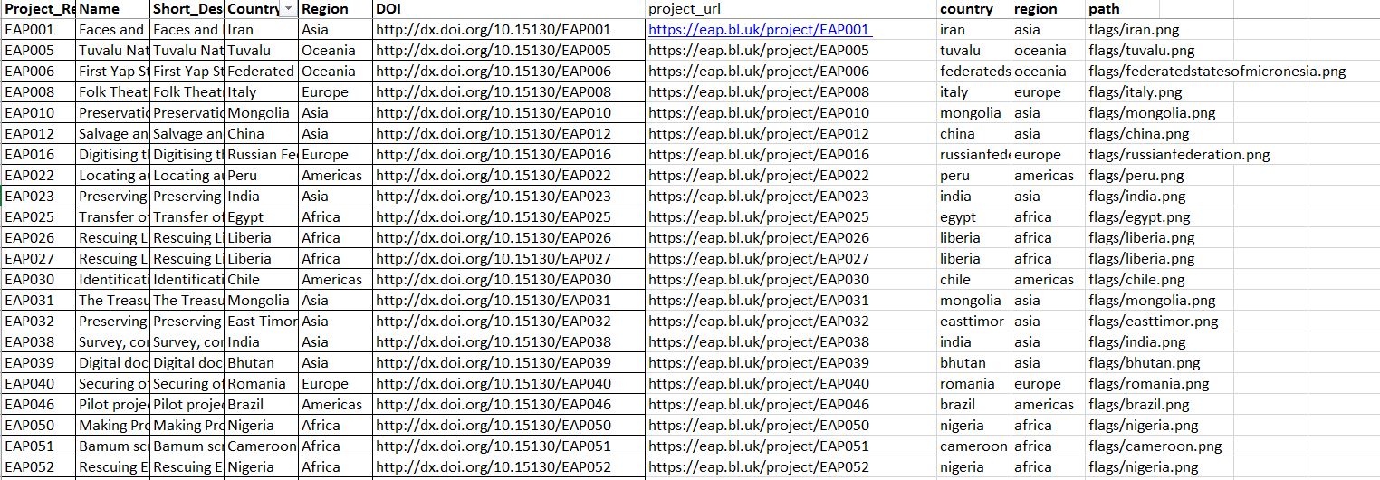
Using MongoDB, we hold a single collection: EAPComplete. This collection contains over 300 thousand records, of different types and descriptions, from which relationships are built.
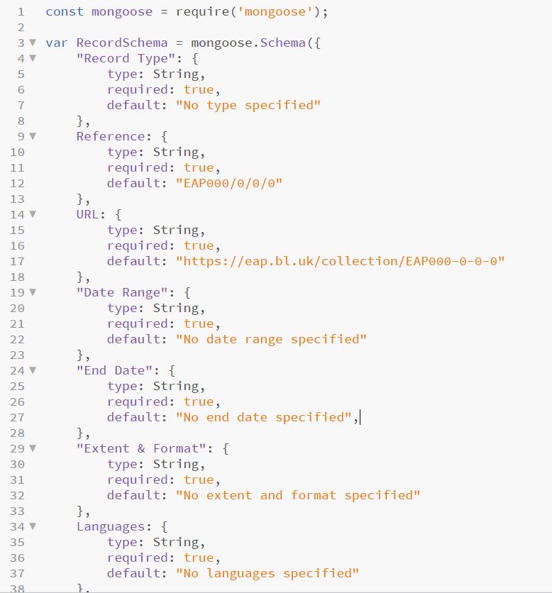
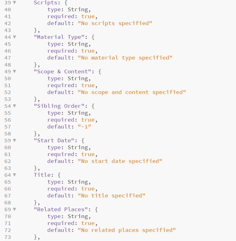
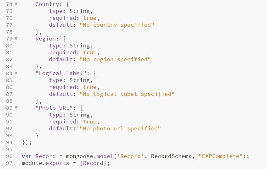
A record contains different fields, compressed in the formal description of a mongoose model. The model is universal and is used to translate MongoDB data into JSON object, understandable to the browser. We will include here the main schema we implemented our records on. Its multiple types are archival specific terms, ones more obvious in meaning, like ”Title” or “Languages”, while others holding more natural language descriptions, like “Scope & Content” or “Extent & Format”.
Implementation of Key Functionalities
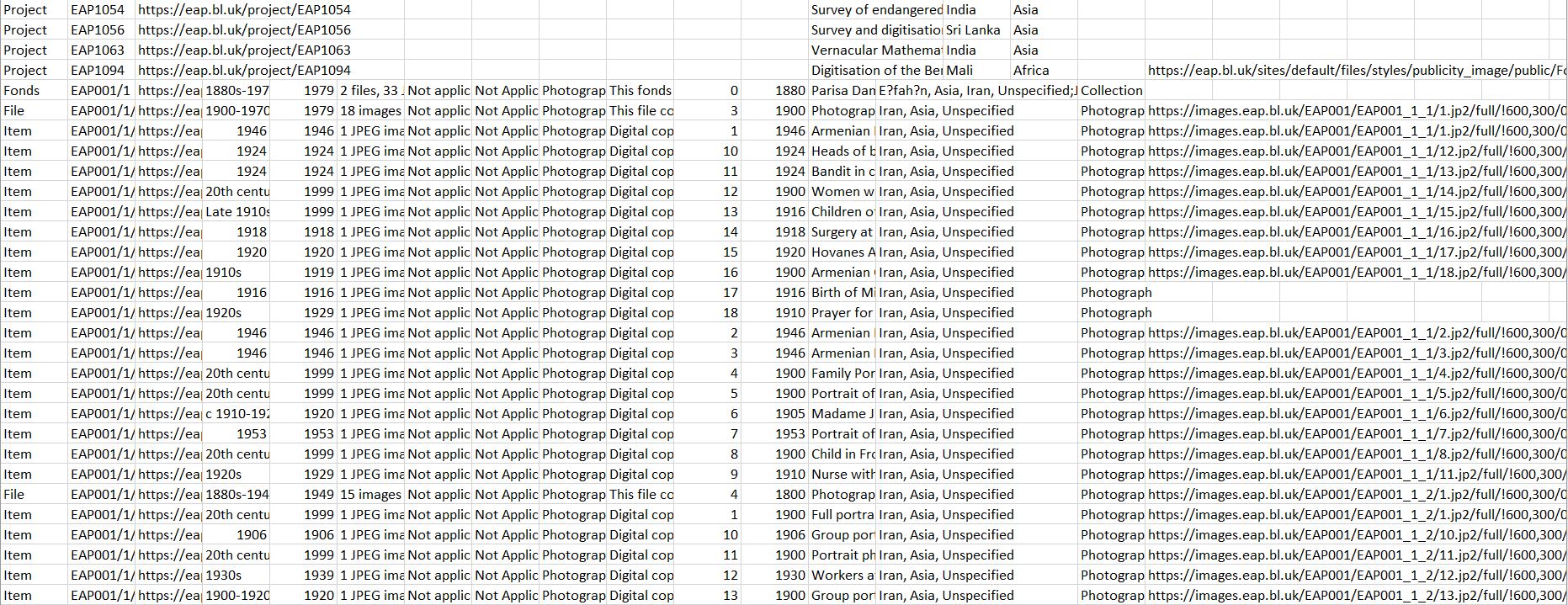
On our first meeting with our clients, we were given a spreadsheet with all the items stored in the EAP database. However as weeks went by, we discovered that certain data was missing. For example the Material type was absent, or that the top-level of the archives hierarchy, namely the projects, were not given to us. That resulted in more spreadsheets, which we had to merge in order to have a consistent copy of all the data before entering them to MongoDB.
-
Unfortunately, there were still some inconsistencies with our data, which were preventing us from implementing our visualizations.
-
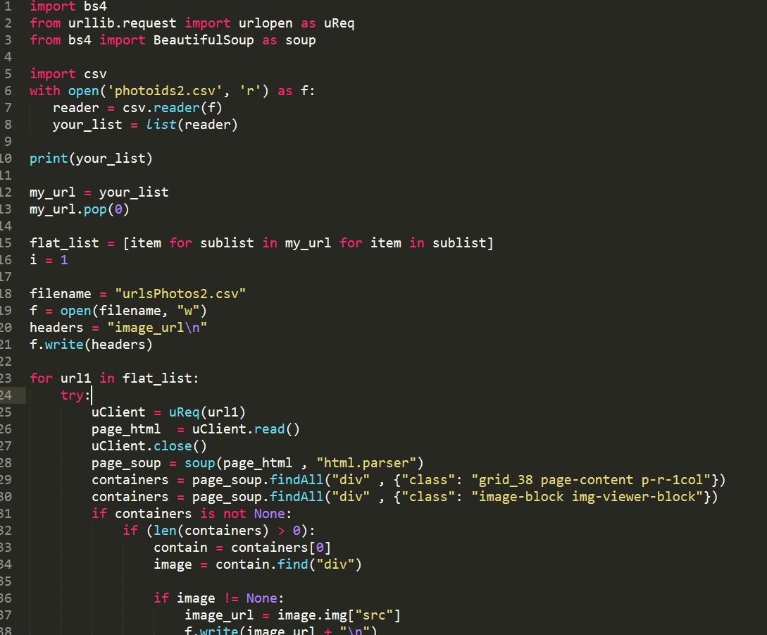
For our timeline visualisation, there was a lot of underlying work in getting the data ready as the project-level items didn’t have dates. We therefore wrote a python script, which examined all the lower-level items belonging to the project, to find the minimum and maximum dates of each project. Additionally, as we weren’t given any data on photographs, we wrote another python web-scraping script, which took the url site of each photographic item in our data and stored the direct image link in our database. This was quite a time consuming process, as there were 150 thousand picture urls to be scrapped, and our script was running for almost 72 hours straight. We then realised that some of the links are not working since they are corrupted on the EAP database, and we informed our clients about that, so they could fix that.
-
We then had to decide how to filter our data for our needs. After some examinations we found that a lot of the attributes were useless and redundant; the description language was always English, there were some meta-codes used by the archivists, a lot of the data weren’t properly filled and contained dummy data, or that we had both a date range and a start and end date.In the end we removed a lot of those data and we decided to keep only the attributes we considered necessary and valuable.
-
To implement our visualisations we first had to get used to all the different layouts and modules d3 has. We then had to pick the best ones for our ideas. Fortunately, d3 provided a lot of layouts and different scales, which are essentially mapping functions, ranging from colour and time scales, to hierarchical layouts. Those layouts really helped in getting the data plotted and shaped in the tree-map and circle packing visualisations.
Some of the d3 functionality we used throughout our visualisations were:
Colour scales- X and Y axis functionality for the timeline
- Layouts for treemaps and circle packing
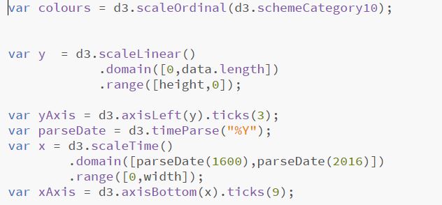

- X and Y axis functionality for the timeline
-
We also wanted to use the force layout, which involves some underlying physics equations and makes items gravitate around a pair of coordinates. Applying these force modules to items makes them slightly move around their center of gravity, resulting in a more playful and moving visualisation which stimulates the user, something we used in our Projects by Country visualisation. By changing these coordinates accordingly we were able to split the Projects by their continent, merge them all together, or just merge all projects depending on their country.
Final Product
Our final implementation consists of five different visualisations, displayed and explained below.
Languages Tree-map
As languages were one of the most prominent attributes in our data, we wanted to see how many of them exist, and show how prevalent each language is. That is why we choose a quantitative type of visualisation for languages; the treemap. When the user hovers above each language, a tooltip appears displaying the language and the number of times it appears in the archive collection. Clicking on that language, the user will be redirected to our Countries-Projects visualisation where the projects that contain the selected language will be shown.
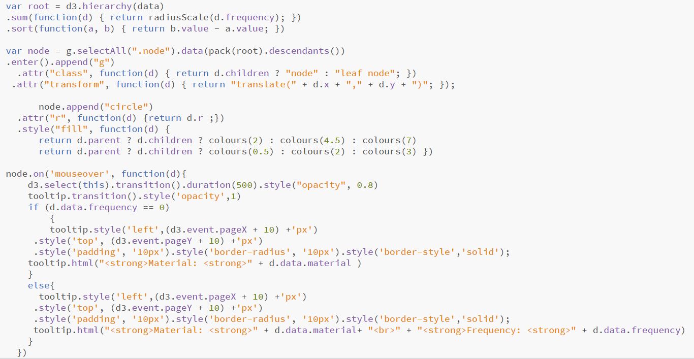
Circle-Packing Bubbles
This visualisation illustrates the different material types that can be found in the database. It is a two level hierarchical visualisation, in where data are first split by their material type, and afterwards by their … Again when the user hovers above each circle, a tooltips appears displaying the material and the number of times that material is found in the archives.
Countries Projects visualisation
This visualisation illustrates all the 321 projects of the Endangered Archives Programme, each one being represented as a single circle with the flag of the country that project originated. When clicking on a circle, more information about the project are shown , on the left of the visualisation. The user can click on a project's title and be redirected to its original EAP site.The user can also split the projects by their continent, or individually by each country.
Photographic projects-timeline
This visualisation illustrates all the projects that contain photographic material, on a timeline which ranges from 1600-2015. When the user hovers above each circle, some project details will be displayed via a toolbar. The user can select one of the projects, which will transform the graph to a timeline with up to 50 dots; each dot representing a photograph from that project. When clicking on a dot, the photograph is displayed, along with its details. The user can then choose to visit the official EAP site and browse the pictures, select another picture or press the back to timeline button where the visualisation will go back to the project level.
Wordclouds - Small multiples
Word-clouds is a data representation which contains frequent words with stop words removed. Finally, this visualisation illustrates 4 word-clouds, with a technique called small multiples. The size of each word in a word cloud indicates its frequency and consequently its prevalence and importance in that project. Small multiples is a visualisation technique in where a series of similar charts is displayed, allowing them to be easily compared.
The data we are using to plot the word clouds come from an attribute called “Scope And Content”, which is essentially a small description of each item in the archives. Our visualisation takes all the item descriptions of a project and after applying a trim function to remove stopwords(like a, the, numbers etc), draws the wordcloud.