UI Design
Human-Computer Interactions
Table of Contents
Design Principles
Consistency
Consistency is the key to a successful design. It is important to maintain consistency in the design of the website to ensure that users can easily navigate through the website and find the information they are looking for. Consistency in design elements such as color, typography, and layout can help create a cohesive and unified user experience.
Simplicity
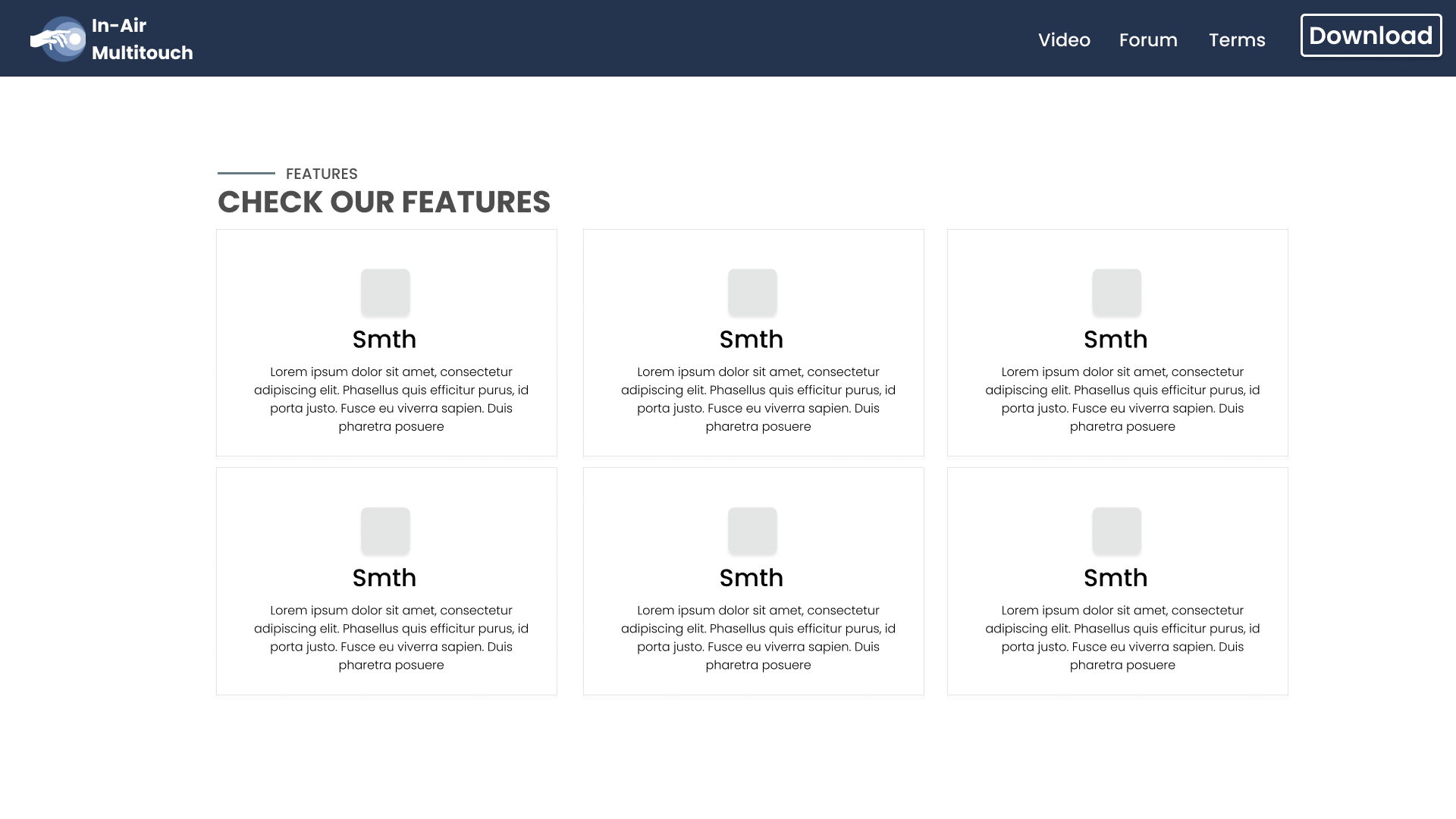
Simplicity is another important design principle that can help improve the user experience. A simple and clean design can help users focus on the content and tasks at hand without being distracted by unnecessary elements. By keeping the design simple, a more intuitive and user-friendly experience is created for users.
Accessibility
Accessibility is an important consideration in web design. It is important to ensure that your website is accessible to all users, including those with disabilities. This can include providing alternative text for images, using clear and easy-to-read fonts, and ensuring that the website is navigable using a keyboard. By designing with accessibility in mind, a more inclusive and user-friendly experience for all users.
Visual Hierarchy
Visual hierarchy is the arrangement of elements on a page in order of importance. By using visual hierarchy, users through the content and help them understand the relationships between different elements on the page are guided .This can help improve the user experience and make it easier for users to find the information they are looking for.
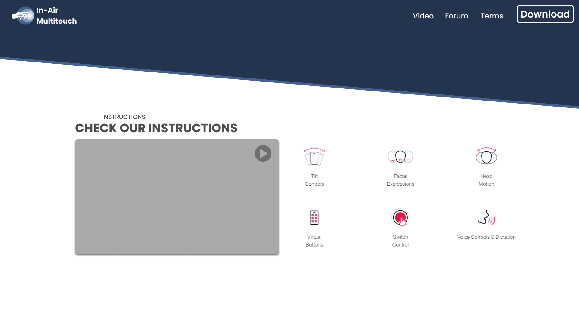
User Guidance & Feedback
User Guidance Manual is an important part of the design process. By providing manual to and feedback from user.
>
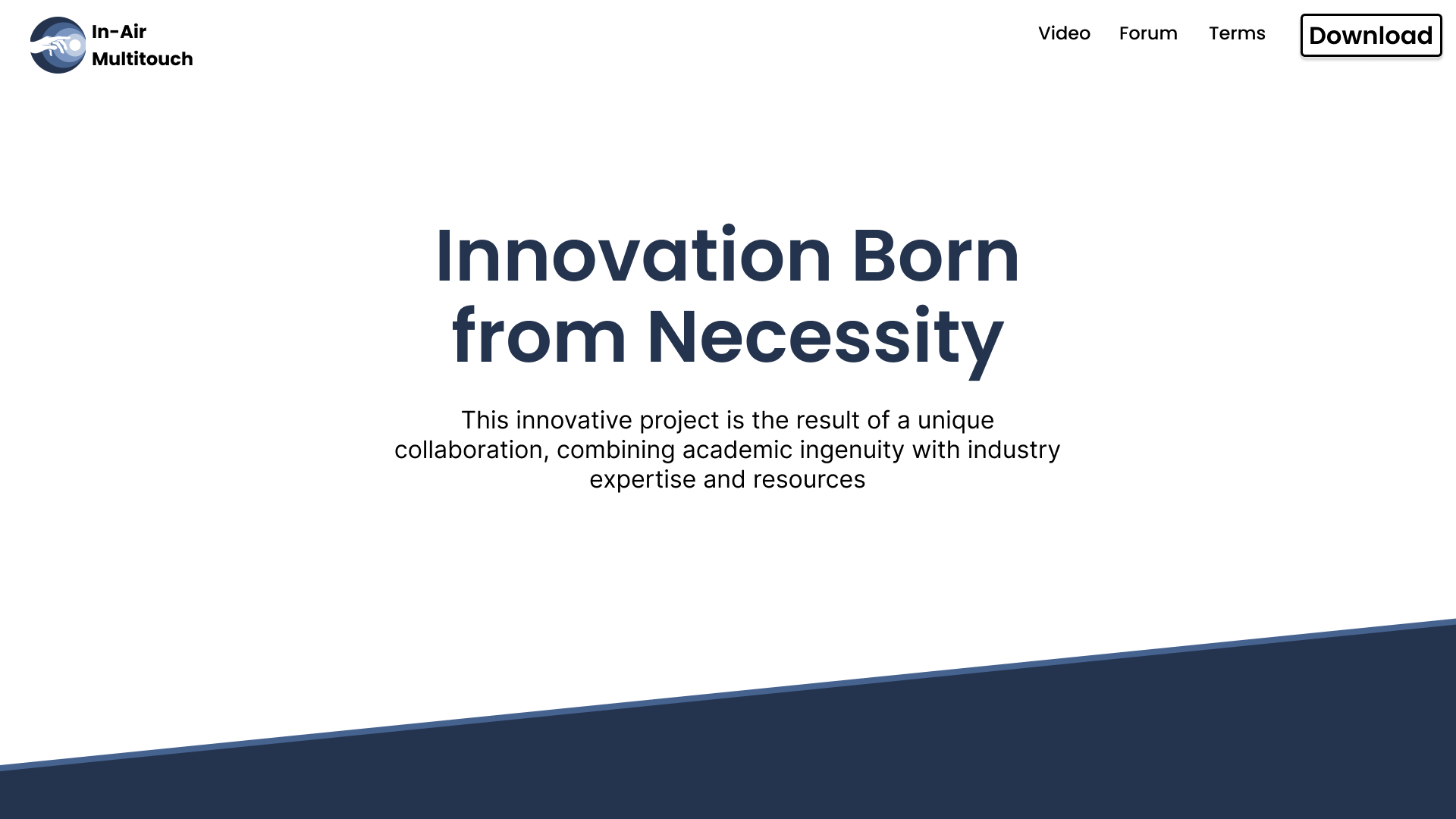
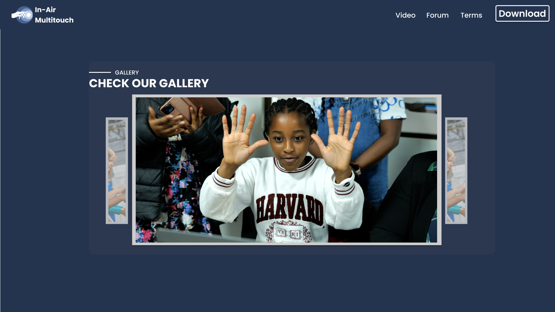
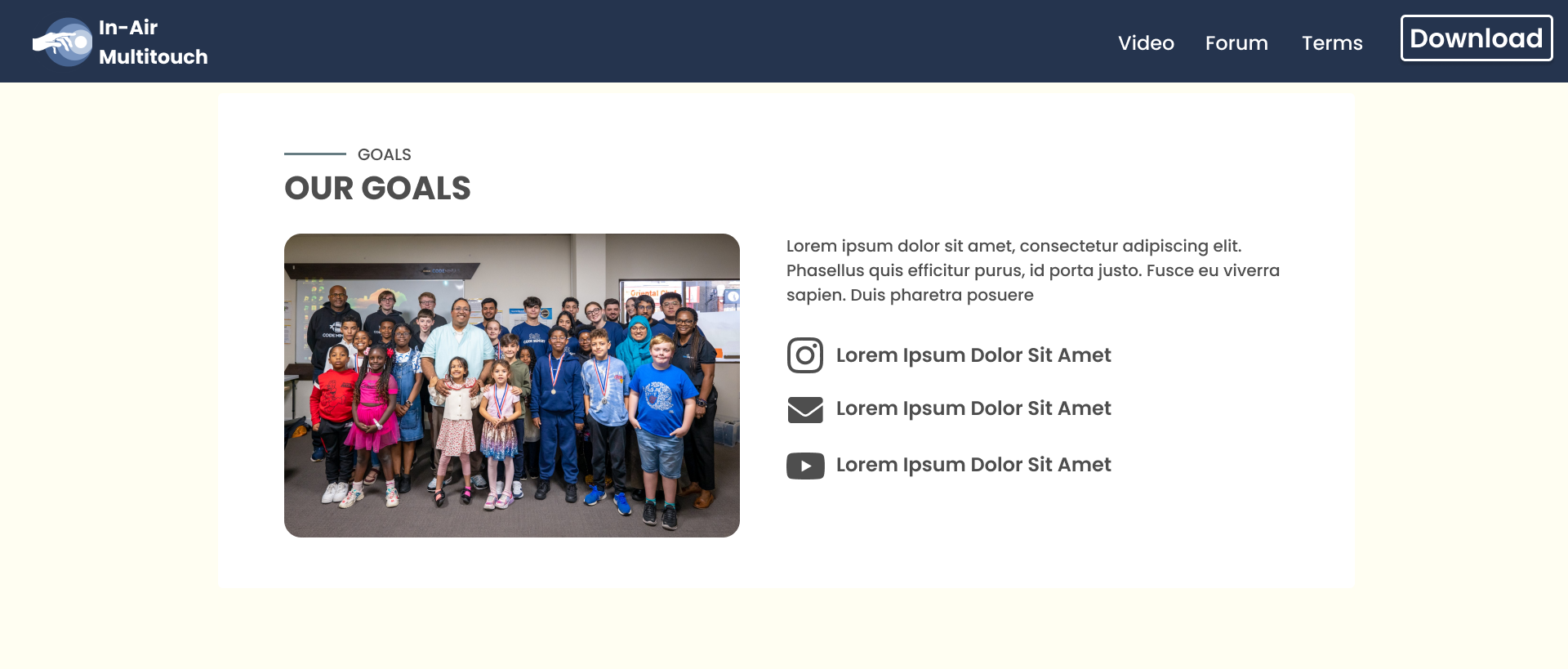
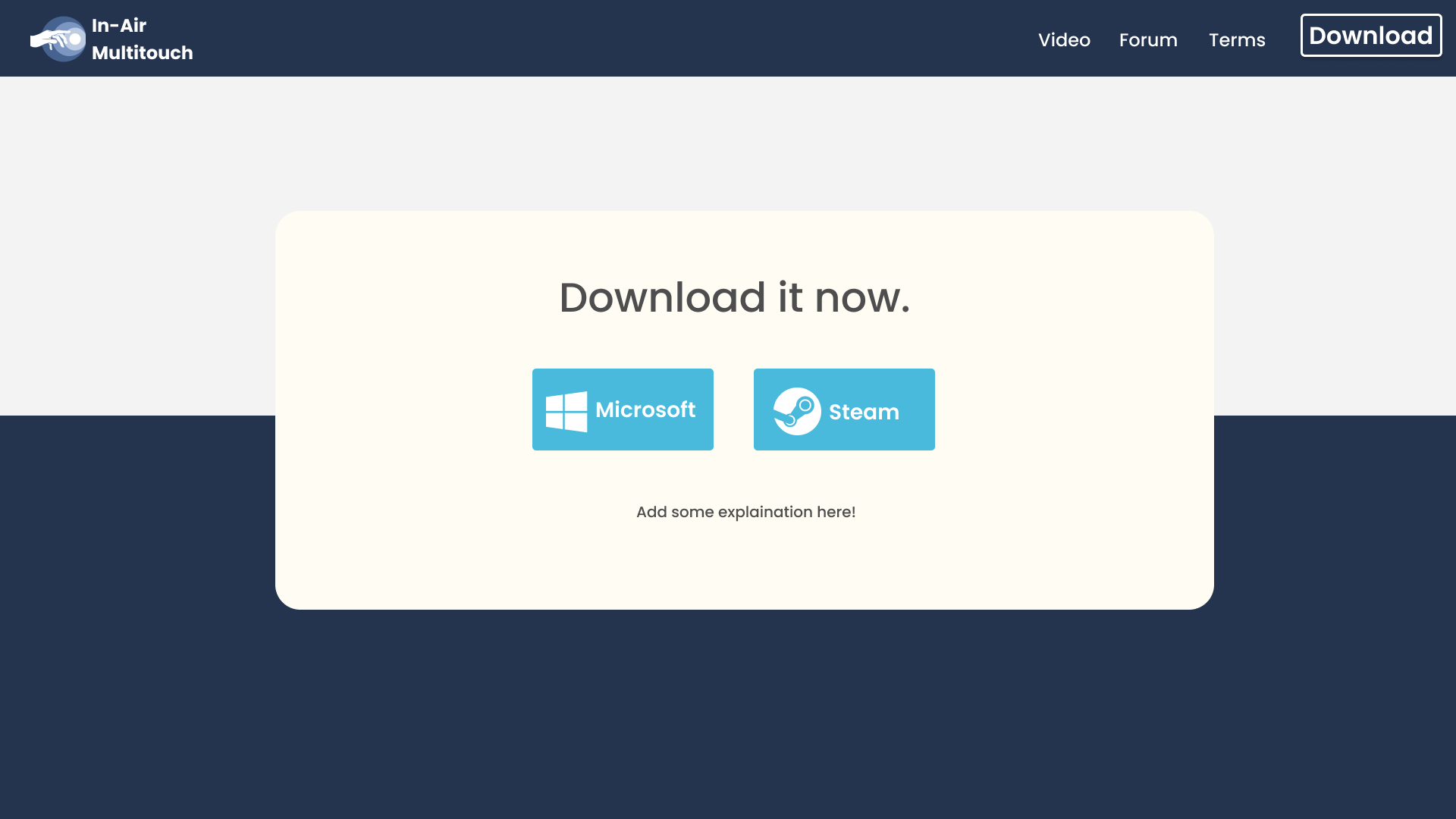
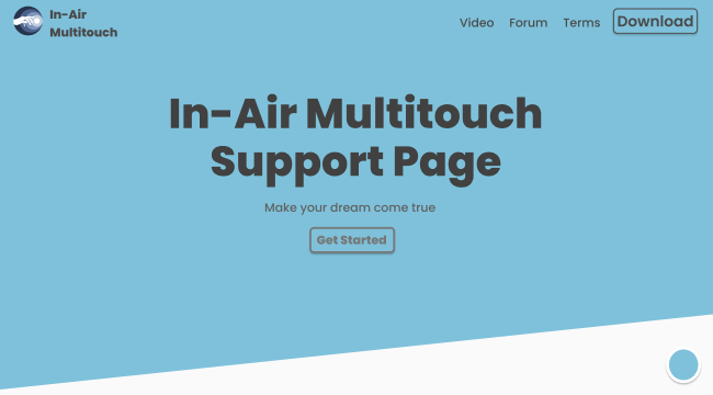
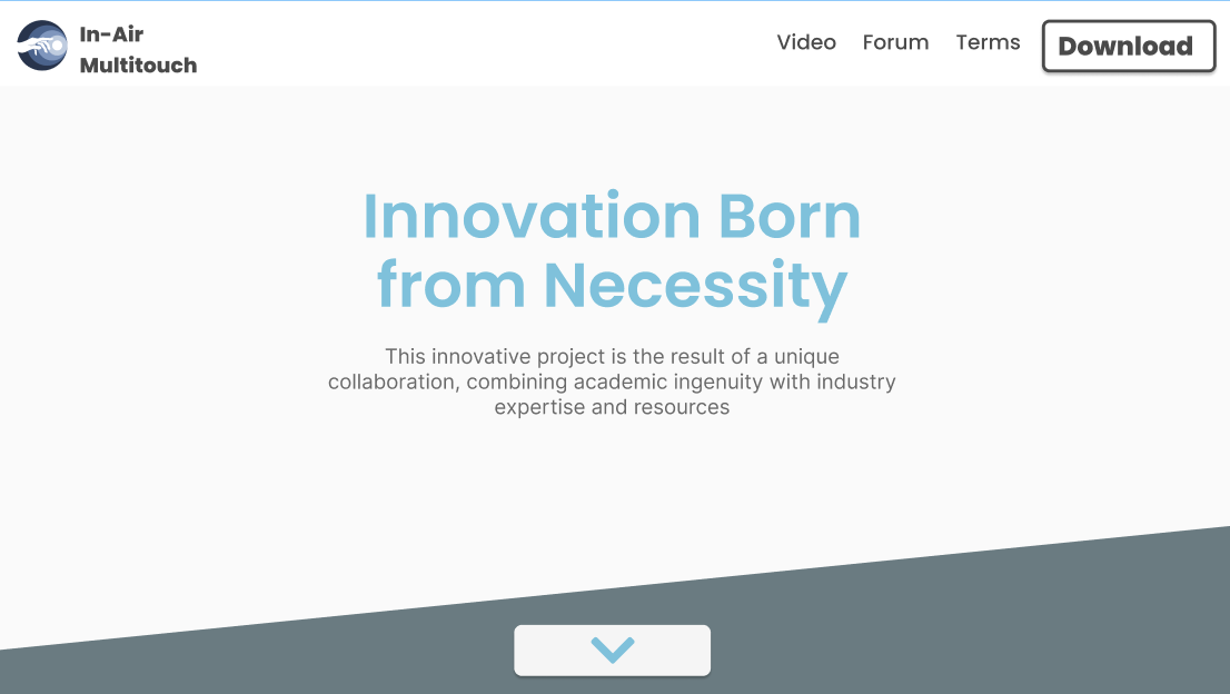
As you can see with our design we focus on the modernity with majority focusing on the image and white space to give the user room to breath. This allows user to be relax
and don't feel overwhelm by the information. Also the nav bar is smaller this is to do with our perception of nav bar where it is larger in website than in pictures.
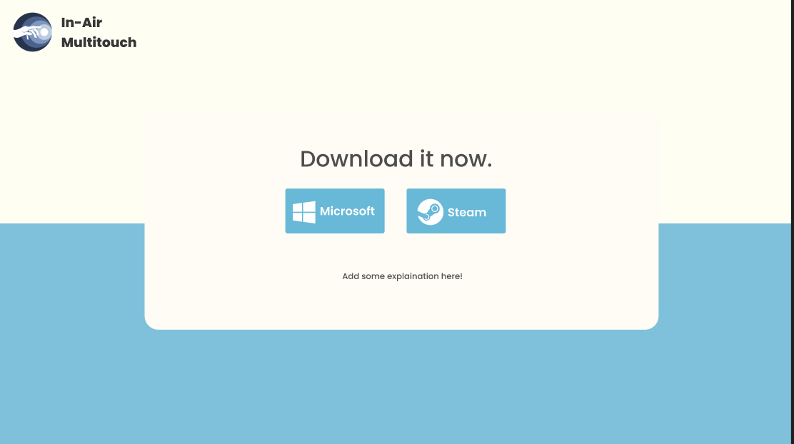
The colour scheme choose here is mainly white and cream whereas the blue is just temporary colour for the user to customize. White colour can go along with any colour therefore we chose it.
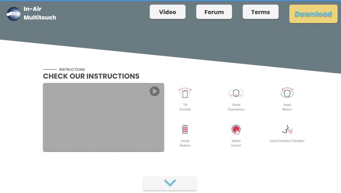
Also as for content wise we remove quite a lot but this mainly due to us interviewing other team again to see how ready they are to give us the content and some of them have to remove some part
where they promise they going to give us at first like a set of tutorials. The removal of the blocky nav bar button also make the user focus more on the download which suggest by our supervisor.
This iterative process give us the best design possible.
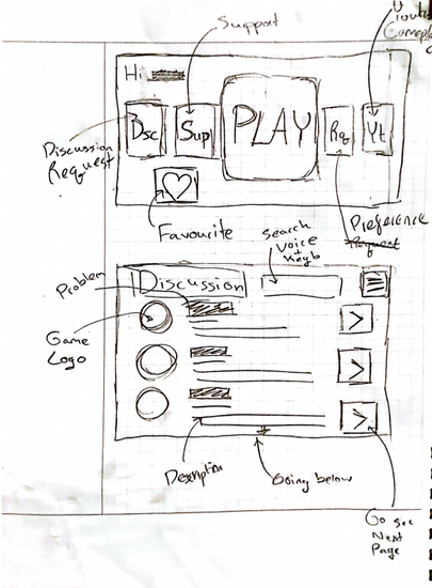
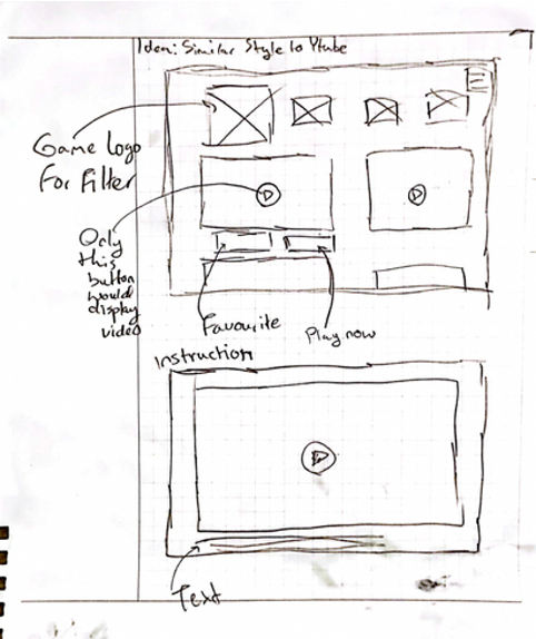
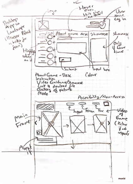
Sketches
After gathering the user requirements and using personas to better understand them, we drew up the sketches to explore ideas on our Web Generator.
The sketching was done based on our design principles.
Prototype
We then came up with the prototype based on the sketches and users’ requirements.


Final Design
Rationale